
There’s a wealth of data in the Census Bureau’s April new home sales report, released just last week. The overall data showed a down April that broke the trend of rising sales under way since 2012. The charts below provide some color and detail about what’s going on.
First, the US economy has created more than 13 million new jobs since the recovery began in 2010. But this time, instead of leading the turn as they normally do, new home sales have lagged, both in time and quantity. A yawning gap has opened between the rate of growth in full time jobs, and the new home sales rate.
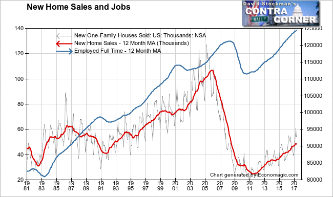
This gap isn’t narrowing. It’s getting wider. Whereas jobs growth and new home sales used to be joined at the hip, they no longer are. This is clear evidence that the jobs being spawned in the US economy today don’t pay enough for buyers to be able to afford the purchase of a new home.
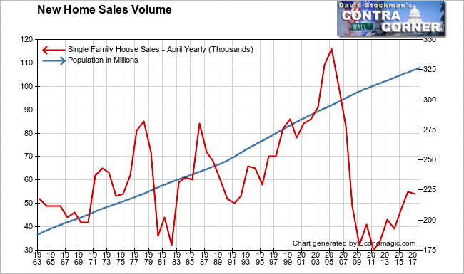
Put low wages together with rapid housing inflation and what you get is a depression. The 12 month average of new home sales are only at the level reached in 1993, 24 years ago, when the US had a much smaller population. This chart of new home sales versus population illustrates. Population growth continues at nearly a straight line rate with just a nearly imperceptible slowing since 2009. Sales, on the other hand have always been volatile, but they have always recovered to oscillate around the population growth trend. But not this time.
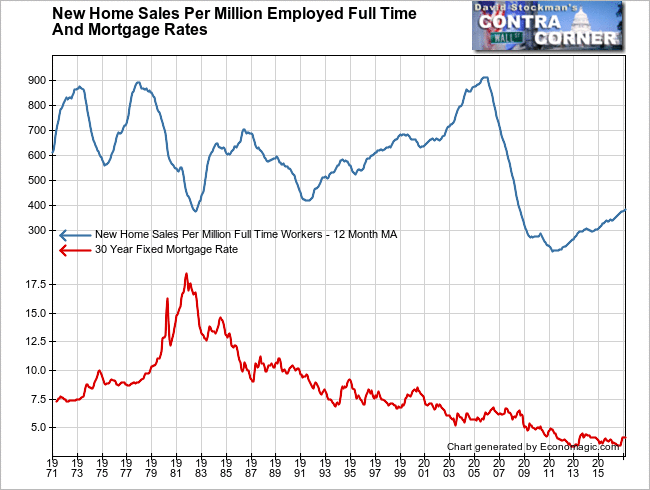
A different way of illustrating this is to calculate the sales rate per unit of population. This chart shows the annual sales rate per million people. I have also included the line graph of mortgage rates. The puny recovery of the past 6 years has only brought the sales rate back to a monthly average of just below 150 sales per million of population. That is barely above the rate at the bottom of the 1982 recession, when mortgage rates hit 18%. Today they are around 4%.
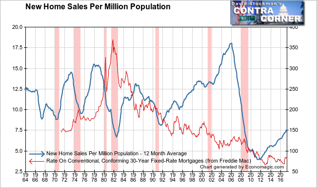
The collapse of the bubble from the 2005 sales peak to the 2011 bottom had an enormous impact, dropping sales to the lowest level in the 50 year history of the data. In 1982, mortgage rates were 16-18%. Today they are at 4%. But today, sales are only at the levels of 1982, the previous worst recession of the post WW2 era.
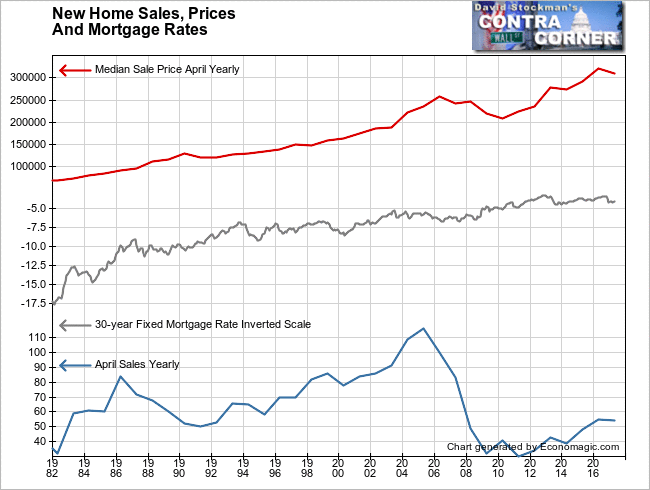
The result of the Fed driving mortgage rates into the sub basement is that sales prices have inflated apace. That has kept the typical mortgage payment from falling to allow more people to buy new homes. The market is stuck at depression levels of sales thanks to the Fed subsidizing mortgage payments by pushing down the interest component. But that subsidy hasn’t benefited buyers. Their costs haven’t fallen. The benefit has accrued to sellers. But most homeowners could not sell at these price levels if they tried to because there are too few buyers to afford the current, inflated prices.
Combine the fact that the new jobs being created have lousy pay, with the fact of rapid house price inflation and here’s what you get–a historic depression in the rate of new home sales per million employed full time workers. Not only are the sales per million workers still below the level of the 1982 worst post WW2 recession, but the slope of the recovery has also been the absolute worst in the history of new home sales data… With the help of record low mortgage rates! There’s only one way to put this. Disaster!
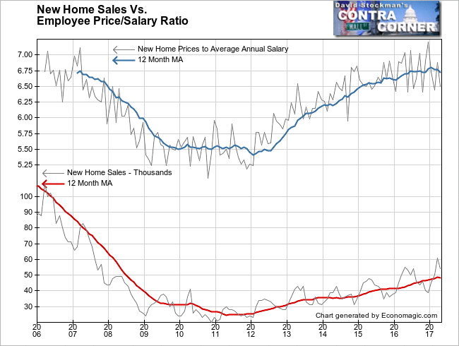
Here’s another chart that illustrates the problem. Thanks to the Fed’s mortgage rate subsidy we’ve had massive housing inflation. This chart shows that prices are now at the same level relative to to average annual worker salaries (BLS data) as they were at the top of the bubble. We know what happened the last time prices reached this ratio. Demand was exhausted in 2006 and sales began to collapse. Prices hung around peak levels until 2007, but the market was already dead. Few sellers could sell. The prices recorded in 2007 were a mirage.
The April sales slowdown and price decline today could be the first indication that demand is exhausted for this cycle. Meanwhile, breaking sales down by price range we can get a clearer idea of who has been helped by the Fed mortgage subsidy and who hasn’t. We can also get an idea of where the hit came in April, and draw some conclusions about the future.
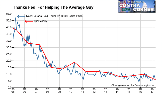
Ostensibly the Fed’s policies were designed to help the average American purchase a home and thereby stimulate the economy. But if you define average as having the median household income it’s clear that ZIRP and QE did no such thing. Today’s median income household would be able to afford a purchase price of just over $200,000 by conventional qualifying ratios with a 10% down payment. Nearly half of American households would be maxed out at $200,000. Sales in that price range just hit a record low for April of 6,000 units. That compares with 43,000 in 2005. It has been all downhill since then.
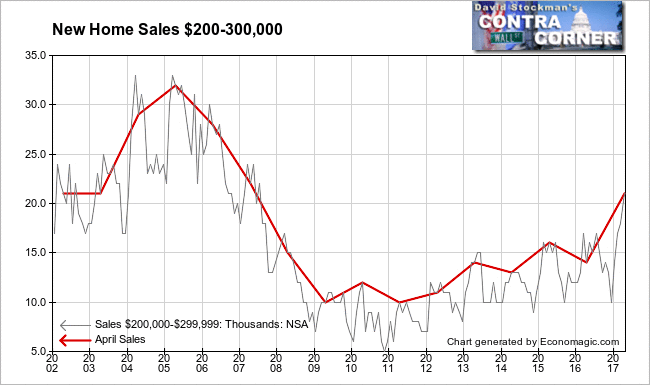
Sale prices between $200,000 and $300,000 would accommodate households just above the median household income. That’s where the sweet spot for builders would be. That’s where the largest number of households are who could afford to buy the homes that the builders are building. And in fact, here’s where the sales were in April.
The first jump in mortgage rates off the mid 2016 lows has triggered a massive buying panic, just as I had forecast. This wasn’t due to any academic insight on my part. I spent years in the trenches of the home sales and mortgage finance businesses. I have seen the process play out before. First comes the buying panic, then comes the disappearance of buyers. I surmise that that’s where we are now.
If that’s correct, sales in this price range would be topping out below the levels of 15 years ago. That’s an indication of how weak demand is. Remember, 2002 was also a recession year.
The buying panic in the higher price ranges took place in March. April sales fell sharply in the $300-400,000 range, where the second largest number of buyers are. These buyers would be in the $80-100,000/year household income range. They are already tapped out.

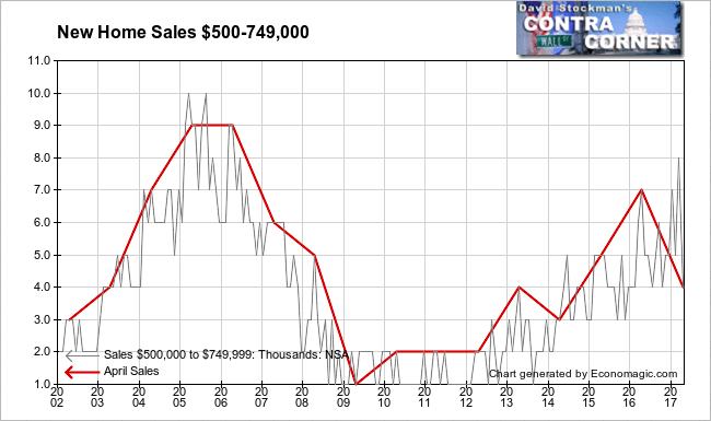
The same is true in the $500-750,000 range, where buyers would typically have household incomes in the $120-200,000 range. There was an enormous buying panic as mortgage rates rose in the fourth quarter of 2015 and into March of this year. Last month, sales plunged. This too is a sign that any pent up demand in this income range has been exhausted.
Put these pictures together and what we see is a market that may have already gone over the top. The limits of affordability have been reached. Any price inflation from here is likely to prove to be “transitory” as buyers can no longer afford to pay. Sales volume will dry up, and prices will roll over in response. The implications are bearish for the financial system as more mortgages start to go underwater and the mirage of collateral that protects the financial system will disappear.

