
Inquiring minds may be interested in a detailed look at the yield curve and spreads between various durations following the Fed’s Wednesday rate hike. Let’s start with a long-term chart from 1996 to 2015.
Yield Curve 1996-Present
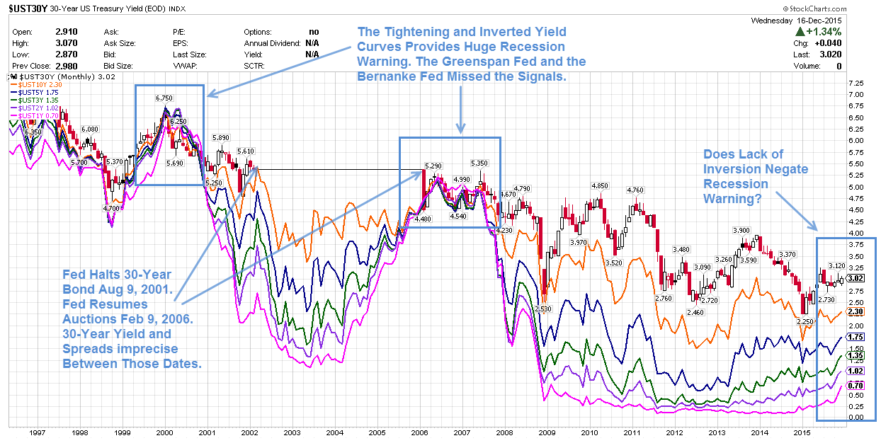
click on any chart for much sharper image
Legend
- Red-Black: 30-Year Yield
- Orange: 10-Year Yield
- Blue: 5-Year Yield
- Green: 3-Year Yield
- Purple: 2-Year Yield
- Pink: 1-Year Yield
Notes
- The above chart shows month-end closing yields except for December 2015 which is as of December 18.
- The Fed stopped 30-year bond auctions on August 9, 2001.
- The Fed resumed 30-year bond auctions on February 9, 2006.
- The yield and various spreads on the 30-year bond are imprecise between those dates.
Spotlight on Spreads and Inversions
It is very difficult to see spreads and inversions over such a long duration in the above chart. There are simply too many data points.
For ease in viewing, I took year-end closing numbers (except the current year which is as of close on December 16, the day of the hike), and plotted them in Excel.
Yield Curve 1998-2015 (Year-End Values)

Yield Curve Differentials 1998-2015 (Year-End Values)

Bubbles of Increasing Amplitude Over Time
In the above chart, my statement “Fed’s Real Policy Error is to Encourage Massive Speculation, First in Housing, then Everywhere. Bubbles Reblown, Only Bigger” is a play on John Hussman’s post this week entitled Deja Vu: The Fed’s Real “Policy Error” Was To Encourage Years of Speculation.
Unfortunately, here we are again. The Fed has blown another bubble at least as big as the bubble in 2007 and 2000.
A friend recently commented something along the lines “there is no way this is bigger than the 2000 bubble”.
Actually, it is bigger in many ways. While it’s true the dotcom bubble had huge numbers of stocks that went completely bust and never recovered, that bubble was predominantly centered around technology. Energy, mining, consumers staples, and non-technology smallcaps were not in bubble territory.
In 2007, housing and financials were in a massive bubble. Today, valuations are stretched nearly everywhere you look except mining and energy.
Median P/E ratios are at an all-time high. For details please see Stocks More Overvalued Now Than 2000 and 2007 No Matter How You Look at Things.
What’s Next?
“What’s next?” is a key question that everyone seems to be asking. Yet, in aggregate, market participants do not seem concerned about the obvious bubbles and likely answers.
Many think that a recession cannot be on the horizon because the yield curve is not inverted. However, Japan proves otherwise. Things change at zero bound.
Although the belief that rates cannot go negative has been shattered, I do not ever expect to see the day when 10-year yields are even more negative than 3-month yields.
Four More Hikes Coming?
Are four more hikes are coming in 2016? I doubt that, but see Saxo Bank’s Real Forecast for 2016; Mish Comments and Projections for a differing opinion.
Meanwhile, watch that yield curve carefully. If the Fed hikes and the curve inverts, immediately kiss the recovery goodbye. If the Fed does not get in its stated hikes, it will likely because the Fed is worried about a recession that is long overdue and already baked in the cake.
Finally, for everyone who thinks the economy is about to take off, please explain ….
- Trucking: Massive Collapse in Trucking Shipments Every Month Since June
- Industrial Production: Industrial Production Declines Most in 3.5 Years, Down Eighth Time in Ten Months
- Inventories: How to Uncover Hidden Economic Weakness!
If you think manufacturing is no longer relevant, please think again.
Mike “Mish” Shedlock

