
Initial jobless claims have reached an all time record low level for this time in March in a continuing string of record lows has now persisted since September 2013, with the exception of a few weeks here and there. Employers continue to hoard workers at bubble levels.
The data on weekly first time unemployment claims has painted a picture of a US economy that is in a bubble that has been boiling over for 18 months, driven by the massive central bank money printing campaigns and ZIRP.
The headline, fictional, seasonally adjusted (SA) number of initial unemployment claims for last week came in at 291,000. The Wall Street conomist consensus guess was 293,000. That was a near bulls eye.
We don’t play the expectations game, whose outcomes are random and meaningless in the big picture. Our interest is in the persistence of the trend in the actual, unmanipulated, not seasonally adjusted (NSA) data. Tracking and analyzing the actual total of state weekly counts is the best way to see what’s really going on. The Department of Labor reports the actual unadjusted data clearly and illustrates it in comparison with the previous year. The mainstream financial media ignores that data.
According to the Department of Labor the actual, unmanipulated numbers were as follows. “The advance number of actual initial claims under state programs, unadjusted, totaled 259,671 in the week ending March 14, a decrease of 18,254 (or -6.6 percent) from the previous week. The seasonal factors had expected a decrease of 19,127 (or -6.9 percent) from the previous week. There were 285,970 initial claims in the comparable week in 2014.”
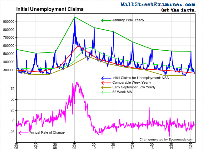
The week to week change was better than average for that week of March for the second straight week, reversing 2 weeks of below average performance. The actual week to week change was a decrease of 18,000 (rounded). The 10 year average for that week is a decrease of 23,000 (rounded). The current drop compared with a decrease of 16,000 in the comparable week of 2014.
Looking at the momentum of change over the longer term, actual first time claims were 9.2% lower than the same week a year ago. That’s not materially different than the previous week when the drop was -8.1% Since 2010 the annual change rate has mostly fluctuated between -5% and -15%. The current number is solidly within that range. There’s no sign of the trend beginning to weaken.
At the last bubble peak in 2006, claims began to increase late in that year. The housing bubble had already peaked a few months earlier but the stock market continued on its merry way for 9 more months, not finally ending its run until September 2007. In that instance a clear breakout in the number of claims toward the end of 2006 gave plenty of advance warning that all was not well before stock investors got a clue. Conversely, at the 2000 top, claims had given little advance warning. They began to break out concurrently with the top in stock prices through midyear 2000.
Huge cracks have begun to show up in the oil producing states. The impact of the oil price collapse started to show up in state claims data in the November-January period. While most states show the level of initial claims well below the levels of a year ago, in the oil producing states of Texas, North Dakota, and Louisiana, claims have recently been above year ago levels. North Dakota and Louisiana claims first increased above the year ago level in November. Texas reversed in late January.
In the most current state data, for the March 7 week, claims in these states were well above year ago levels after a huge surge that week. Texas was up 22.7% (from 13% the prior week), Louisiana +50% (up from +20%), and North Dakota +44% (up from +28%). I also looked at Oklahoma this week. It is up 43.5% from the same week a year ago. These increases are probably just the tip of the iceberg, with more layoffs and ripple effects to come.
With its huge and widely diversified economy, Texas could be the harbinger of things to come for the entire nation as the ripple effects of the oil collapse and the disappearance of those $85,000 per year jobs spread through the US economy.
In the February 28 week, 25 states had more claims than in the same week in 2014. Many states are on the hair trigger between an increase or decrease versus a year ago. In the March 7 week, just 13 states had more first time claims than the year before. A month ago only 10 had a year to year increase. At the end of 2014 only 8 were up year to year. At the end of the third quarter of 2014 there were just 5. It’s pretty clear where the momentum has been headed.
The growing number of states with year to year increases in claims is akin to a stock market advance-decline line in a negative divergence from an advance in the market averages. It may be a warning sign of deterioration that is not apparent in the topline numbers.
I track the daily real time Federal Withholding Tax data in the Wall Street Examiner Professional Edition. The growth rate of withholding taxes had run red hot through early February, hitting a 12 year record of +8.7% that had the feel of an economy that had reached the boiling point. That tipped us off that the BLS nonfarm payrolls would blow out the consensus estimate and spook Wall Street traders. Very few if any Wall Street pundits or bloggers made a similar call, but the real time tax data was absolutely clear that February had been a barn barner on the jobs front. There’s nothing like good old-fashioned, real-time, hard, unmanipulated data to give a clear picture of what to expect from the BLS and other economic data that are released well after the fact.
The growth rate of withholding taxes, while still strong, has receded over the past month through this week. So far, this is consistent with the normal short term cycle we have seen in this data for the past few years. The year to year change of over 5% is still a strong number, just not as strong as in February.
Big employers have been partying and hoarding workers like it’s 1999, and that’s not a good sign. The tech bubble topped out in 2000 and the recession followed. The housing bubble peaked in 2006, but the damage did not begin to scare businessmen, policy makers, Wall Street and mainstream pundits until late 2007, and the real collapse followed a year later. The clock is ticking toward a similar end today, and this time the central banks will be hard pressed to engineer another credit bubble recovery.
While we have been teased with signs of change in the claims data from time to time, the trend is still in force. This data will continue to encourage the Fed to engage in the charade of pretending to raise interest rates sooner rather than later.


