
Last week the Federal Reserve updated its quarterly Financial Accounts of the United States Z1 (formerly Flow of Funds) meaning that we can recheck valuation levels of the stock bubble from alternate points of view (data). The most common valuation given by the report is Tobin’s Q which compares the estimated value of corporate equities (liability) to nonfinancial corporate business net worth rather than earnings. It is an alternative view that incorporates elements of the balance sheet (notably leverage) while maintaining an anchor to fundamental economic composition.
Since QE3, valuations according to the Q ratio had gotten as far out of balance as the early dot-com bubble, circa 1996. For my own analysis, I modify the Q ratio by subtracting commercial real estate assets from net worth to avoid having one bubble “justify” another; as rising real estate values turn into a bubble themselves they would artificially increase corporate net worth and then skew the valuation through purely financial means. This modified Q shows valuations a bit further along in comparison to the dot-com bubble, circa late 1997/early 1998.
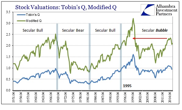
The Z1 series estimates that corporate equities peaked in Q1 2015 at $23.1 trillion, which pushed the modified Q valuations to a new “cycle” high in that quarter. In the original Tobin’s Q format, valuations peaked in the middle of 2014 which suggests the influence of commercial real estate at least over that small window. Both valuation methods show, of course, the more recent stock market stumble which has had very little effect overall in bringing about more balanced appraisals for stock prices systemically. The Q3 2015 estimates for corporate equities show a 10% decline from the Q1 peak, so this series does capture a good deal of the mid-summer turmoil as far as valuation effects are concerned.
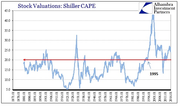
That view seems to align very closely with other fundamental methods, including reported corporate earnings and Robert Shiller’s CAPE ratio.
Extremes in valuations suggest extremes in expected forward returns. They do not tell us how those extremes come about, only that when valuations are at highs forward returns are historically low – to the point of not justifying even long-term holdings. Low valuations show the opposite. Pairing the modified Q ratio to 10-year forward returns easily demonstrates the relationship.
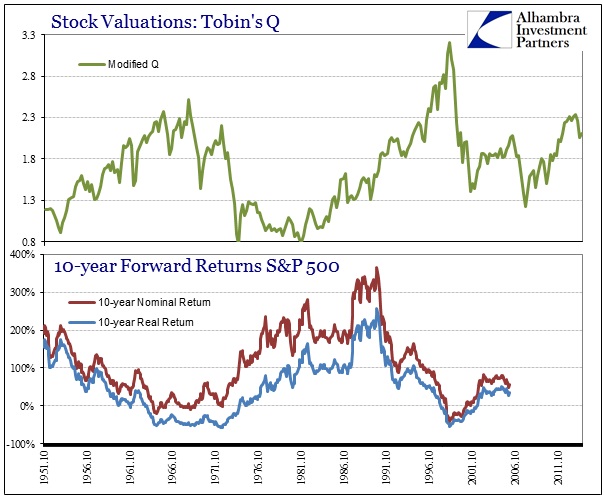
So far holding stocks from even just after the dot-com crash across a 10-year horizon is lacking in returns, owing in large part to the events in and around 2008. The biggest cost of the panic and Great Recession was not necessarily the huge drawdown, but the cost in time as it took years (and continued unnatural “aid”) for the rebound just to get back to even.
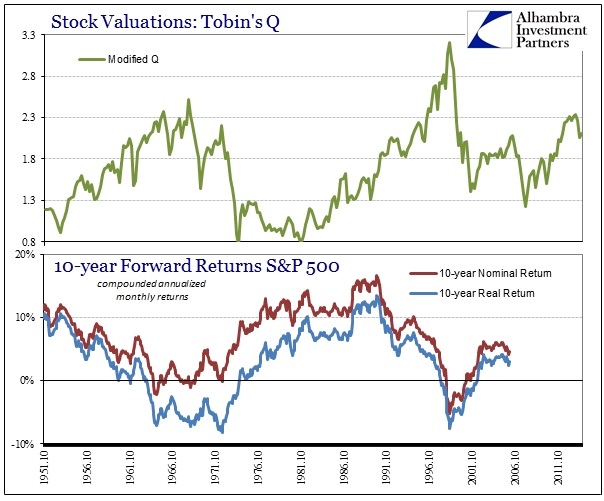
At the end of 2005, for example, the modified Q ratio was still historically high at 1.82 owing to the fact that the dot-com crash, bad as it was, did not reset the valuation extremes as most bear markets do (such as the end of the 1970’s/early 1980’s). For that valuation, 10-year returns were just clocked (omitting dividends) at 62.8% nominally and 38% in “real” terms, adjusting for the CPI. On an annualized, compounded basis, that works out to just 4.6% per year nominally and a pathetic 3.0% in real terms even though stocks were back near record highs (above 2000 on the S&P 500 and almost $22 trillion in Z1) in December 2015. By way of comparison, a 10-year US treasury yielded about 4.39% on the last day of 2005.
The best returns were generated when valuations in this format were 1.5 and less on a consistent basis. The serial asset bubbles are not helpful because they do not lead to the fundamental paradise monetarists suggest of them (when they allow themselves to consider bubbles as bubbles). The Z1 series also provides useful data for considering the inefficiency of asset inflation in raw economic terms.
We can compare corporate equities to GDP as a fundamental valuation yardstick, which presents an even greater imbalance to historical experience (though this view is skewed by overseas activity; in other words, some corporate equity value is derived from true economic gains not included in GDP).
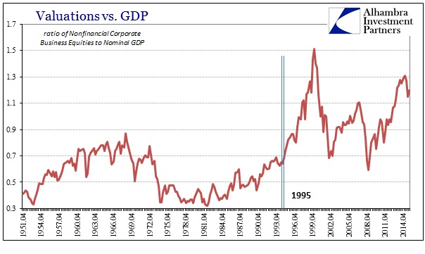
As with the Q ratios, the selloff last year erased very little of the valuation extreme leaving corporate equities still historically overvalued (by quite a bit).
In terms of economic efficiency, we can compare business debt (both corporate and non-corporate) to GDP to examine the economic effects of leverage on businesses. Also an imperfect view, this relationship however continues to show the long-term process of more debt/less growth that is undoubtedly a major factor in structural economic issues we see in the 21st century. In more recent quarters, this disparity has increased again as the economy has stumbled despite companies that are adding debt more freely (average Y/Y growth in credit market liabilities was 6.9% in 2015 compared to 5.2% 2012-14).
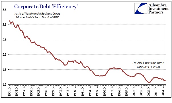
The economic efficiency of business leverage in Q4 2015 was as bad as Q1 2008, and not much better than the lowest point Q1 2009.
This ineffectiveness also manifests in the household sector as compared to consumer spending. If there was an actual “wealth effect” as economists propose we should see a less extended (in the extreme) relationship between household net worth (derived in Z1 mostly via equity and home prices) and final sales to domestic purchasers (the GDP report series that totals overall American consumer purchases regardless of where the goods or services were produced).
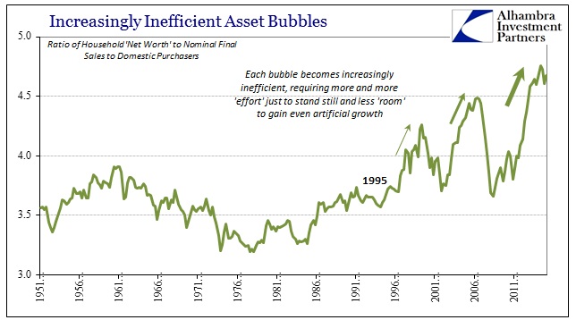
This weak relationship is all the more distressing given the emphasis placed upon the wealth effect during the QE regimes – they got asset price inflation to reignite but without sufficient spending to justify the grave imbalances detailed above. This inefficiency suggests common sense (yet again), meaning that spending is far more about income (and permanent income) than asset bubbles. The wealth effect was meant as another of Keynes’ proposed “pump priming” methods, but it, too, has failed to materialize like the others (redistribution). Spending for the sake of spending does not lead to more fruitful and sustained economic activity, to which the whole global economy can now easily attest.
That leaves stocks, in particular, far too close to historical extremes in terms of valuations without any justification (economic and otherwise) for that. This broad survey of alternate stock measures only confirms that view. If valuations are to return to a more considered level, economically speaking, the liquidations in August and January would be just the start. In any case, we can expect very low returns moving forward though it is left to the imagination as to how that comes about. It might simply be further continuation of the past twenty months or so (“rising dollar”) of somewhat volatile but mostly sideways trading, or it might propose, given economic instability and the high degree of financial inefficiency from all sides “supporting” that shaky foundation, a third go at the bubble cycle.

