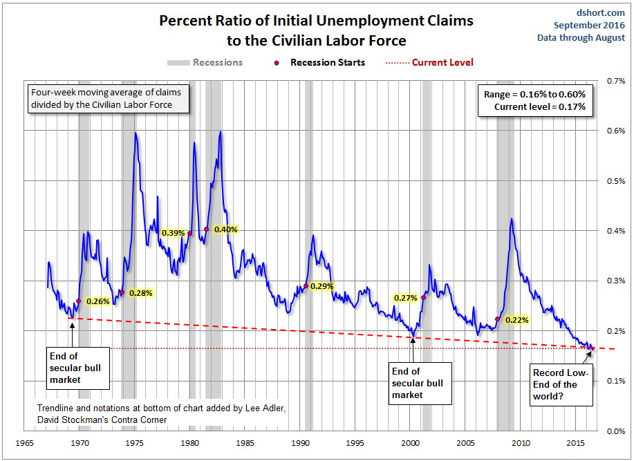
Doug Short at Advisor Perspectives creates fantastic charts. This one shows the long term downtrend in initial unemployment claims. It correctly points out that claims are presently at the lowest rate in history as a percentage of population. But is that bullish? The notations in the upper 3/4 of the chart are those of Advisor Perspectives. At the bottom I have added “Adler’s perspectives.” 
Original chart source (before our annotations): Advisor Perspectives


