The idea that US housing prices are not in a bubble because they haven’t reached new highs on an inflation adjusted basis has become popular lately.
I have a couple of problems with that idea.
First, its proponents deflate house prices by CPI, then conclude that since real, “inflation” adjusted adjusted existing home resale prices have yet to exceed their peak in 2005-06, therefore the current market is not in a bubble. Somehow, if CPI is inflating at less than 2% and house prices are inflating at 6%, the “real” inflation rate of houses at triple the CPI inflation rate is not a bubble.
They may be right, but I don’t think so.
Their reasoning ignores the fact that house prices were at the top of the bubble in 2005-06, and that bubble soon deflated. House prices bubbled higher then for 5 years. Bubbles are not a single point in time. They involve a process of speculative price inflation. Most bubbles in modern history evolved over a similar lifespan. They usually lasted about 5 years from the time prices first accelerated out of a base pattern until the time they reached their parabolic peak. By those standards, in bubble years the housing market is elderly. It may have further to go, but its days are numbered.
Here’s another problem with judging “bubble or not bubble” in terms of inflation adjusted prices. The proponents of this measure fail to account for the fact that if they deflate prices by an inflation factor, then they should also deflate the incomes which people have available to purchase those houses. We can only judge whether prices are expensive or not relative to the incomes people have available to purchase the houses. If incomes are rising 6% per year and house prices are rising 3% per year, then houses are getting cheaper. In this case, the situation is the reverse of that.
We can derive a fair and unmanipulated measure of the price to income ratio of houses, similar to the PE ratio of a stock, by dividing the median US house sales price by the median US household income. We use the nominal actual median price for the year divided by the median household income for that year. The Sales Price/Median Household Income Ratio, or P/I can then be compared year to year on an apples to apples basis, just as we compare PE ratios to the past to determine whether stock prices might be overvalued.
The P/I ratio enables us to measure and visualize how much prices have risen relative to incomes, which is a truer measure of “bubbleness” than price alone. Bubbles die when prices outrace the ability of buyers to pay. First sales volume collapses, then prices follow soon after when sellers experience a Wile E. Coyote moment en masse. That’s what happened in the 2005-2007 period.
While the US may not yet be at the top of a bubble, the charts below show clearly that it is certainly in a bubble, two bubbles in fact. One is a bubble in existing home resales, which may have some room to run, or not, and one is a bubble in new home sales, which is in a state of record hysteria.
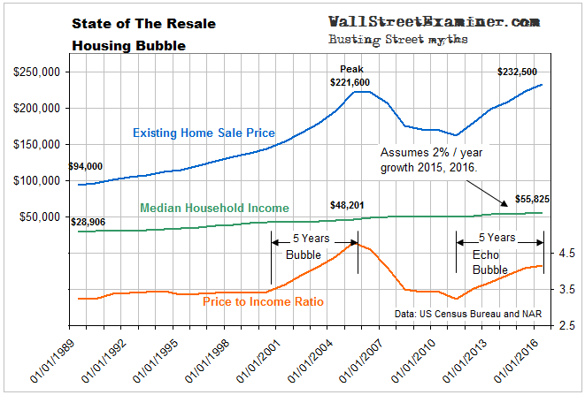
The first shows the inflation curve of existing home resale prices along with the graph of median household income and the P/I ratio.
Click to view chart if reading in email.
It’s easy to see how fast house prices have outpaced median incomes, and I may have been generous in estimating 2% increases in median incomes for 2015 and 2016. From 2008 to 2014, the most recent year for which median income is available, the compound growth rate of median household income was just 1.1% per year. In contrast, since housing prices bottomed in 2009, the median US house resale price has inflated at 5.1% per year. The picture is even worse since 2011. House prices have been inflating at a compound rate of 6.3% since then. Data available for 2016 so far suggest the market is on track for to hit a similar inflation rate.
While the current bubble in resale prices is not as extreme as at the peak of the last bubble, at nearly 4.2 times median household income are mid bubble relative to the 2003-06 period. In terms of time, however, this bubble is elderly, and at risk of proximate death. The past bubble is not so distant that people don’t remember what happened. Reaction time could be quicker this time as a result of that memory.
Central banks rigging long term interest rates have driven the current bubble. In order for prices to continue rising against the slow rise in household incomes, mortgage rates would need to keep falling. Even if they were to remain stable and prices continued to rise, eventually this would lead to bubble top conditions. In a scenario where mortgage rates begin to rise and incomes continue to grow at a snail’s pace, the end will come sooner. Whether you believe the current price bubble is sustainable or not is contingent on what you believe about mortgage rates. Will they continue to decline or not?
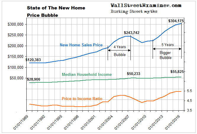
The picture is more extreme for new home sales. In that arena both prices and P/I ratios are in raging bubbles, even bigger than the 2002-06 bubble.
Click to view chart if reading in email.
Builders have gone crazy building bigger and bigger homes for rich people. Fewer and fewer households can afford the median price of a new home. In view of that trend, it’s only a matter of time before this market collapses again. Any rise in mortgage rates above current levels could be the clincher.
The post The State of The US Housing Bubble was originally published at The Wall Street Examiner. Follow the money!


