In 2012 the Fed set an “inflation” target of 2%. Only it wasn’t really an inflation target. It was a PCE target. The PCE is the Personal Consumption Expenditures Index, which the BEA reports as part of its quarterly GDP reports. There’s also an interim monthly update that is not widely followed. The PCE is a weirdly weighted, narrowly defined basket of goods and services used by consumers. It is similar to the CPI, and largely based upon CPI, but the methods used to weight its components cause the index to under represent inflation even more than CPI does.
While the Fed purports to base its inflation target on PCE, you better believe that it has its eye on CPI. It certainly has been reacting that way lately.
As I have shown in past posts, CPI understates the inflation rate of typical consumers’ ordinary costs of living by about 1% per year. It doesn’t even begin to measure the “general level of prices.” That was the most traditional definition of inflation before economists arbitrarily narrowed the focus to consumer prices only. The CPI doesn’t measure or reflect actual monetary inflation because it excludes asset prices. It excludes the rapidly rising level of house prices, which affect consumers directly. It also excludes the soaring inflation of financial assets. The latter is the most dangerous inflation of them all because it ultimately leads to financial crisis, asset price crashes, and severe economic recessions or depressions.
As a result of its official focus on PCE, with its eye really on CPI, the Fed has completely missed or deliberately ignored actual inflation. In fact, even consumer price inflation, has been well above its 2% target ever since the Fed codified it in 2012, if you count housing prices correctly. Government inflation measures don’t do that. But eventually rising house price inflation filters into the CPI data on a lagging basis, well after the fact. That leads to central bank panic and a rapid tightening of monetary conditions. This is the essence of the concept of “behind the curve” that economists talk about when the Fed acts too late to curb what it already an entrenched and accelerating inflation.
That’s where we are today as the BLS announces that “Whoops, the CPI rose a seasonally adjusted 0.6% in January.” That’s over 7% annualized. Even on a 12 month lookback the BLS reported an annual rate of 2.5%. In actuality, if more correctly measured, the cost of living for typical consumers has risen closer to 4% over the past year. That 7% annualized CPI may not be too far off.
The Fed has been behind the curve all along, and is now getting disastrously so as it keeps its balance sheet grossly, hideously, insanely inflated. At the same time, it continues a charade of increasing interest rates, but its rate target is still only 0.5% to 0.75%. It’s as if the economy were in a depression, and as if we were in a general “deflation,” as opposed to rising consumer inflation and raging housing and asset inflation.
The more that policy makers, the financial media, and investors ignore these conditions, the greater the danger becomes.
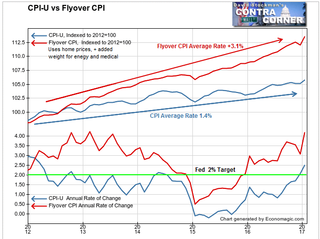
Let’s compare the BLS version of the CPI with David Stockman’s Flyover CPI.

The Flyover CPI substitutes actual US median home prices for the phony construct called Owner’s Equivalent Rent (OER). OER was ginned up in the 1980s after the BLS removed actual house prices from the CPI because housing inflation was causing CPI to rise too much too fast. It was costing the government and big business a fortune in indexing costs for government payments and labor contracts.
OER is based on an occasional survey that asks owners what they think their house should rent for, as if homeowners would know. Then it adjusts that figure monthly based on a small sample survey of renters each month that asks what they are paying in rent.
That method typically understates market rent significantly because most tenants are on older leases that increase only minimally. When tenants move, they get sticker shock when they confront the reality of the market. The BLS doesn’t recognize market rent, so OER lags and understates the rental market. Meanwhile it ignores actual home prices altogether.
The Flyover CPI uses the FHFA national median home sale price in place of OER. FHFA data lags by a couple of months, so we estimate the 2 most recent months based on actual home price changes reported by the NAR and Redfin, which use broad based national metropolitan MLS data for currently signed home sale contracts.
Flyover CPI also gives greater weight to energy and health care costs. When energy prices fell sharply in 2014-15, the Flyover CPI reflected that. But it has come roaring back since mid 2015 when energy prices began rising again.
As a result of measuring the real cost of living more accurately than CPI, the Flyover CPI clearly demonstrates that the Fed has been behind the curve ever since it announced its inflation target in 2012. For most of 2012 through mid 2014, Flyover CPI ran at a rate of approximately 2.5% to 4%. It fell below 2% only during the energy price crash, and climbed back above 2.5% at the end of 2015. Flyover CPI is currently running at a year over year rate of +4.1%. CPI is finally starting to play catch up.
Compare the performance of Flyover CPI with the fact that the BLS version of CPI was above 2% for only 3 months between mid 2012 and the end of 2016. It is currently running at 2.5%, which remains well below the actual inflation rate of living costs.
The suppressive effects of CPI methodology tend to keep the index well below the actual inflation rate of living costs for years at a time. But eventually there is a period where it catches up to some degree. When home prices and market rents continue rising at a high rate, the OER tends to start catching up. That’s where we are now. Energy prices have also rebounded, therefore CPI is suddenly above target.
The Fed is now running around with its hair on fire as a result. The latest Fed blah blah was talking about 5 more interest rate increases this year. CPI should continue to accelerate, and the Fed will go into panic mode in an attempt to tamp down the inflation that never went away. But the Fed will only be chasing its tail until interest rates become truly punitive and the economy shuts down as a result.
The Fed isn’t alone in its misperception. Virtually everyone, from the economic priesthood, to Wall Street and its media handmaidens, to professional and individual investors, have been watching the wrong measures of inflation all along. They are in the process of getting caught with their pants down.
It may take a while longer for that realization to show up in the market, but last year’s rise in Treasury yields was the dawn of realization. Keep an eye 10 year Treasury yield. If it breaks out through 2.6%, it will be a sign that the inflation panic is on. As yields rise, stock prices will succumb.
We’ll look at more illustrations of the Fed’s failure to measure inflation accurately, and the likely consequences in subsequent reports.
Lee first reported in 2002 that Fed actions were driving US stock prices. He has tracked and reported on that relationship for his subscribers ever since. Try Lee’s groundbreaking reports on the Fed and the Monetary forces that drive market trends for 3 months risk free, with a full money back guarantee. Be in the know. Subscribe now, risk free!


