We saw in our last report that total industrial production was stronger than it has been over the past couple of years, contrary to what your government and its media told us.
But in every top line number, there are hidden stories. This is one of those stories. Let it serve as a warning to all concerned investors.
We always look at the not seasonally adjusted (NSA), actual data for these series and all other economic data. Seasonally adjusted data is frequently misleading. And even though the actual, NSA data is available, no one in the media bothers to analyze or report it.
The current monthly change can be compared to past changes for May to get an idea of how strong or weak this month was. We can also look at whether the annual rate of change is rising, falling, or stable. This will give us a much clearer idea than the often wrong SA number, of how the month fared.
All IP indexes are expressed as a percentage of the production in the base year, which was 2012. They are based on the unit volume of production, not the monetary value. Therefore the data need not be adjusted for inflation.
Energy Production
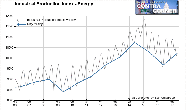
Energy Production was a big contributor to May’s annual 2.3% real growth in total IP. It rose by 1.4% month to month. Purely by coincidence, that was the same increase as the total IP month to month increase in May. May is a month where energy production usually increases, including 8 of the 10 previous years. May of 2016 saw a 0.9% increase. May of 2015 was down 0.7%. The average change for May over the past 10 years was an increase of 0.7%. The current monthly increase was the strongest May since 2012.
The trend shows a strong rebound since the bottom of the energy collapse a year ago. The blue line on the chart connects the May reading each year.
It’s no accident that energy prices are once again collapsing.The annual growth rate of US production in May was a very strong 5.8%. It was the strongest year to year growth since December 2014, when the oil collapse was in its early stages. A year ago, the rate of change was -6%. That was coming off the worst year to year performance of -9.5% in November 2015. The rate of change has continued to accelerate upward from that level, but booming production is causing another collapse in prices. Production should start to wane soon.
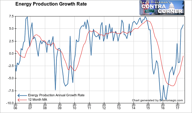
Energy was obviously a big contributor to May’s top line growth. With prices collapsing this isn’t sustainable.
Non-Energy Production
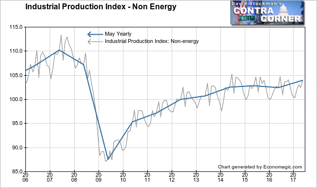
This category is mostly about manufacturing, not including oil and gas production, transmission, and refining. It was dead in the water from 2014 until 2016, but lately it has begun to rise. It’s now just above the peak recovery level reached in 2015. But it is still nearly 6% below the peak reached in 2007. We’re still in a depression by this measure, still making less “stuff” than we made in 2007. In fact, the US economy is still producing less than it did even in 2008, when the recession was well under way. And we’re only 4% above the benchmark year of 2012. That growth rate is about on par with population growth.
The economy did begin to get a second wind over the past year. It’s no coincidence that this increase began when the Fed started its program of raising the interest rate on excess reserves (IOER). That’s the subsidy that the Fed pays to the banks on their massive excess reserve holdings at the Fed.
Raising that rate increases bank income and lowers their cost of funds, easing financial conditions. It is in no way a tightening. Businesses increase spending and speculative investment in a rate increase cycle anyway. That goes on until rates begin to actually bite very late in the game. Rising interest rates are stimulative. The fact that the Fed is merely increasing IOER in a fraudulent attempt to manipulate the Fed Funds rate only exacerbates that.
Non energy IP rose 1.4% month to month in May. May is usually an up month. It was down only twice over the past 10 years. May 2016 was one of those instances at a drop of 0.3%. The average May change over the past decade was +0.5%. The May 2017 increase was the strongest May reading since the recovery kicked off in 2010.
On an annual basis the gain was also 1.4%. This was a strong uptick from a year to year decline of -0.3% in April. It was the strongest year to year increase since January 2015.
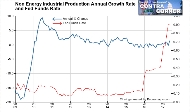
The growth rate had been weakening since the 2o10 bungee rebound from the 2009 crash. That weakening continued throughout the period of the Fed’s Zero Interest Rate Policy (ZIRP). The contraction continued through the Fed’s first increase in IOER, but began to turn positive after the second increase.
But this time really is different. The Fed will be shedding assets from its balance sheet beginning within the next few months. That will be a real tightening. The markets will shudder and the economy will begin to weaken again. This time it will contract from an already weak level. The contraction would be starting from no better than the 2008 recession levels. It will be interesting to watch the interplay of tightening monetary conditions, a weakening economy, and investment psychology.
Perhaps the big question will be how policy makers react. How much pain will they be willing to endure before reversing course?
We need not plan that far ahead. The first step will be to execute a plan to protect your portfolio before the Fed’s real tightening begins, probably late this summer or early fall.
Electric and Gas Utilities
Everybody uses energy every day to run their businesses and their households. Utilities production and distribution is therefore a good proxy for the overall performance of the US economy. An uptrend in utilities production represents real growth. Flat production signals economic stagnation, and a decline in utilities IP suggests a shrinking economy.
Utilities production shows that demand from the US economy grew by nearly 80% from 1982 until 2007. We then see a brief break in growth in 2008-2010 from the Great Recession. There was a bit of a rebound over the next 2 years, but then everything stalled.
As the April and May lines on this chart show, production has stalled since 2012. It remains below the 2007 level. This is in spite of population growth of around 0.75% per year. Simply to represent stability, these lines should be rising by that amount. Instead the US economy looks no better than stagnant, and may actually be shrinking.
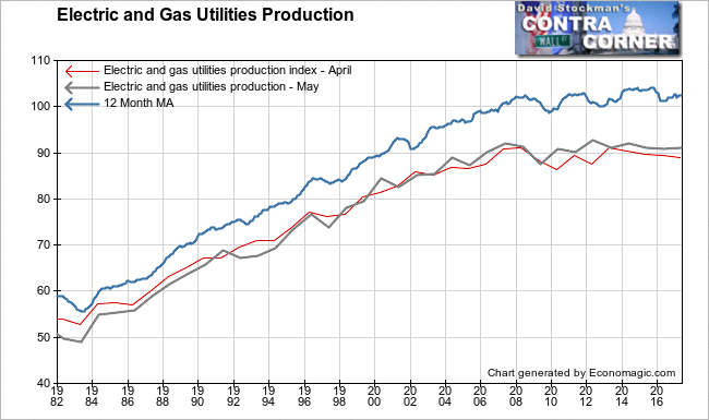
Some of this stagnation could be an artifact of conservation and increased energy efficiency. But these efforts are themselves partly a manifestation of belt tightening. Furthermore, increased energy efficiency did not just begin in 2007. That trend has been underway for years. These signs of secular stagnation are real, and should be recognized as such.
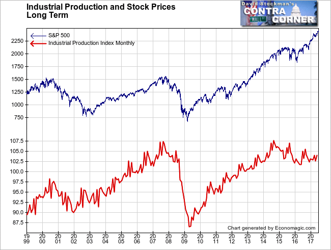
Finally, we look at stock prices in relation to total IP. This chart makes clear just how grave the risks in the stock market are. Industrial production has been in a downtrend since 2014. The usual correlation between stock prices has completely broken. Financial games have taken over the stock market.
Economists complain about low inflation. But this is where the inflation is. It’s in asset prices. The Fed is now getting ready to begin a program of withdrawing and extinguishing the money that created this bubble.
Let the buyer beware.
