Sentier Research released data on Median Household Income last week. They reported that their measure of real median household income (HHI) was 0.9% lower in December 2016 than in December 2015.
Sentier uses data from the US Census Bureau’s Current Population Survey. It also seasonally adjusts the data, which is unnecessary and may be misleading on a month to month basis.
Their report indicated that real median household income was 9.1% higher than in August 2011. They use CPI as a divisor. CPI fell between 2014 and 2015 due to a sharp drop in energy prices, contributing significantly to the reported gain in real income.
Sentier reported that real median household income was $57,827 (2016 constant dollars) in December. That was virtually unchanged from December 2007, when the Great Recession officially began. The figure then was $57,886. The current figure is 1.3% below January 2000, when Sentier’s data began.
Sentier concluded that, “These comparisons demonstrate that we are still at a level of median annual household income that is not significantly different than the level that existed at the beginning of the great recession nine years ago and also lower than the level at the start of the last decade more than sixteen years ago.”
While I quibble with their use of seasonal adjustment and with the idea of a 9% gain in real income between 2011 and today, their overall conclusion is valid. The typical American household has gotten nowhere over the past 16 years (and probably longer).
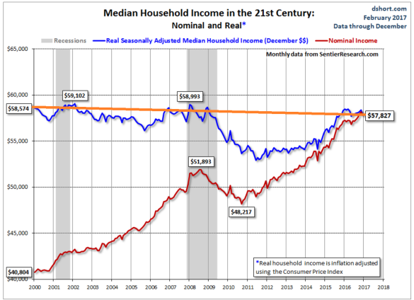
Doug Short at Advisor Perspectives had made a nice chart of Sentier’s data. He compares nominal Median Household Income with Sentier’s version of real Median Household Income.

Source: Doug Short
Note that most of the 9% gain since 2011 came between 2014 and 2015. The collapse in energy prices caused that increase. The growth rate of nominal household income didn’t change all that much. The real median income series got a one time shot in the arm from the energy price crash.
2011-2014 saw a weak recovery from the income crash that occurred during the great recession. Then came the boost from the drop in energy prices in 2014-15. Since the beginning of 2016, it has been back to business as usual–steady stagnation or erosion of household purchasing power.
Given that the energy price crash was a one shot deal, we’re not likely to see any surges in real income from falling CPI again.
That’s a pretty shocking chart, so I wanted to look at the data based on our data here at Contra Corner. I’m using the BEA data on annual median household income through 2015. For 2016 I projected nominal median income based on the BLS data for Average Weekly Earnings current through December.
I have used the Flyover CPI developed by David Stockman as the deflator. We have written at length about the Flyover CPI in past posts. The Flyover CPI differs from the official CPI in a couple of important ways. It counts actual house price inflation as opposed to the BLS’s phony construct of housing inflation called Owner’s Equivalent Rent. It also gives slightly higher weight to energy and medical costs.
We believe that the Flyover CPI is a more accurate measure of consumer price inflation than the BLS version. The Flyover CPI recognized the energy price collapse in 2014-25. But that drop was somewhat offset by the ongoing surge in housing and medical costs. Inflation did not drop as much in 2014-15 as the CPI showed.
On average, the Flyover CPI has run between 0.75% and 1.0% higher than CPI in recent years as it more accurately represents surging housing and health care cost inflation.
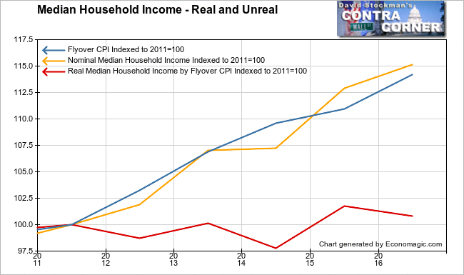
I have plotted nominal HHI and HHI deflated by the Flyover CPI since 2011. That was the year that Sentier reports that median real HHI began rising. Supposedly real HHI has gained 9% since then. However, when using a more accurate measure of CPI, the picture is just a bit different.

All 3 series are indexed to 2011 at 100. As you can see, nominal HHI has closely tracked inflation. In fact, this is almost always the case historically. There’s some fluctuation year to year, but over time, the real HHI tends to revert toward equality with consumer inflation. As for the gain that Sentier reported from 2011 to today, it didn’t happen. Real HHI is up just 1% since then.
You can see the jump in real HHI in 2014-15, caused mostly by the drop in energy prices. There was a somewhat stronger gain that year in nominal HHI, but that was only because 2013-14 was flat. The rise in nominal HHI in 2014-15 was a simple case of reversion to trend after a weak year. The big jump in real HHI in 2014-15 therefore appears to be a result of these two factors–the drop in energy costs, and a reversion to trend in the nominal HHI.
That was never going to last, but it fooled most mainstream analysts into thinking that typical households were making real economic gains. We looked at that data a few months ago and showed that that was not the case. Both our data and the latest Sentier data showed a year to year decline of about 1%.
A longer term perspective is instructive.

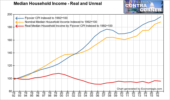
We have data on the Flyover CPI going back to 1992. As deflated by the Flyover CPI, real HHI has never recovered to the levels of the decade from 1992 to 2003. Real HHI reached its nadir in 2006 when the housing bubble topped out. Even though nominal incomes were growing rapidly from 1999 to 2007, housing inflation, medical costs, and energy inflation were increasing faster. That caused household incomes to fall from the 1999 peak to their 2006 low.
Then, as house prices fell during the Great Housing Crash, nominal incomes fell at a slower pace. That caused what appeared to be a recovery in real incomes. In fact it was just that prices fell a bit more than incomes during the recession. Nominal incomes leveled off in 2008, then fell in 2009 and 2010 just as inflation was creeping back. That locked real median income into the range where it has stalled since 2009.
Most importantly, the 9% gain that Sentier saw since 2011, didn’t happen. It only looked that way because CPI grossly under measured actual inflation. It was inputting housing inflation at 2-3% when the actual increases were as high as 13% in 2012-13, and mostly 5-6% since then. When housing costs are measured properly, as they are in the Flyover CPI, the rise in real HHI since then 2011 was actually 1%.
A society in which household purchasing power is chronically stagnant will not see much in the way of increased economic output. This is why long term GDP growth has been steadily falling for decades. As more and more middle class jobs are automated out of existence, this trend can only get worse. Most businesses will not do well with this reality. Beware of government agencies and others using the official CPI measure to hide the fact of long term real household income stagnation.
Lee Adler first reported in 2002 that Fed actions were driving US stock prices. He has tracked and reported on that relationship for his subscribers ever since. Try Lee’s groundbreaking reports on the Fed and the Monetary forces that drive market trends for 3 months risk free, with a full money back guarantee. Be in the know. Subscribe now, risk free!


