
The BLS announced last week that headline CPI increased by 0.2% in November. Core CPI (ex food and energy) also increased by a reported 0.2%. These are seasonally adjusted month to month changes. The year over year changes in Core CPI have been running above the Fed’s 2% target for about a year. Headline CPI is still below target but rising fast as energy prices rebound.

The problem is that these numbers are wholly fictional, not just because of the seasonal adjustment process, but because the do not accurately reflect the impact of price changes for the typical median income American family. And in now way, shape, or form do they represent “inflation.” That’s because they measure only consumer goods, not assets, and the BLS doesn’t even measure consumption goods and services inflation properly.
We have looked at this issue before, but to briefly review, the BLS counts housing as about 30% of total CPI and about 40% of core CPI. Those weightings seem about right, but what goes into the housing costs is a complete fiction.
Instead of using actual house selling prices, the BLS makes up a number called Owner’s Equivalent Rent (OER). That’s a silly concept that asks homeowners what they think their house should rent for. OER is also based on a CPI component called Rent of Shelter. It’s a survey of tenants asking them how much their rent has increased.
Since virtually all leases have a fixed increase clause or CPI clause, the inflation rate of this item is based on some date in the past when the lease was signed. Most people stay in their apartments for at least a few years. The changes in their lease contracts do not reflect the current market. When market rents are rising fast, contract rents will understate the true size of the increase. But when tenants move to a new place, they get clobbered with the full weight of the actual changes in the market.
Over the past few years, the rent component of CPI has been gradually rising as people move and report the impact of higher market rents. But the CPI rent factor is still held down by old leases. Therefore rents never catch up to reality. OER has in recent months lifted off from around 2.5% to 3.5% per year. But market rents have actually been rising at 4-6% over the past couple of years. OER has never been anywhere near that.
The BLS doesn’t recognize rent inflation accurately, and it doesn’t even consider actual house price changes. They eliminated that in 1982 after several years of “study.” The BLS stopped considering home prices because it reclassified homes as an “investment” rather than a consumption good.
The real reason they did that was because government contracts, salaries, and benefits, especially social security were all indexed to CPI. Rapidly rising home prices were causing CPI to soar, costing the government and taxpayers billions. So the government found a rationale to eliminate one of the biggest sources of the “inflation” problem.
While home price inflation continued to soar through the 1980s and 1990s and on, “inflation” continually fell. It did so because economists and the government conspired to simply ignore it by not counting assets at all. Instead they limited “inflation” to CPI, and narrowly defined that as a measure of consumer goods.
To illustrate, here’s a comparison of home price inflation as measured by the Federal Housing Finance Agency to the rent component of CPI (See Footnote 1).
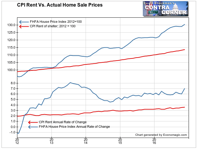
The Fed set the 2% inflation target in 2012. On this chart. both the CPI rent component and the FHFA home price index are indexed to the average level in 2012. Since then, house prices have risen by slightly more than 30%. CPI includes rent increases of only 15% over that 4 years as a substitute for actual house prices. At 40% of total CPI that shaves about 6% off the total CPI increase. Simple division tells us that that has cut the annual increase in CPI by about 1.5%. If the BLS used actual house prices instead of the phony imputed rent figures, the current inflation rate would be around 3.5%, not 2%.
David Stockman has developed a concept of CPI which attempts to more accurately reflect inflation. It is called the Flyover CPI, in reference to the impact of inflation on most middle income Americans living in the heartlands outside of New York, LA, San Francisco, and Washington DC.
The Flyover CPI gives a slightly higher weight to medical costs and energy than does the BLS’s CPI-U. That’s the measure that the media and economists focus on as representing inflation.
More importantly, the Flyover CPI includes an accurate measure of housing price inflation, as represented by the FHFA house price index. Here’s how Flyover CPI compares with CPI-U.
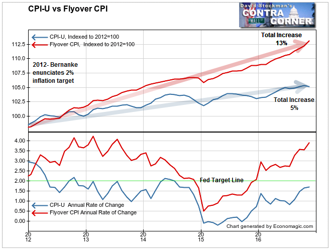
Since the Fed set its “inflation” target at 2% in 2012, headline CPI has risen by a grand total of 5%. CPI has been persistently below the Fed’s target of 2% since mid 2012. The problem got worse when oil collapsed in 2014-15, and CPI-U still hasn’t climbed back to a 2% annual increase.
Meanwhile, Flyover CPI, which accurately measures housing inflation and gives slightly greater weight to medical and energy costs, has a total increase of 13% since 2012. It has persistently been between 3% and 4.5%, and is currently at 3.9%. The only time it fell below the Fed’s target was during the energy price collapse. Unlike CPI-U, Flyover CPI never went negative.
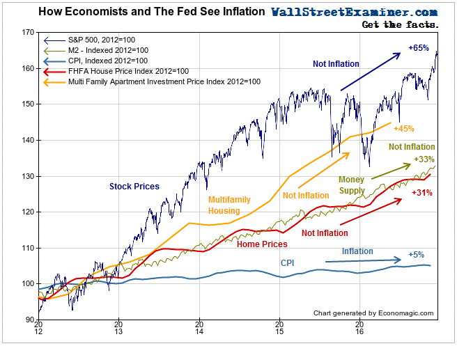
Economists and the Fed have managed to define away real inflation rates by ignoring asset prices. The chart below shows how economists view inflation. It graphs several measures, including M2 money supply. Monetarists define inflation as a monetary phenomenon. If money supply is growing faster than economic output, that’s inflation.
We see monetary inflation driven by central bank money printing clearly manifest in asset prices. Keynesians only see “inflation” as applying to consumer prices. I would suggest that asset inflation is far more dangerous than consumption goods inflation. Asset inflation leads to financial crashes. But economists today cover their eyes, repeat the mantra of “I can’t hear you,” and see no evil. It looks like this.
The recent rise in bond yields and interest rates against this backdrop seems like a compelling story that isn’t likely to go away as long as one or two of the world’s 3 big central banks are printing money. That money continually flows into the US, inflating M2. This buttresses the case for a systematic program of liquidating long term fixed income securities.
Likewise the selloff in gold seems detached from reality. Another opportunity to accumulate gold should be at hand. This is where technical analysis comes in handy. I apply technical analysis to the trend of the price of gold, and of precious metals mining stocks, in the Wall Street Examiner Pro Trader Precious Metals Update. You can follow these reports risk free for 90 days. Click here for more information or to get started.
(Footnote 1) Because the FHFA data is currently only updated through September, I have imputed the increases for October and November based on the home price inflation reported by online real estate broker Redfin. Redfin calculates the median price increase for the national market from the 42 large, active metropolitan area it serves. Prices are from closed contracts reported that month. The FHFA index typically closely follows the Redfin reported prices at a similar to slightly lower rate over the ensuing 2 months. I imputed the last 2 months prices accordingly.

