
By Tyler Durden at ZeroHedge
Sorry folks, it’s not a bull market. Not yet. The evidence I’ll outline indicates it may be too early to celebrate. I know the headlines are dominated by calls for new highs to come, a bull market in full swing ready to break out of a multi year consolidation. I’ve recently outlined the technical target should a sustained breakout indeed occur, but I’ve also outlined the structural bearish issues I see underlying the market.
Today I’m looking at the technical evidence that, so far, suggests that there is zero evidence to suggest that we are in a bull market. In fact it appears there is risk building that this is a completely broken market in its final inning. Yes we’ve had a massive rally off of the February lows, but the technical evidence is mounting that this may still be a bear market rally.
Why? Because key charts remain decisively bearish and any sizable pullback could literally kill any notion of a bull market.
Consider the actual evidence:
Since QE3 ended in October 2014 main markets in aggregate are in essence flat. Only the $NDX has shown any sizable gains, and advances have been driven by a few select mega cap stocks:

On this basis I have to ask: What bull market?
Note tech, the recent leader, may be on the verge of turning. While the latest sport is to ignore bad earnings key tech stocks are showing serious topping signs.
Let’s look at the $NDX in itself: This chart shows a potential heads and shoulders pattern of size with a broken wedge trend line to boot:

Note the declining RSI and the weakening MACD. New highs are made of this?
Perhaps the underlying individual stock patterns are bullish? Not really.
$MSFT: That recent high showed a massive negative divergence with what appears to be a rounding top and a false breakout:

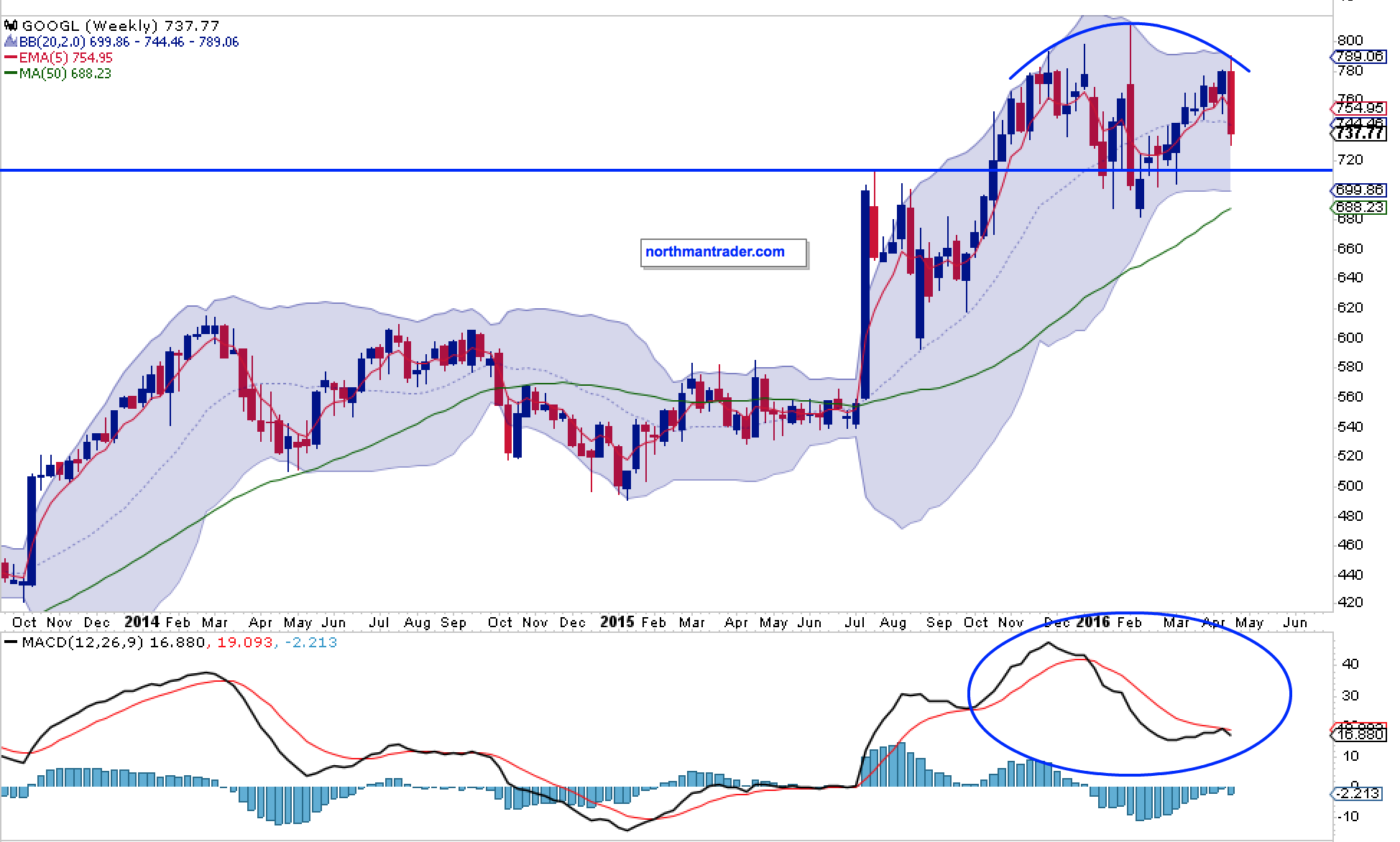
$GOOGL: A similar picture.
$NFLX: Potential heads & shoulders, with a bear flag, broken trend line and horrid MACD:

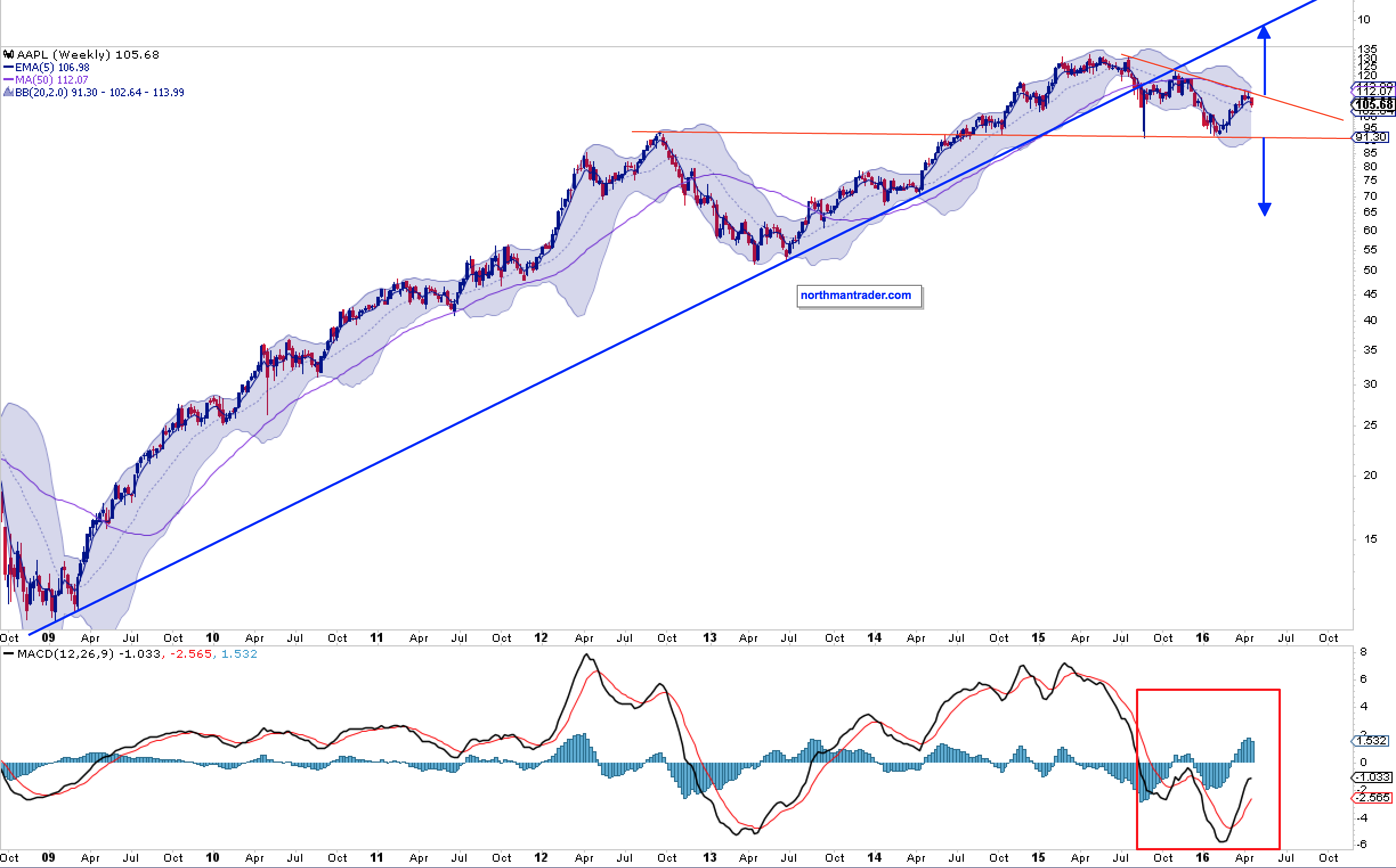
How about the flagship $AAPL? It could go either way I suppose based on the pattern below, but the trend line is also broken and the MACD is below the center line and recently we have seen lower highs. Will declining PC sales and a slowing smartphone market be the driver to new highs? Perhaps the upcoming earnings report next week will provide clarity:
In terms of mega cap leaders on the $NDX that leaves us with $AMZN and $FB.
$AMZN: The weekly Bollinger band is now flat and the MACD is showing massive relative weakness. Could it fly back up to the upper Bollinger band? Yes, but a negative divergence is then an almost certainty:

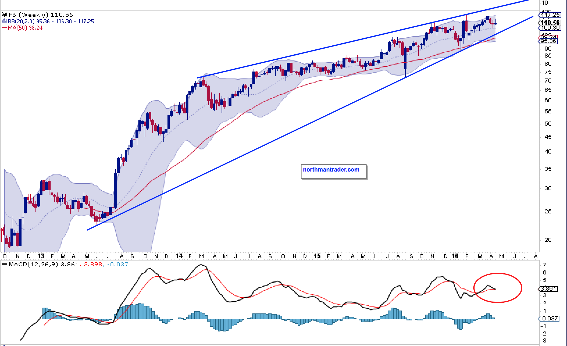
$FB, the most consistent stock out there has formed a multi-year wedge pattern and looks to be printing a MACD cross-over. New highs are possible, but the wedge pattern points to future danger:
“But this rally has been so powerful, maybe it’s just tech that sees some sector rotation?” Perhaps, but then I must ask why are some of the most important stocks in the market looking just as concerning?
Consider:
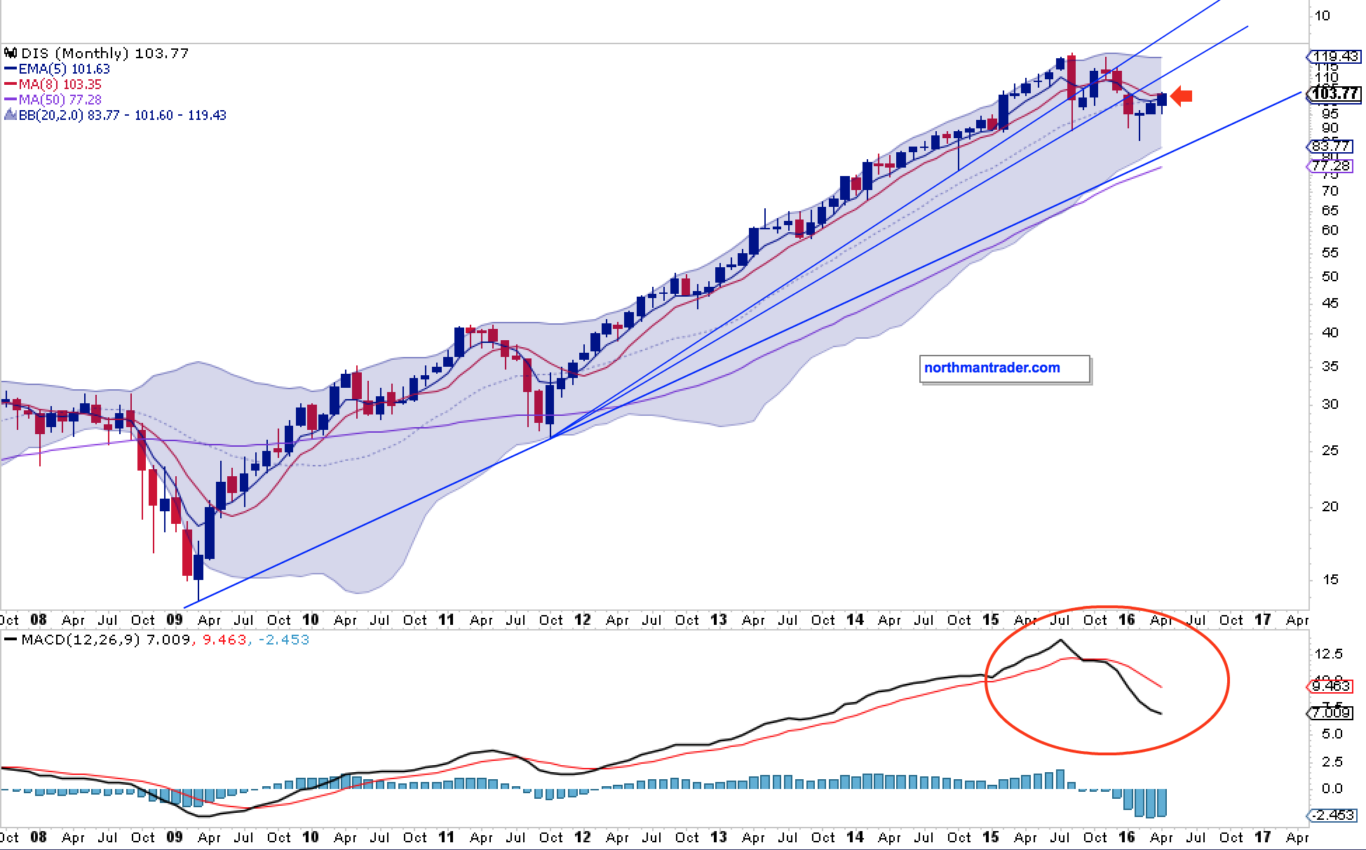
$DIS: Multiple broken trend lines, lower highs, and a negative MACD:
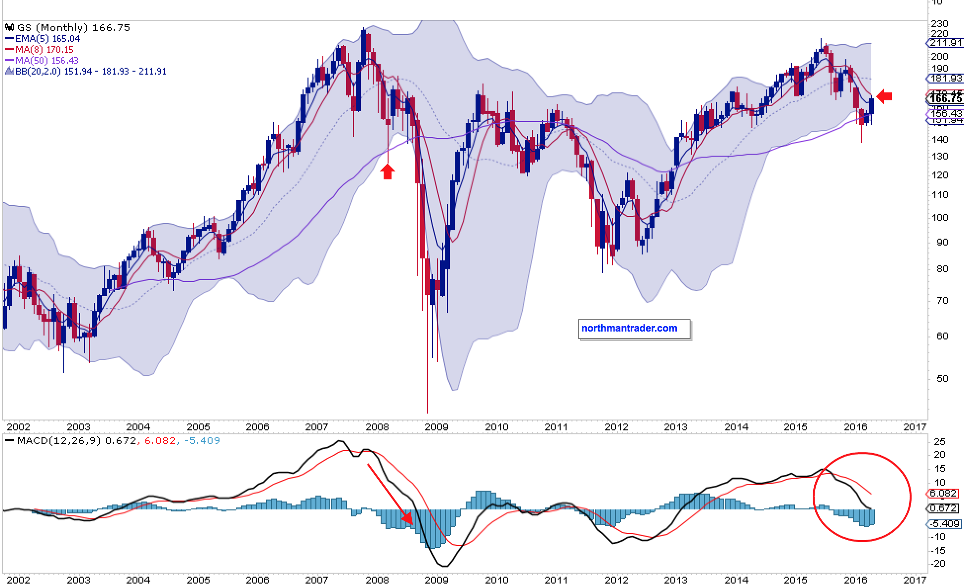
$GS: MA reconnect, and lower highs and a negative MACD:
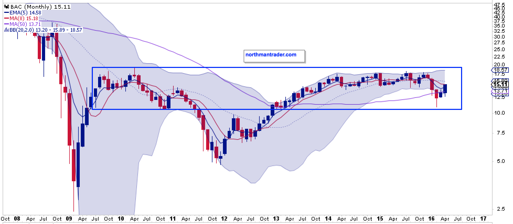
$BAC: Gone nowhere, back into range with a MA reconnect:
$V: Just printed a major negative divergence on new highs:

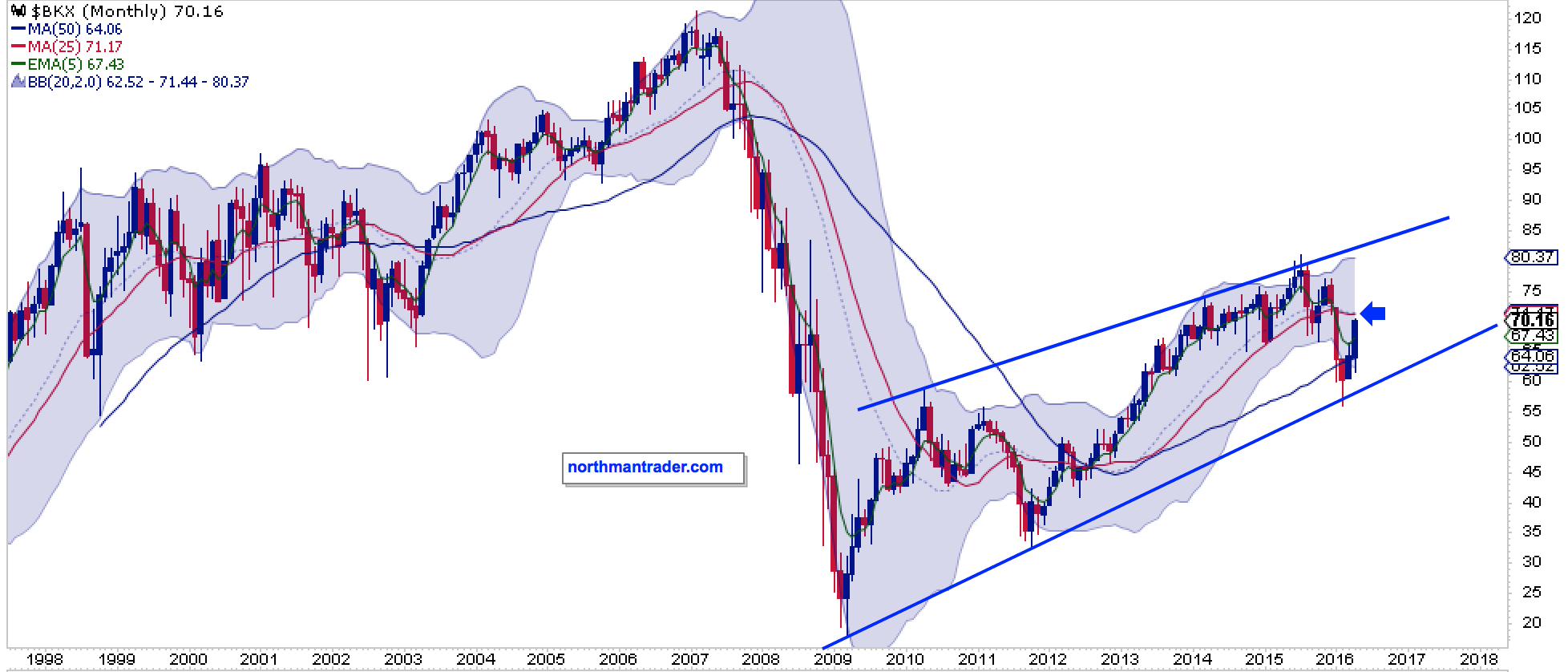
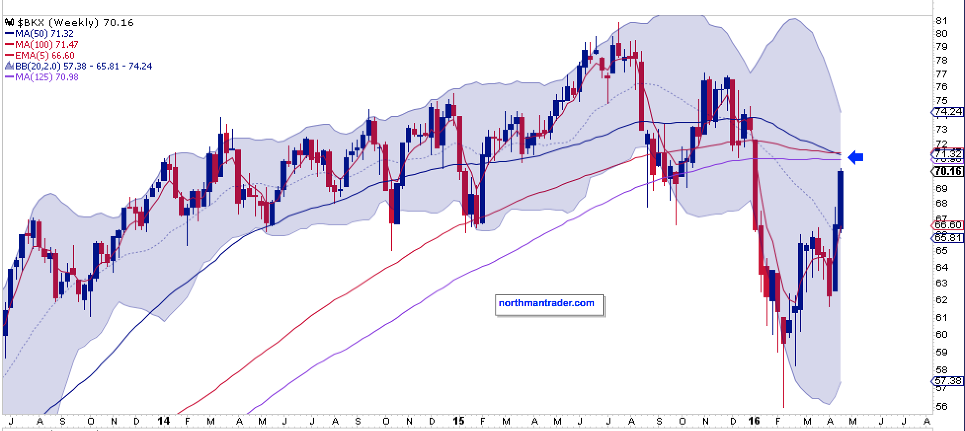
The entire banking sector looks ready to face major MA resistance: I see no new highs anywhere:
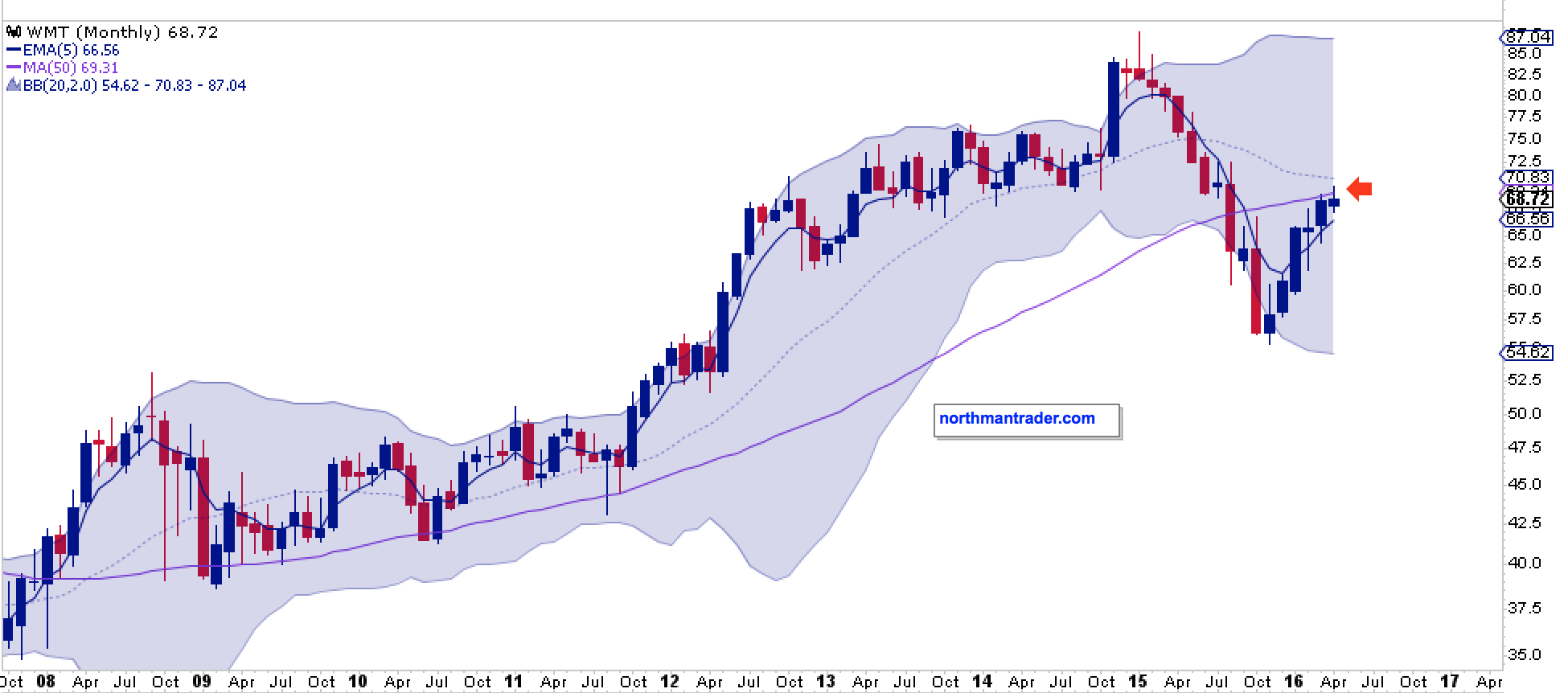
The largest retailer in the world $WMT just made its way back to reconnect with its monthly 50MA after a 6 month rally. It’s hitting major resistance with no new highs on the horizon:
$SBUX: Broken trend line and a negatively turning MACD:

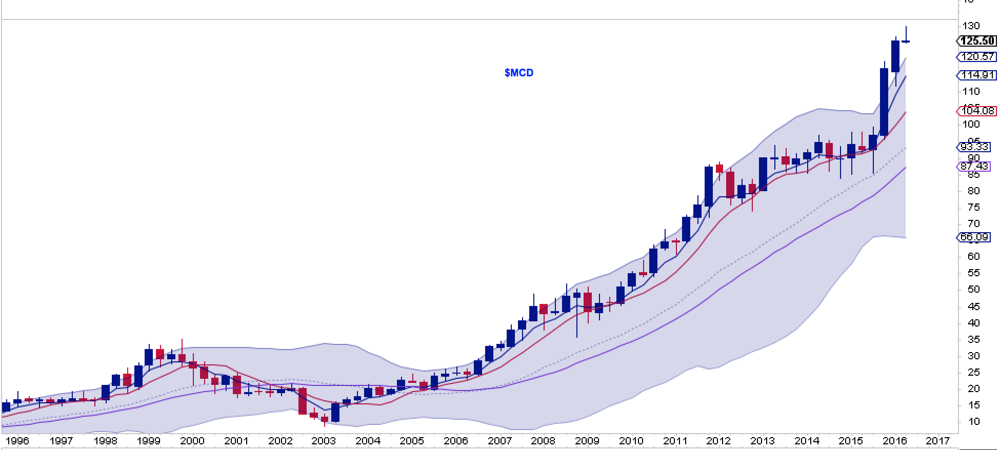
One of the biggest winner in this market has been $MCD and still we can observe a major rejection candle at the end of a major up trend basically begging for some sort of pullback and MA reconnect:
Which begs the question: What will these charts start looking like if a pullback develops?
The technicals strongly suggest at least a pullback is coming:
$NYSI is the most overbought since 2013:

The $NYHILO is close to max and is at a level that has shown pullbacks to emerge from:

$BPSPX is in process of forming a bear flag:

And the $VIX- $SPX relationship suggests volatility may be coming to a market near you.
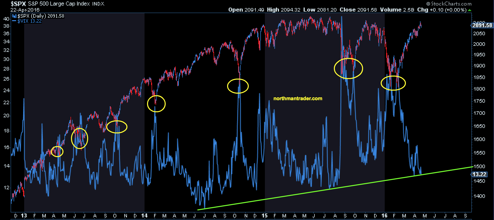
$SPX made all time highs on May 21, 2015. Ironically the bear market rally in 2008 (a 14.5% move off its March lows) not only ended on May 20, but also marked the high for that year. Sell in May does apply in some years you know.
Bottom line: From my perspective the bull case remains unproven. It may still happen or it may not. Fact is we are still in range, yet highly overbought and one can certainly make the following argument until proven otherwise:
1.The $NYSE just rallied from its lower weekly Bollinger band to its upper weekly Bollinger band and reconnected with a key pivot MA, its weekly 100MA. And it was rejected. No new highs evident:

2. Central banks have once more succeeded in re-inflating a market that looked ready to break down. In popular media narrative this is called “resilient”. One can observe when markets are “resilient” and when they are not:

Janet Yellen was busily on the phone to the BOE’s Carney and the ECB’s Mario Draghi during the February lows, this much is known according to the Fed’s own records. What was discussed remains unavailable to the public. But “whatever it takes” remains the rallying cry by central bankers world wide.
3. What have they achieved? In terms of asset inflation it remains a mixed picture. After all the global Dow Jones index remains below 2007 highs and has been making lower highs since its peak in 2015:

And mind you, that’s with 650 rate cuts, over $60 trillion in global debt expansion (counted as GDP growth) and massive central bank balance sheet expansions including the US Fed’s $4.5 trillion monstrosity.
Stocks have gone basically nowhere since QE3 ended in October 2014. However they have succeeded in getting more expensive:
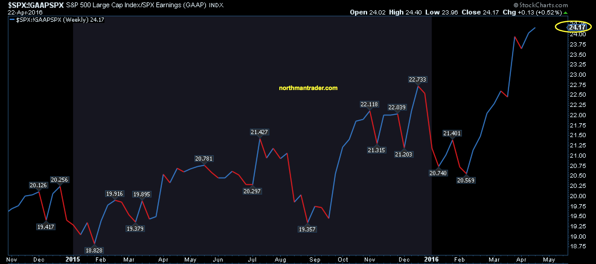
Bull market in multiple expansion.
Summary of the evidence: We have just witnessed a massive 16.6% market rally from heavily oversold conditions aided by global central bank intervention. Stocks in aggregate are in essence flat in return since QE3 ended while P/E ratios have expanded to new highs on a GAAP basis. Technical charts of major high cap stocks indicate major resistance ahead, signs of rolling over and negative divergences. Price remains in range and several key indices remain far below all time highs. Even new highs would print negative divergences which would make any initial breakout highly suspect. Participants remain highly complacent in the face of mounting evidence that all is not well in the global economy or in company earnings reports, yet market sentiment is expecting not only new highs, but also the dawning of a new bull market.
The evidence presented above suggests that the bull case remains unproven as of yet.
Source: What the Charts Say: No Bull – the Evidence – ZeroHedge

