
The Wall Street Journal claimed in its PR release on housing starts last week that single family starts rose 8.1% in September to 783,000. This is what I call the headline or top line number. It the seasonally adjusted (SA), annualized, impressionistic representation that economists and statisticians have cooked up to depict the trend. For some reason economists seem unable to analyze and understand the actual data before massaging it.
The initial number is revised in subsequent months and years as more data comes in, so that the line is fit to the center of the trend channel over time. The SA number is essentially the difference between the actual number and type of moving average that includes guesses about 5 years of future data along with past and present data.
After thereby swagging where they think the past and expected future moving average should be, they derive the monthly number based on the difference of the actual number from the idealized expected central tendency line. Then the next month, when they get their first clue how far off they were, the revise the last month. They do that again the following month. Then they do it every year for the next 5 years. When you look at a chart of long term seasonally adjusted data, any data that’s 5 years old or more is a perfect fit for the actual trend. Current data isn’t. Sometimes it isn’t even close. Economists and the mainstream media like to pretend that it is.
The media only reports the initial guess, which really is little more than a wild guess. However, it is possible to evaluate the actual data before the statisticians massage it and the mainstream dutifully issue the masseur’s report.
Actual data is a mysterious and wonderful thing. It’s mysterious because the government publishes it but no one in the mainstream financial PR mills like the Wall Street Journal and CNBC report it. It’s wonderful because, well… it’s actual. It is what really is, subject only to sampling error when the data is based on a small initial sample. In addition, it’s easy to depict and interpret. Any trader or investor with a rudimentary knowledge of charting techniques and a tool with which to draw straight lines can do it. Experienced technical analysts can take that a few step further by applying simple moving averages or growth rate indicators or simple ratios to draw clear pictures of what’s actually happening in the marketplace, day to day, week to week, and month to month.
Using those techniques, we can see an accurate picture of the trend, and most importantly get a jump on the market when trends are in the process of reversing. Reversals take time, and there is almost always some warning before the markets and the economy start sinking into the mire.
Seasonally adjusted annualized economic data invariably lags the trend change by a few months, and it takes even longer for the next trend to become clear. By then it’s usually too late for investors to do anything about it. Charting the actual data allows investors to be proactive rather than reactive.
So the headline number for this widely followed economic indicator was that single family starts rose 8.1% in September to 783,000. But the actual number of starts in September as sampled by the Census Bureau surveys was 68,000. That was up 1,300 units from August. Is there some way to get to an 8.1% annualized growth rate from that?
Sure. It’s so simple even a technical analyst can do it. We just take the current monthly change and compare to the same month in the recent past. Voila, that tells us directly how fast the number is increasing or contracting. Economists can’t figure it out the simple way because they’re too busy brilliantly manipulating the number to notice the actual data.
Over the past 10 years, the average change for September was a decline of 1,600 units. This isn’t necessarily the seasonal norm for this month because historically September swings both ways. It has been an up month as often as it has been down. It’s more of an “even keel’ month with only small changes. This month’s number isn’t materially different from the norm. Last year September had a decline of 1,4oo units.
There’s also variation due to the weather. We often make fun of that excuse but in housing in particular, bad weather or other factors can delay starts. There may also be calendar related delays. Most developers don’t start construction on a weekend. The number of business days in the month can have an impact.
While September was a slightly better than average September, August had the weakest month to month growth for any August since the housing crash. Clearly the reason for the apparent mild strength in September was a bit of catching up of business that was delayed from August by the calendar, or the weather, or whatever non-economic factor depressed August.
There is another way to judge whether the trend is stronger, weaker, or about the same. Compare the annual rate of change for the current month with preceding months. The current number looks pretty impressive at +4.6%. But it’s nowhere near 8.1% which the media reported. Furthermore, it is only mid range of the annual growth rate of the past 6 months of between +0.5% and +8.6%. It is much slower than the growth rate in the period from September 2014 until March 2016. 12 of those months had double digit growth rates. So there has definitely been some some slowing over the past 2 quarters and the current growth rate is nowhere near what the headlines said.
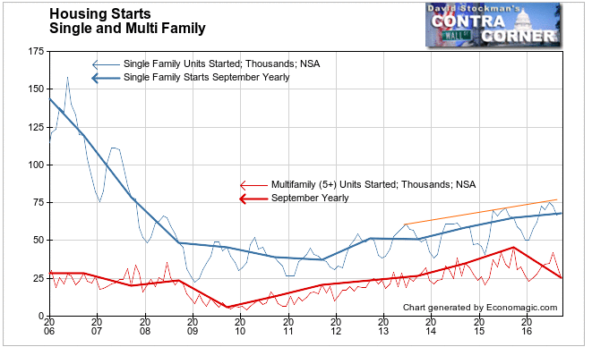
There’s a funny thing about single family starts. Surprise, surprise, they lag behind the new home sales data that is reported a week later. If the house ain’t sold, builders don’t build. This week’s new home sales release comes on Wednesday. Be on the lookout for our breakdown of that data. It will give us a better handle on this market than the number of starts.
Meanwhile, note that starts have been slowing as new house prices inflated at a slightly higher rate than during the Great Bubble. So I have no doubt that the current market is also in a price bubble. As prices inflate faster than household income, sales and starts must slow. And so they have. Likewise, in August, prices broke their uptrend, suggesting that housing inflation is topping out, if it hasn’t already.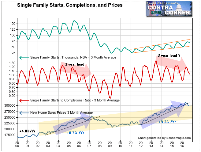
The ratio of starts to completions also suggests that the housing market is peaking. This ratio fell for 3 years before house prices topped out in the 2001-2006 bubble. In the current period this ratio has been peaking at lower levels in each cycle since 2013. Is this another case of 3 years of weakening leading to a top? We should have a clear answer soon.
It’s important to keep all this short term fine tuning in perspective. The boom bust cycles do not consider the long term structural problem in the US economy. That problem is clearly visible in the long term charts.

Single family starts are only just above the level to which starts fell in the 1981-82 Volcker recession when mortgage rates were 16%. They have not even reached the level of the bottom of the 1992 recession and they are 38% below the bottom of the 2002 recession.
They are even well below the bottom of the 1974 recession! Back then all we had was the energy crisis with sky high gas prices, gas lines, an OPEC boycott, the greatest US government scandal in history, a constitutional crisis, and a Presidential resignation, not to mention then record high 10% mortgage rates. I know all this because I was there. I was 3 years into my business career. Perspective.
Today, 7 years after the bottom of the Great Recession, after 7 years of massive money printing and zero interest rates, and 7 years of so called “recovery,” housing starts are still below the 1974 low.
As bad as that chart looks, in reality the situation is even worse considering that US population has grown by over 50% since 1974. On the basis of starts per million population the current number is still 17% below the previous record low since they began reporting housing starts 1959. That record low was set in the Volcker recession of 1981 when the Fed had pushed mortgage rates up to 16% to slow the economy enough to break the back of wage inflation and the CPI. It also had the salutary effect of helping the Federal Government bust the then all powerful and deeply corrupt labor unions.
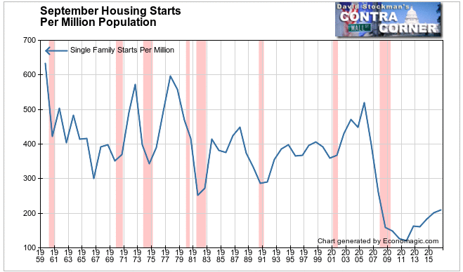
In the current era of QE and ZIRP, by stimulating housing inflation with record low mortgage rates, rather than boost the recovery, the Fed has retarded it. Housing inflation has raced so far ahead of wage and salary inflation that fewer people than ever can afford to buy. The workforce no longer has any power whatsoever to pressure wages higher fast enough to keep pace with the 5-6% house price inflation driven by ZIRP. As a result housing development has slumped to such a degree that even the doubling of activity off the 2011 low still leaves single family starts 17% below the all time record low.
The Fed has made a mess from which there is no escape. Allowing mortgage rates to rise now will only drive housing deeper into the dumpster. But not allowing rates to rise will cause even greater asset price distortion (not just houses) and greater financial system instability. Sooner or later we all must pay a terrible price. This is probably not a good time to own either houses, commercial and multifamily real estate, and stocks for the long haul. First we must go through the pain of the “Great Correction.”
Lee Adler first reported in 2002 that Fed actions were driving US stock prices. He has tracked and reported on that relationship for his subscribers ever since. Try Lee’s groundbreaking reports on the Fed and the forces that drive Macro Liquidity for 3 months risk free, with a full money back guarantee.

