The Census Bureau’s monthly update on new US home sales for May had lots of interesting data buried between the lines. I’ll touch on a few things here, with more to come in a subsequent post.
First, while prices rose only 1% year over year, they are now up nearly 31% since the 2011 lows and by nearly 22% since the 2007 peak. And this isn’t a bubble?
Click here to view chart if reading in email.
Then there’s the business from economists and the media blaring about the “recovery” in the housing industry. Indeed sales are up a massive 122% since the May 2010 bottom! But the reports lack perspective. The bubble peak was in 2005, already 11 years ago, and sales are down 57.5% since then, and even down 35% since 2007, when the collapse was already under way for 18 months.
The May 2007 benchmark is important because that’s when employers finally stopped hiring full time employees. So don’t get too excited about the ultra low, all time, million-year record first-time jobless claims that the media is all hot and sweaty about. Employers are always the last to get the news. That’s because they take their cues from the stock market. Unfortunately for employers, investors are always the second to last to get the news. The thing about the markets knowing more than everybody else–discounting the future–it’s hogwash. The market doesn’t “know” anything. The market doesn’t have a mind. It can’t possibly discount the future accurately. It’s a liquidity meter. That’s all. And employers know even less about the economy than the market does.
So here we are with stock prices surging, until tonight when BREXIT surprised everybody, the markets, the betting lines, the surveys, hell even its supporters. And even more clueless employers are still adding jobs. Maybe the Brexit will be the catalyst that finally gets them to find their mentality, wake, up, wake up to reality.
Click here to view chart if reading in email.
But what’s this? New home sales aren’t keeping up. Supposedly jobs growth translates into home purchases. But even though lots of full time jobs have been added since the 2007 jobs peak, they don’t pay enough to allow workers to buy new homes. How do you call your neighbor’s kid who just got his Phd? Just text Uber and he’ll be right over. Or when you see him at the restaurant, yell “Waiter!” These are the jobs this screwed up, QE’d, ZIRPIAN economy is mostly producing.
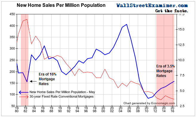
A good way to visualize just how historically bad the housing industry is doing is to normalize for population growth, dividing sales by population.
Click here to view chart if reading in email.
Sales per million people have risen by 87% since the 2010 bottom. Is that a lot? Not when you consider that the current sales rate is only 39% of the 2005 level, and that it is no better than at the 1982 bottom when mortgage rates were at 16%. Think about that. Mortgage rates are at their lowest level since the beginning of the Hebrew calendar 5,776 years ago, and current new home sales are no better than they were at the bottom of the Volcker credit crunch in 1982. Hey, I was working on The Street back then. I remember well what it was like. That was not a good time to be in the housing business. And today is just as bad.
I hate to think what might happen when rates start to rise. Apparently the Fed feels the same way. People who think the Fed will ever be able to normalize its balance sheet are deluded. The Fed, and the rest of the world’s big central banks, have backed themselves into a corner with monetary policy that has only gotten more and more insane. As more and more investors and traders come to that realization, the housing market and the stock market face yet another collapse, this time with no discernible way out via magic monetary tricks. The next time, nature must run its course.
The post Here’s How Bad US New Home Sales Are was originally published at The Wall Street Examiner. Follow the money!


