In all honesty, I could start almost any piece I write with the phrase “economists are stumped.” It has become something of a baseline where there is some element or condition of the global economy that doesn’t make sense to them. The latest update in JOLTS for July continues to be faithful to the seeming contradiction. By view of the Job Openings portion of the report, the labor market is beyond robust, hitting a new record high and perhaps suggesting the economy is not damaged by the “rising dollar.” The pace of hiring activity, however, leaves a much different impression.
One of the labor market’s biggest mysteries just got deeper: The number of job openings available at the end of July climbed to a new record of 5.9 million. Yet the number of people actually being hired into one of those jobs was 5.2 million for the second month in a row.
The number of unemployed workers per job opening has fallen to 1.3, the lowest since 2001. What would normally sound like good news—abundant jobs—is tempered by the fact that people simply aren’t being hired into the positions at rates like in the past. About 300,000 fewer people are being hired each month compared with the pace reached in February. And during the entire economic recovery, the U.S. has yet to notch a month of hiring that matches the pace seen at the heights of the middle of last decade or the early 2000s. [emphasis added]
Job openings suggest the “best jobs market in decades”, while hiring leaves quite a bit to be desired. That is especially true given the timing of these two series’ departure – 2014.
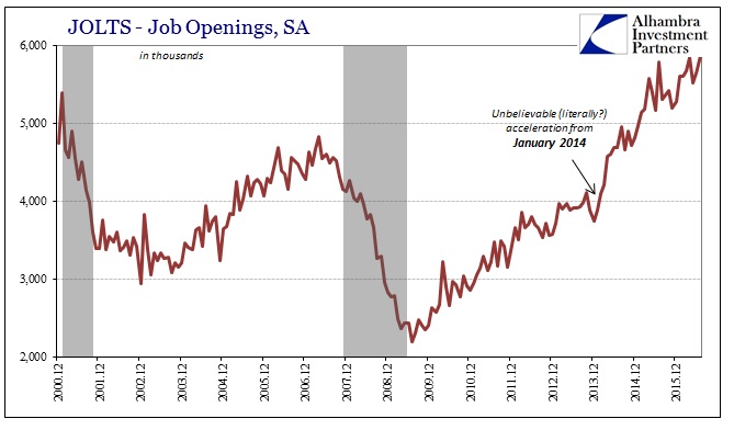

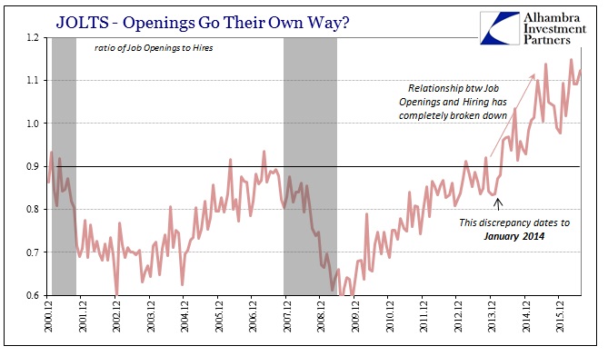
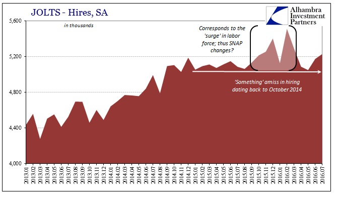
The calculated statistical estimate for job openings surged in early 2014 and has rarely paused beyond normal monthly variation. The statistical count of hiring hit a wall around October 2014 and has been mostly sideways apart from unusual activity last autumn and winter (more on that below). This divergence has left an almost complete breakdown in the relationship into which economists surmise (of course) that the economy must be robust, therefore job openings are “correct” meaning that businesses want to hire they just can’t find enough qualified people.
That was, in fact, one of Janet Yellen’s contentions when she testified to Congress back in June – even after the “terrible” May jobs report that was released just a few weeks prior to her appearance on Capitol Hill.
Obviously our job at the Fed is to make sure we have a strong job market that there are enough jobs that are being created…looking at training programs and educational opportunities, I think that’s a piece of the puzzle as well.
She cited a “mismatch” between the robust jobs supposedly available and the skills possessed by the potential supply of labor. That might be the case, though the explanation for the mystery is likely much simpler. Even by count of the Establishment Survey, the labor market has been slowing (how much and from what starting point are still debatable). That slowing started around the end of 2014.
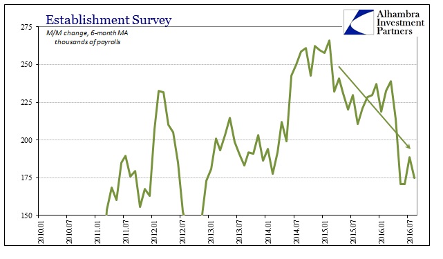
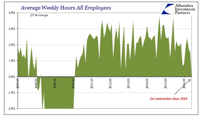
This reduction isn’t just apparent in the Establishment Survey but almost all facets of the labor data including the Federal Reserve’s holistic alternate, the LMCI.
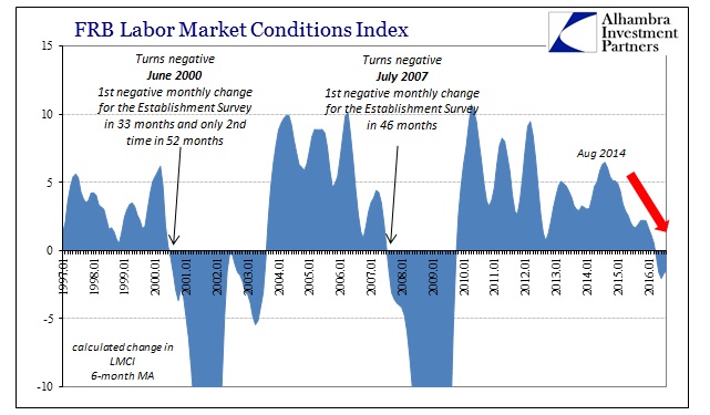
Given that there is far more corroboration for slowing labor utilization, and thus hiring, from within the BLS and Federal Reserve data it is therefore more likely that the true state of labor is reflected in that curious “plateau” of hires rather than the continued surge in job openings. Further, comparing job openings to the labor force as in the Beveridge Curve suggests statistical aberration as a reason for the discrepancy. The Beveridge Curve was developed to suggest a common sense correlation between job openings (demand for labor) and the willingness of the unemployed to join the labor market (supply of labor).
When viewed from the perspective of the unemployment rate, the level of job openings on this upward trajectory seems to make sense.
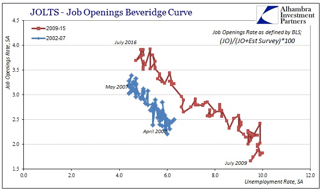
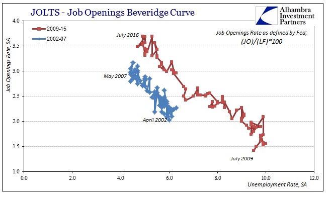
The downward sloping relationship suggests there is and has been a good and expected inverse relationship between the Job Openings series and the calculated, official unemployment rate. Given the participation problem, however, that immediately calls into question what it is that the Job Openings series has been measuring. In other words, because the actual labor force has been severely pared back by the Great Recession and then the official definitions about who should be counted within it, reflecting a more consistent (historically) labor participation rate shows in the alternate Beveridge Curve that Job Openings do not relate to overall labor supply much at all.
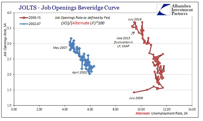
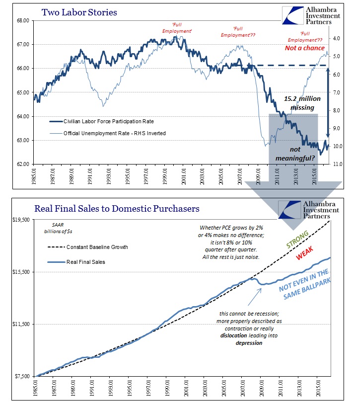
Economists continue to contend that the participation problem doesn’t matter, or that it relates to Baby Boomers somehow picking the depths of the Great Recession as the perfect time to retire, but in common sense terms it is utterly clear that the shrunken labor force does reflect the shrunken economy (and vice versa) and thus matters far more than the weak excuses that attempt to dismiss it. This would suggest, strongly, that the alternate Beveridge Curve is much closer to “reality.”
All that simply means there are far more questions about Job Openings than Hires; the latter being far more consistent (if still likely overstated) especially about the past eighteen months or two years of this “rising dollar.” The only inconsistency, if it may be termed as such, is the temporary jump in hires starting last fall.
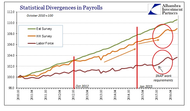
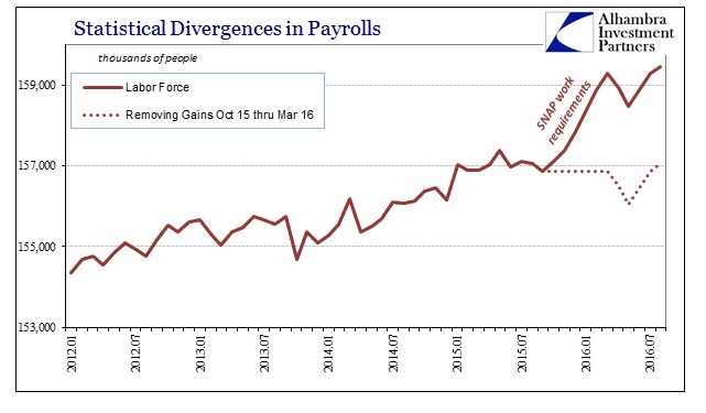
That, too, is relatively easy to explain given the coincident timing in the Household Survey and Labor Force estimates coincident to the changes in work requirements to remain eligible for SNAP. Since the JOLTS series are tied back to the CES, we would expect to find some kind of related move. As the chart immediately above shows, removing the questionable surge in labor numbers from October 2015 to March 2016 (which coincides exactly with the window of changing work requirements) matches the overall trend in hires when doing the same. It is largely sideways from late 2014 to now, suggesting that despite the purported ongoing surge in job openings, apart from welfare changes the American pool of potential labor is unmoved and unimpressed – once more arguing for the alternate Beveridge Curve rather than the one that follows the dubious unemployment rate.
It is far more likely, in my view, that Hires reflect the real slowing that we see throughout the economy, a deceleration related to the further damage inflicted by the “rising dollar” that remains ongoing. Hires also all into question the idea of the “best jobs market in decades” both as a matter of its peak comparison to even the middle 2000’s but more so this lack of further acceleration. Janet Yellen will undoubtedly continue to refer and depend upon Job Openings, but that is quite likely just another statistical phantom that further explains why she can’t explain both “unexpected” weakness and why it has proved far more than “transitory.”


