The most important chart you may ever see on the current US market is one derived from data on the European banking system. Why would a chart of European banking data have anything to do with the US markets? Because in this interconnected world, “liquidity anywhere is liquidity everywhere.” And some of that liquidity flows to and through Wall Street sooner or later because US securities markets are still considered the safest and most important in the world, particularly the market for US Treasury notes and bonds.
Liquidity, by the way, is just Wall Street’s fancy word for “money” or “cash.”
Stock and bond prices are determined by the supply of and demand for those securities. Demand is driven by the amount of cash in the pockets of investors, traders, and most importantly, dealers. You’ve heard the expression that “the cash is burning a hole in their pocket.” That’s epitomized by the excess cash in the accounts of the dealers and the banks. It’s burning a hole in their pockets. They’re using it to buy stocks and bonds. That drives stock prices, and particularly bond prices, to levels that are completely insane.
The supply of securities is determined by governments and companies. Corporations may issue or buy back stocks or debt securities. The biggest supplier of securities, by far, is the US Government. Week in and week out Uncle Sam is there issuing billions in debt securities to pay its bills and absorb that excess cash that the Fed and other central banks have created, and continue to create.
Prices are set at the margin. In other words, if there are just a few more players with a little more cash in the bid side queue than there are sellers and suppliers in line on the sell side, prices rise. If more sellers than buyers are in the queues, prices fall.
Economic fundamentals influence the ability of buyers to buy, the need of sellers to liquidate, and the need for governments to sell debt to raise cash, thereby adding to supply. Economic data helps us to understand the context of the markets. Today the difference between the economic trends and securities prices helps us to understand just how insane the current environment is.
However, if we truly want to understand securities prices, we need to put economic fundamentals aside for a moment. Let’s focus instead on the size of the worldwide liquidity pool and the direction of flows within that pool. By doing so, we can make some sense of the markets and how they got to these insane levels.
I began reading and drawing stock charts regularly in about 1968. By the early 1980s I had learned to look for correlations between monetary data and securities price behavior. Those correlation charts help us to understand where securities prices have been, why they are where they are now, and where they’re probably headed.
Once I construct the charts, I follow them regularly to see if they stand the test of time. As the pundits are fond of saying, “Correlation does not prove causation.” It may not, but correlation can certainly imply causation. If there’s clear logic for a causal relationship, and years of evidence to support it, then correlation may well prove causation. Proof isn’t necessary however. The correlation alone is usually instructive.
Which brings us to a chart of European bank deposits. Remember that “liquidity anywhere is liquidity everywhere” in today’s world. The same big banks act as Primary Dealers in both the US, Europe, and Japan. There are 13 of them. They are mostly names that you would instantly recognize, like Goldman Sachs, JP Morgan, and Deutsche Bank.
Europe has the biggest combined banking system with about €17 trillion in deposits. The US is next with around $11.3 trillion. Japan has the equivalent of about $7 trillion USD in deposits. China’s banking system is opaque. One source suggests that M1, which is mostly short term deposits, is around $7 trillion in USD equivalent. However, much of that money is captive and cannot leave the country.
The European banking system is the elephant in the room.
Let’s look at the European Central Bank (ECB) balance sheet first. It is the head and trunk of the elephant. It can spew liquidity from its trunk, or it can suck it in. For the past couple years it has been making loud noises to warn that it will spew “whatever it takes” to raise the water level, lift all the boats, and make the fish harvest a great one.
Economics, particularly as practiced by the high priests of central banking is, after all, a biblical pursuit. It grew out of myth and allegory, cults of personality that grew into great religions. So the elephant spewed and the lake rose; for awhile anyway. And the markets saw that it was good, even though most boats sank, and many fish got sick from cash pollution. Now the fish are dying and even more boats are sinking.
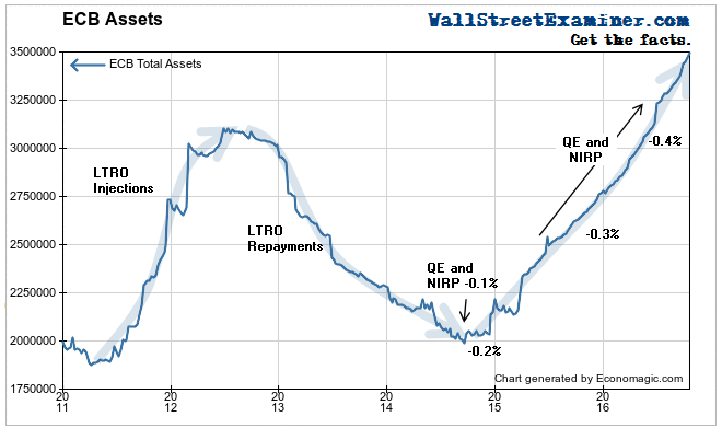
The ECB’s balance sheet has been tossed by giant waves of liquidity opposing a sea of troubles, particularly since 2011. In 2011, attempting to spur recovery and stabilize the storm tossed banking system, the ECB initiated the LTRO program (Long Term Refinancing Operations). These were voluntary 3 year loans which the ECB required the banks to hold for at least a year. The ECB “strongly encouraged” all banks to take the money, even if they didn’t need the loans. After a year, the banks that could, began to aggressively repay the loans. That continued throughout the next 2 years. At that point the ECB introduced its QE program of outright purchases, the pace of which it increased in mid 2016.

This chart shows the effect of these and later programs on the ECB balance sheet. On the surface some of those programs appeared to work. The LTRO program clearly did not work because the banks repaid the loans as fast as they could. They didn’t need the extra liquidity so much as they needed more capital, and these programs haven’t filled that need. If anything they encouraged even more dangerous speculation particularly in light of Draghi’s foaming at the mouth rant to do “whatever it takes,” to backstop the European banks’ wild speculation. It’s the Draghi put.
When LTRO didn’t work, Draghi went to outright QE in 2014, the purchase of securities from the banks, thereby providing them with cash. However he added a new wrinkle, a negative deposit rate on the banks for the cash they held at the ECB. This year he doubled down when the program wasn’t having the desired effect on the European economy or the European banking system, where the crisis has only intensified. The ECB’s balance sheet has soared as a result.
What this chart does not show is the effect of these programs on the European banking system in crisis, and the direct impact that has on US markets. We’ll get to that, including the most interesting chart in the world, in Part 2 of this report.


