That the economy grew at a “faster than expected” annual rate of 3.5% in the third quarter has been touted as a sign that now – finally, after years of false promises – it is reaching that ever elusive “escape velocity.” But instantly, people with keen eyes began to quibble with it.
One big factor was military spending, which spiked 16%, the fasted since Q2 2009. This rate is based on the increase from the second quarter that is then annualized, assuming that spending wound continue at this rate for a year. This type of quarter-to-quarter annualized rate is volatile. For example, it plunged 20% in Q4 2012, jumped 17% in Q2 2009, and 18% in Q3 2008. Spikes and plunges often run in sequence (chart).
In reality…. According to data from the US Treasury, the Department of Defense spent $149 billion in Q3, which was actually down a smidgen from the $150 billion it spent in Q3 2013. This lets out a lot of hot air. That spike was likely a fluke, much like other spikes and plunges before it, and much of it may well be undone in Q4.
The other two big factors in that “faster than expected” growth of GDP were inventories, which ballooned and will eventually have to be whittled back down, and exports.
The surges in these three categories caused JPMorgan to cut its Q4 GDP growth forecast to 2.5% from 3.0%. “All three of these categories tend to be associated with payback the following quarter,” explained chief US economist Michael Feroli. And the crux of the economy, the consumer? “Still plodding along in a steady, but unspectacular, manner….”
Whether or not that annualized quarterly rate of 3.5% was a mirage – year over year, the economy grew by just 2.3%.
A growth rate barely above 2% is exactly where the US economy has been for the last five years! Nothing has changed. For a recovery by US standards, it’s a very crummy growth rate, and far from the escape velocity that Wall Street hype artists have predicted for years in their justification for the ceaselessly skyrocketing stock market.
But it gets worse. The population in the US has been growing too. And the economic pie has to be divvied up among more people. So the pie has to grow faster than the population or else, on an individual basis, that growing overall economy, gets cut into smaller slices of the pie.
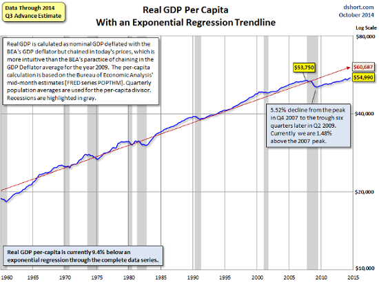
GDP adjusted for inflation as well as population growth produces real per-capita GDP. It is the sort of economic growth that people actually experience. Doug Short at Advisor Perspectives has been tracking this measure for years (here is his update and methodology). And it paints a gloomier picture.
Before the financial crisis, real per-capita GDP peaked in Q4 2007. Then it fell 5.5% to bottom out in Q2 2009. Since then, it has been working its way back up. In 2013, it surpassed its pre-crisis peak. Now, it is up a measly 2.3% from where it was nearly seven years ago! And it remains far below the long-term trend (red line):
On this per-capita basis, the economy grew only 1.7% from Q3 last year. That’s less than half the annualized quarterly rate that has been bandied about all day.
It doesn’t even include the fact that the fruits of this economy have been very unequally distributed over those seven years, with the gains concentrated at the very tippy-top of the heap of humanity that makes up America. For the rest, this economy has been a tough slog.
And then, of course, it gets even worse.
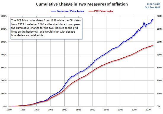
The deflator used in the GDP calculations to come up with an inflation-adjusted growth rate is the Personal Consumption Expenditure (PCE) index. But inflation as measured by PCE is usually lower than inflation as measured by CPI. The only time since the financial crisis when PCE was higher than CPI was in 2010. In the latest reading, core PCE (without food and energy) was 1.47%, while core CPI came in at 1.73%.
The difference each month may not be huge, but it’s cumulative, and over the years, it adds up. This chart by Doug Short (here is his latest update) shows the diverging paths of PCE (blue line) and CPI (red line) – and the game that those who’re using PCE are playing with us:
Since PCE is used to adjust GDP for inflation, “real” economic growth has been systematically overstated. If GDP had been deflated over the years with CPI, instead of PCE, that measly 2.3% growth of per-capita GDP since 2007, as crummy as it may appear, would likely be negative. And that explains why so many people – struggling with soaring rents, medical expenses, college costs, etc. – find that their slice of the economic pie has been shrinking since the financial crisis.
And this is the economy that has been stimulated since 2008 by the Fed’s relentless zero-interest-rate policy and $3.5 trillion in printed money, on top of an additional $8.8 trillion in federal government debt. More “stimulus” can hardly be imagined. It makes otherwise sane people walk off in an uncertain direction, muttering to themselves and shaking their heads uncontrollably.
So, right in line, the essential ingredient in a thriving housing market is skidding inexorably in America. Read… The American Dream Going Bust – in One Chart


