One of the most important indicators that can help you understand the market is the total value of bank trading accounts. The Fed tracks and reports this weekly. I have been charting and reporting it for years. At times this measure appears to give advance warning of trend changes in stocks and bonds.
The Fed calls this measure Trading Assets on its weekly H8 statement of the consolidated assets and liabilities of all commercial banks. The Fed explains that it excludes fixed income securities held for trading purposes, such as Treasuries, Agencies, and corporate bonds. It does include the fair value of derivative contracts, interest rate, foreign exchange rate, other commodity and equity contracts, which I read to mean futures, options, and swaps.
Now wouldn’t it seem useful to know just how the nation’s commercial banks are doing in these trading accounts? I thought so too, so I began running a chart of a predecessor line item around a dozen years ago. The Fed changed the definitions of certain line items in the H8 in July 2009. Continuous data is available since then. It has indeed told an interesting story. Banks don’t exactly seem to be Karnak when it comes to seeing the future, but they do move with the trends.
By itself, the graph doesn’t tell us much. A 7 week moving average smooths out the usual weekly squiggles nicely and imposes only a slight lag. From 2010 to 2013 the value of these accounts typically swung from $250 billion to $335 billion. The graph broke down from there in 2013.
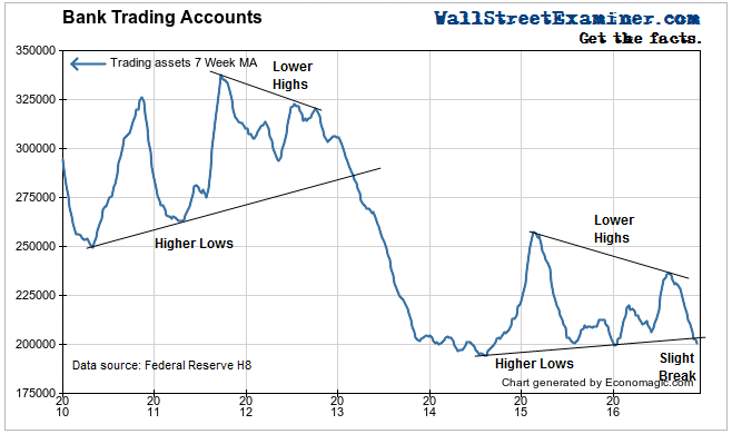
A pattern of converging highs and lows since 2015 looks similar to one that occurred in 2011-2012. In recent weeks the 7 week MA has just dropped slightly below the trend of rising bottoms, just like it did early in 2013. It raises the question of whether this could be the beginning of a big breakdown like that. Furthermore, does that mean anything? In technical analysis of price charts, when triangle patterns break down, they often signal big moves to the downside.
I wish that I could tell you that right now this graph is sending an unequivocal signal, but at the moment there are two possible messages. While this drop below the trendline may be a kind of sell signal, at the same time, the level is around the area where the last 2 downswings bottomed over the last 2 years. This requires some sorting out.
One of the things that we should keep in mind is that the increases and decreases in trading assets may have several causes. Accounting rules require that bank trading accounts be marked to market, unlike investment accounts which are carried at cost. Investment accounts hold securities for the long haul. Trading accounts are short term holdings with the purpose of buying and selling for trading profits.
We can infer that these are mostly bullish bets. Bearish bets such as shorting futures contracts would be held in different accounts, which the Fed designates as Trading Liabilities.Trading profits would cause the line to rise. Purchases of instruments would also cause a rise. Likewise sale of the instruments in the accounts which are not immediately replaced by ensuing purchases would cause a decline as would losses.
To learn what the data may be implying, we need to use correlation charts, plotting the graph along with a dependent variable. Since I’m interested in both stock prices and bond yields, I normally run a 3 line chart, but for the sake of clarity, I’ll show them separately. That way we can see if we can ferret out anything important from the correlations or lack thereof.
I’ll start with the Treasury market. First I have zoomed in on the past 3 years, comparing the graph of the value of trading accounts to 10 year Treasury yield. Yield is plotted on an inverse scale, a proxy for a price graph. The correlation is striking.
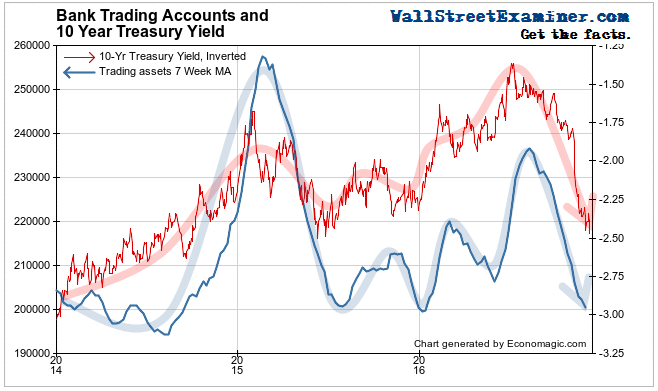
The two lines move in tandem. It tells us that the banks are trading mostly yield related derivatives. The trading accounts appear to lag by a month or two, but that’s mainly because the 7 week moving average has a built in lag of 3 1/2 weeks. When the actual weekly figure is plotted, it tends to move closely with bond yields. The weekly data is posted 9 days after the end of the weekly statement period. Crossovers of the 7 week moving average have often been timely intermediate term trading signals.
Apparently, rather than making the market, the prop trading desks appear to be trend followers. Their accounts increase when the market is rising in price (yields falling). They decrease when prices are falling (yields rising). Whether this is a result of taking trading profits and losses, or simply buying on the way up and selling on the way down, can’t be known. Let’s just say that it’s a good thing that trading isn’t their only profit center.
This trend following is not something new. Looking back to 2010, we see the banks repeatedly responding concurrently with prices, with one exception. That was 2012-13, when the banks seemed to get the jump on the market. But was it because the banks were selling, or because they were taking big losses? Again, the chart can’t tell us that.
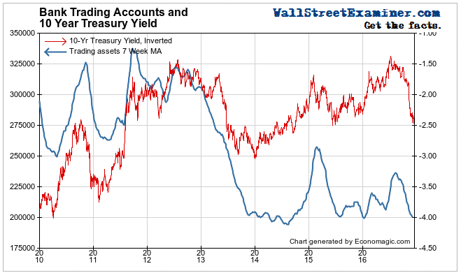
Perhaps it was because the banks were shedding most of their proprietary trading operations in preparation for the looming Dodd Frank proprietary trading restrictions. The imposition of those restrictions have been delayed time and again. Goldman’s lobbyists and moles inside the Treasury Department have probably been successful in delaying them into oblivion.
The chart does tell us that bank traders are trend followers, not trend leaders. In the latest downturn in bond prices (upturn in yields) they followed the market, bringing their trading accounts right back to where they were in January. If they had trading profits on the way up in the first half of the year, they probably gave up most of it on the way down. Furthermore, when they should have been in the pits making and balancing markets, their selling helped to drive the trend.
They may be gamers with quick reflexes, but trading geniuses they’re not. At least not most of them.
So how is this useful to us? If we stretch the moving average to 13 weeks, and plot the actual week to week levels along with it, the chart gives us some useful signals for trading bonds (and some not so useful).
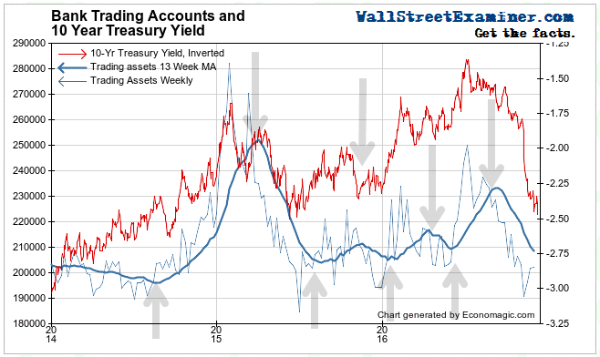
The level of these accounts is now around the line where they have bottomed twice before in the past 3 years. Both of those times were pretty good junctures for bond purchases. The next time the weekly line crosses the 13 week moving average to the upside should be a good opportunity to buy.
By the same token, this could be the most important inflection point of all time for the bond market. If the line drops below $185-190 billion and the 1o year yield moves above 2.5%, it could be signaling another crash. This time it would be a signal that the long secular bull market in bonds was finished for good.
If that trigger is pulled, it would be a good time to step aside and dodge the bullet. Short term T-bills would start looking a lot better. And you could brag to all your friends crying in their bear about the losses they’re suffering on their bonds, that you did, in fact dodge the bullet. Because you saw it coming, thanks to this chart!
I’ll show you how the chart of this data might be useful for trading stocks in a future post.
This report is derived from Lee Adler’s Wall Street Examiner Pro Trader Monthly Macro Liquidity Report.
Lee first reported in 2002 that Fed actions were driving US stock prices. He has tracked and reported on that relationship for his subscribers ever since. Try Lee’s groundbreaking reports on the Fed and the Monetary forces that drive market trends for 3 months risk free, with a full money back guarantee. Be in the know. Subscribe now, risk free!


