
A dangerous condition continues to develop in the housing market. Data suggests that underwriting standards are collapsing in an effort to rush sales into the books before the bubble pops.
The NAR reported the misnamed Pending Home Sales Index (PHSI) for March on Wednesday. It’s misnamed because it is the actual number of sales shown by contracts entered into the MLS records in the month of March. The data includes major metros and regions representing a broad cross section of the US.
Buyers, sellers, and agents all consider a contract to be a sale. A sold sign goes up on the property. Typically 95% of all contracts go to closing. The use of the term “pending” suggests a high degree of uncertainty, when the meeting of the minds between buyer and seller in the form of a contract, is in fact a sale. It is the market at that time.
The NAR also reports “Existing Home Sales” (EHS). Those are the actual closings, the settlement of the deal when the money and keys change hands. The closing is really a mere formality. Sales are typically settled 30-90 days from the date of the contract. So the NAR’s “existing home sales” report actually represents the market in the past, usually 3-4 months ago by the time they are reported.
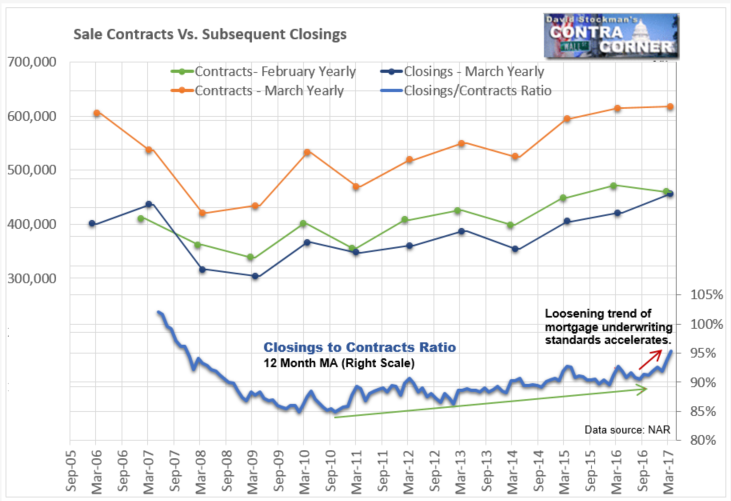
While the EHS report is essentially useless given that we have more current data, the ratio of closings (EHS) to sales (PHS) is a useful indicator of market conditions.
The NAR reported that the PHS declined 0.8 percent in March from February. They said that despite last month’s decrease, the index is 0.8 percent above a year ago. These are seasonally adjusted numbers (SA). Given that the edge is so narrow in the SA data it’s impossible to know how the month actually performed from that data alone. Instead, we rely on the not seasonally adjusted (NSA), that is, actual data.
As we see so often in the SA data, it data was misleading. March was not a weak month.
The actual data showed a month to month gain of 34.2% in March. March always has a big jump from February. To judge whether that was a strong or weak performance I looked at the March change for the prior 10 years. On that score, the average increase for March was +30.8%. March 2016 was only up 30.4%. March 2017 had a bigger sales increase than the both last year and the 10 year average. In fact, it was the strongest March increase since the sales rebound began in 2011.
Year to year, sales did not rise by 0.8% as the NAR reported. They rose by 0.5%. The NAR makes the common but inexcusable mistake of comparing seasonally adjusted data for the same month, when there is no seasonal variation in comparing the same month each year. Comparing one seasonally finagled number to another virtually always results in an error. Sometimes those errors are small, but other times they can be quite large, and misleading.
The graph looks like this. The number of sales contracts is in lower half of the chart. Total inventory is above.
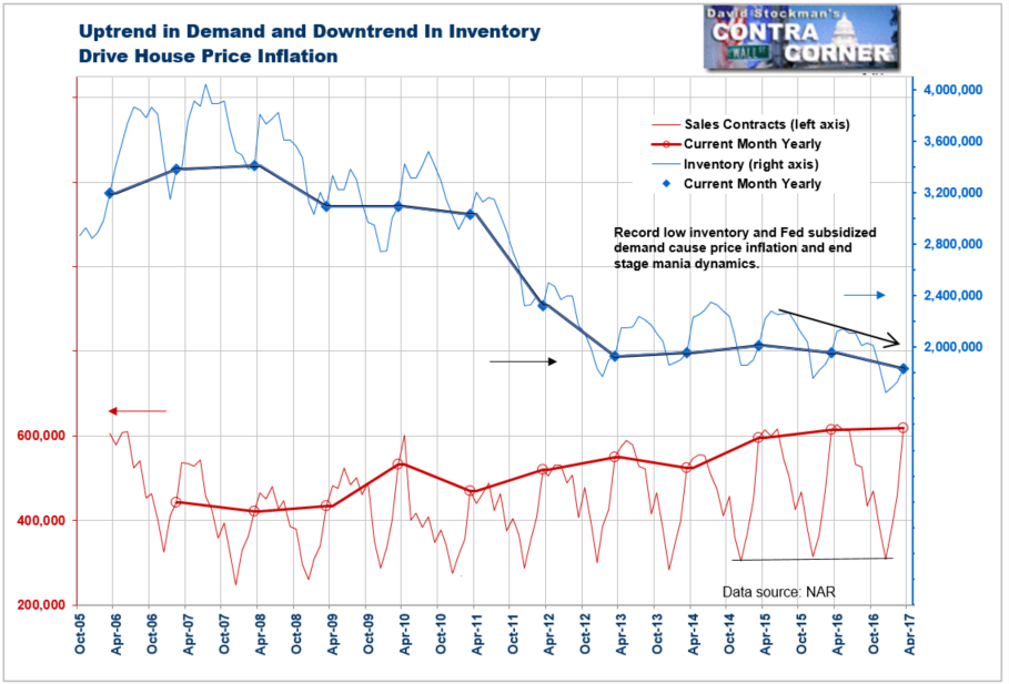
Sales have leveled off over the past couple of years, but at a robust level. However, at the same time, inventory is falling, putting the inventory to sales ratio at all time record lows. That stimulates price inflation. March prices were up 6.8% year to year, barely cooling at all on the heels of a 7.7% year to year jump in February.
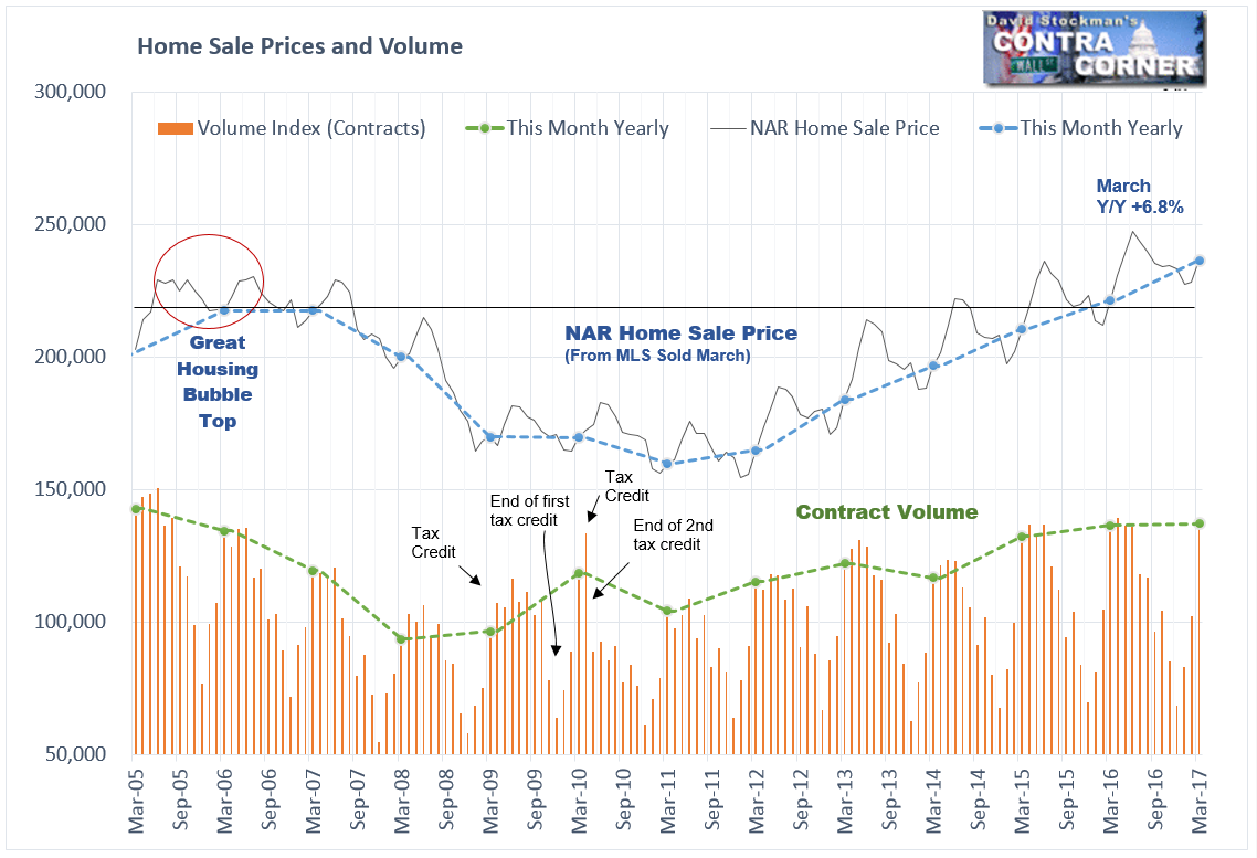
Clearly houses haven’t improved in functionality by 6.8% over the past year. And they’re not 6.8% bigger. They don’t have 6.8% higher use value to occupants. No, this is the purest representation of inflation that there is. But economists and pundits never call it that. To them, a rise home prices is either “growth” or “appreciation,” which is nonsense. It’s inflation. And that house price inflation has been running at 2-3 times the rate of wage and salary inflation.
This creates a dangerous, ever worsening dynamic in the market. Higher mortgage rates compound the problem. They’ve been in a pause since December, but that’s likely to prove temporary. As prices and mortgage payments rise beyond the ability of more and more people to pay, common sense tells us that demand should fall. And eventually it will. But for now it’s still holding up.
It’s not smoke and mirrors. It’s a lowering of underwriting standards by banks eager to get loans on the books before the game ends. They get to book the fees before bundling the loans and sending them off to taxpayer owned Fannie Mae and Freddie Mac. The banks get to keep the profits and offload the risk to us, American taxpayers, who will hold the bag when these weak credits suddenly stop paying.
The evidence of a big easing in underwriting standards is in the ratio of closings to contracts. The higher that ratio is, the more aggressively the lenders have pushed to get loans closed, and closed quickly. They lower credit standards. They lower debt service ratio requirements. They write more liar’s loans where they don’t even bother to check buyers’ incomes. They push appraisers to raise their value estimates to unsupported levels. Most appraisers comply.
In appraisal business, where I spent nearly 15 years, it’s comply or die. To hell with the law that values must be reasonable and supported by the evidence! It’s amazing what otherwise honest people will do when banks strongarm then by threatening them with the loss of their livelihood. Make no mistake, the banks are to blame for these busts when they occur.
And they occur like clockwork. We had a huge bust in the late 1980’s through 1992. The S&L industry collapsed. Home prices fell 30% in some areas. The RTC was set up by the Federal Government to resolve the crisis. There was an effort at reform. It worked for a while, but the Clinton Administration and Congress, in the thrall of the bankers, undid all those reforms and deregulated the banks. Another bubble formed in the early 2000s. Then 20 years after the S&L crisis we got the greatest housing crash and financial crisis since the Great Depression.
Here we are only 10 years later. Bankers have repeated the same crimes of the 1980s, this time with impunity and no fear of punishment or being held responsible. The bankers have again put us at the doorstep of mass financial crisis.
The timing of the unwinding is uncertain, but we got the first whiff yesterday with news of the biggest Canadian mortgage lender being on the ropes. Canada’s housing bubble is more extreme than the US bubble, so it stands to reason that the bad news would be seen there first.
But the two banking systems are deeply interconnected. The 4 biggest Canadian banks (there are only really 6 banks in Canada (talk about concentration) are Fed Primary Dealers. They used to say in Canada that when the US sneezes, Canada catches a cold. Today, the reverse may also be true.
I recall that my son-in-law, who was a risk manager at a Canadian bank told me in May 2007 that a big commercial paper issue in Canada had defaulted. Nobody there, or in the US, was yet talking about a financial crisis. The US media didn’t start reporting the Canadian CP default until a month or two later. Even then, there was little understanding that a true financial crisis had begun. That May CP default was just the first crack to appear in the facade.
I would take the picture of the current home sales fundamentals combined with this ill wind blowing down from Canada seriously. I believe that it is the first sign that the endgame for this iteration of the great North American housing bubble has begun.
Lee first reported in 2002 that Fed actions were driving US stock prices. The US Treasury has also played a role in directly moving markets. Lee has tracked and reported on those relationships for his subscribers for the last 15 years, helping to identify major turning points in the markets in their earliest stages. Try Lee’s groundbreaking reports on the Fed and the Monetary forces that drive market trends for 3 months risk free, with a full money back guarantee. Be in the know. Subscribe now, risk free!

