Today’s release of personal income and spending is very much related to the revised GDP figures, though I have no doubt that the BEA wishes it were not. To start with, the ongoing chain of benchmark revisions has produced an inordinately volatile set of economic accounts. That is quite against the stated purpose of all this adjusting and statistical intrusiveness; they are intended, after all, for a smooth and regular appearance. The fact that revisions have played such havoc is already a signal about further irregularity in what these accounts may be projecting in the first place.
Starting with the personal savings rate, the BEA cannot seem to find a home for it. Up and down and around again, the savings rate has been all over the place for the better part of a year’s worth of revisions.
While the more recent months in late 2014 and 2015 so far have been more scattered, the axis of these revisions is clearly around 2012. That isn’t surprising given that it is the 2012 slowdown that is causing all these issues. But rather than being simply an academic review of past insufficiency in both the actual economy and the statistics that are supposed to describe it, this ongoing statistical “battle” more than suggests the real problem as it exists right now.
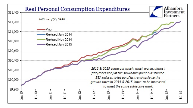
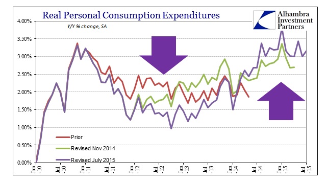
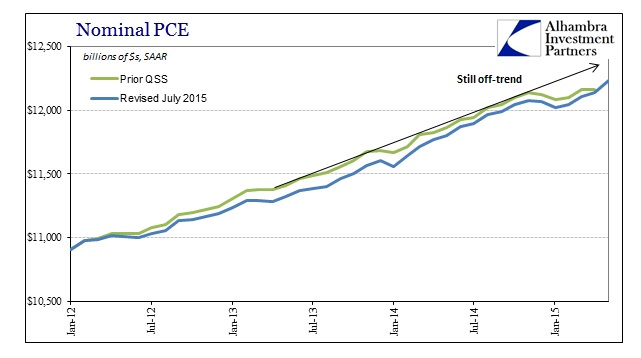
That period starting around March 2012 has become now a confirmed and major depression upon true activity. In terms of spending, as you can see below, each subsequent benchmark revision causes more and more downward estimation for that time period; to the point that, given the increasing number of months now caught up in the revisited benchmark, what was first thought nothing is now a gaping contusion.
That is, of course, a deep problem for the past narrative since economists were so absolutely positive that the “recovery” wasn’t in any way derailed in 2012 despite the very obvious counterpoint that the Fed actually acted in QE3 at the very same time. The fact that it took three years for this to be incorporated into the statistics not only suggests something wrong with the statistical processing but also what may be showing up right now in 2015.
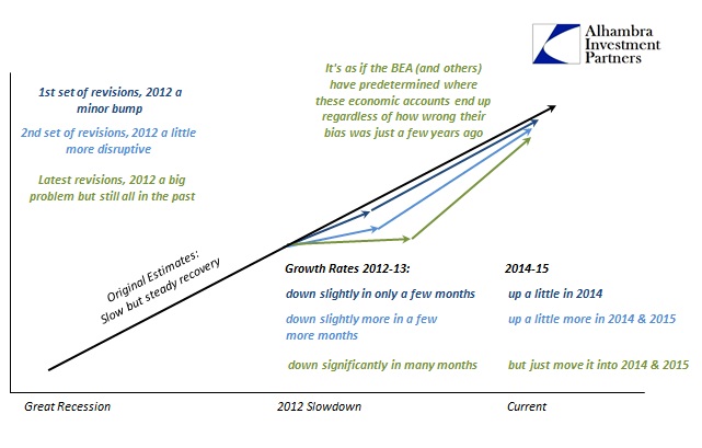
The reason for that is clear upon closer inspection of the revisions, particularly post-revisions. In other words, no matter how low the 2012-13 period goes in the benchmark the trend in spending (or GDP, income, whatever is being revised) from that point onward in the account somehow ends up in the same place. It’s almost as if (it actually is) the BEA is working backward from its current estimates to only rewrite how we got to the same glowing and comforting point anyway.
The net effect of that is to rewrite growth rates. The further downward revisions in the slowdown period has two prominent outcomes; first, those growth estimates closer to the re-benchmarked period are reduced while necessarily, since the end point of the current estimates remains largely unchanged, the growth rates in 2014 (especially the latter half) and 2015 must go up to “make up” the deficiency (taking “growth” from 2012 and 2013 and “giving it” to 2014 and 2015). That has the further backward effect of almost additional unearned assurance since the reduction parts are now well in the past and taken as irrelevant for our current circumstances that receive an upward boost because the BEA for some reason refuses to reduce its current levels despite all this. They got it pretty wrong about 2012 (even though contemporarily there were numerous parallel measures that were indicating the severity of the slowdown in almost real time) but despite no changes to the methods they are solid now with growth looking better each time they do it?
It isn’t just spending that has been “reformed” along these lines, it has also applied to income accounts which is why the personal savings rate lately is all over the place.
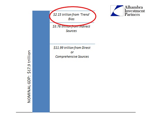
All of this topsy-turvy disassociation comes down to the same “trend” problem that is clearly too much optimistic subjectivity intruding into accounts that the mainstream takes as if the BEA was actually measuring the actual economy. Statistical modeling is exactly that, and that means there is the potential for bias in all of it. In terms of GDP, as the Establishment Survey, that potential is increased significantly by the shortcuts in the design. As noted yesterday, GDP by even its third update is still 12% “trend”, which works out to more than $2 trillion of the nearly $18 trillion estimate being simply covered by bias. The same was true when they were issuing these 2012 and 2013 “recovery” figures, which is revealed in hindsight as increasingly biased over-optimism and thus over-counted growth and income that didn’t exist.
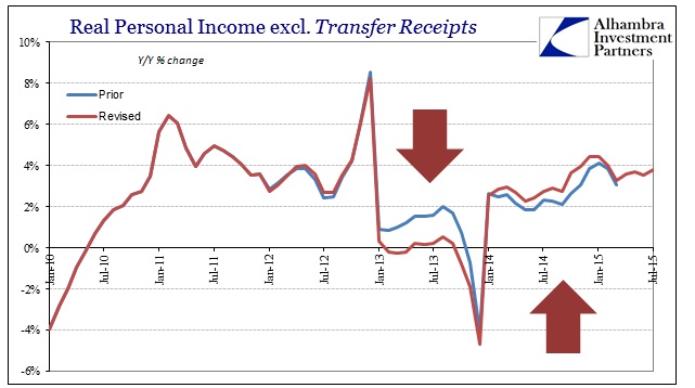
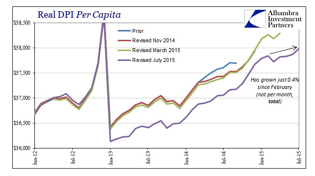
These are not trivial downgrades, either, as the income accounts show immediately above. Not only is the nearly 2% real income growth from most of 2013 gone, it has tremendous compounding effects that explain why the economy, stripped of those upward revisions in 2014 and 2015, might be struggling so much now. Minus 2% to growth rates is a real impact, but minus 2% for almost a year more than 2 years ago is a huge reduction in the current trajectory – or would be if the BEA wasn’t “making it up” by its continued subjectivity about right now.
Even with the current levels as the starting point for all these estimates, 2015 has still been quite a rough year. That would suggest, given a future of revisions ahead consistent with those just being done, the rough year so far might be as 2012-13 much rougher than projected at the moment. Applied to both the spending and income side, though not in equal proportion, economic difficulties become more understandable rather than confounding (as for economists). Incomes have actually been revised lower, faster than spending (to maintain GDP, of course) which is why the savings rate has been revised significantly lower at this last update. We are supposed to believe that with income being far worse both since 2012 and recently that spending was actually quite little disturbed.
Real income per capita has barely grown since February (oil prices “giveth” and now “taketh” back, which is why last year’s increase in real DPI was just an illusion as oil prices were in the process of their collapse) which means that incomes have only really changed based on the calculated perception about energy changes. That isn’t exactly the same thing as the “best jobs market in decades” which is why even the Fed has given up on the economy actually producing wage gains (which is, as they admit, the actual economy itself).
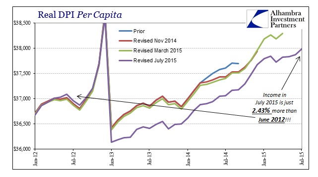
That leads to perhaps the most important measure in all these revisions revealing subjective bias. Real DPI per capita has only increased 2.4% since June 2012; not annual but total for thirty-seven months. That level of economic deficiency is supposed to stand as the basis while current GDP and spending accounts accelerate more recently?
Like the productivity figures, what you start to see is just how that bias is causing problems for these major economic accounts. By refusing to budge about the status of the “recovery” in 2014 and 2015, the continuing revelations about how bad it was at the 2012 inflection within the revised series produce these odd and conspicuous inequities further down the line to the point that very little agrees. At the very least, the fact that the 2012-13 “recovery” continues to disappear should give anyone pause about making solid determinations about the current numbers (which aren’t even good in historical context with all the bias). By that observation and the obvious means by which have been taken to preserve it, it is reasonable to assume that the economy in 2015 is significantly worse than it appears by these BEA productions – a station that would match so many other more drastically down data points, just like in 2012 and 2013.
How else is 2.4% income growth total supposed to bring about all this unquestioned recovery?


