I saw the great numbers on Industrial Production (IP) the other day and wondered what the heck is going on. So much of the data that I watch and write about here shows the US economy and most Americans doing poorly. Retail sales per capita are horrible. Housing is a mess. Joblessness and underemployment are rampant. Then this comes along. Industrial Production rose 0.7% in March according to the news headlines. The Wall Street conomist crowd had expected a gain of just 0.5%. But mygawd, even that is 6% annualized, and the reported number annualizes to 8.5%. How is this possible?
Those numbers are the usual seasonally adjusted media pap fiction, and fiction should never be annualized, but the the actual, not seasonally adjusted numbers (NSA) were also very strong. These numbers also need not be inflation adjusted because they are based on units of production. The Fed’s IP Index (NSA) hit a record 103.33 in March. That was up 4.1% from the year ago figure. The trend has been accelerating since the middle of last year when the year to year gain was just 1.7%. The monthly gain of 1.3% in March was double the 10 year average gain for the month. This, along with the stock market bubble, appears to be one indicator where the Fed’s QE might be having an effect, although the growth rate has moderated since the initial bungee rebound in 2009-10. If it’s having an effect, the effects are diminishing, but on the surface, there’s at least some correlation.
How can this strength be explained given how crappy most other data is? First, industrial production counts production of US factories, mines, and utilities. That sounds like a lot, but it’s still only a relatively small portion of the US economy, which is mostly a service economy. So, yes, it does represent economic sectors that are doing better than what most Americans are experiencing. If you live in Texas or North Dakota, hey, everything is great. The Texas story, by the way, is not a success story of low taxes and less regulation. It’s a story about energy companies headquartered and producing oil and gas there. That enables low taxes and buys deregulation, but that’s another story.
Here’s another contributor to the strong industrial production numbers of the last three months- the shitty weather. Yeah, that’s the ticket. Industrial production was strong because much of the country was shut in for a few days here and there by frigid weather and freak snow and ice storms. Hey! If conomists can blame the weather for bad performance, why can’t I blame it for good performance when there is, in fact, data to support it. Look at the index of electric power generation and distribution. This sub index represents 8.8% of the total IP index. It makes a small and generally not terribly significant contribution to the total index because its index numbers tend to stay in a relatively flat, narrow range. But look what has happened over each of the past 3 months.
In contrast to last July when electricity production and distribution was at its lowest summertime level in 3 years, in January, February, and March, the index surged to record highs for the winter months, well above past records. It went from a year to year decline of 4% last July, to a year to year increase of 4% in March. This 8% swing from low to high was enough to impact the total IP index by about a half point.
That index is small potatoes. The real reason for the rise in total IP is surging oil and gas production. That subindex comprises 29% of the total IP index. Because it has been rising so fast, its weight in the IP index has also risen, from 26% in 2006 to the current 29%.
The Energy subindex has risen 6.4% in the past year. That accounts for nearly half the gain in total IP. Energy production broke out of a base pattern in 2010 and has been accelerating ever since.
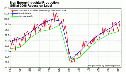
What’s the net effect of the Energy component over the long haul? The Fed, in its infinite wisdom, makes that question easy to answer by publishing the Non Energy aggregate. Lo and behold, it looks more like so many of the other indicators we track, slower increases of around 2-3% over the past 3 years, and no new high.
The index is below the 2007 level and still no higher than March 2008, when the economy had already begun to contract. At the same time, US population has grown by 7% since then. In a very real sense, flat is down. Net production per person excluding energy is therefore down by 7% since 2008, when the US was already entering a recession. Excluding those directly and indirectly boosted by the energy sector, most Americans are not experiencing economic growth.

So while ZIRP and QE may have goosed the energy boom, for the rest of the industrial sector, and indeed the economy at large, especially jobs, the impact has been nil since 2011. In fact, by encouraging financial engineering, distortion, and malinvestment, ZIRP and QE may have actually retarded broader growth. We’ll never know, but the argument could be reasonably made.
So this is a good news–bad news story. The good news is that energy is booming and boosting the US economy. The bad news is that energy is booming and obscuring the terrible performance of the rest of the US economy.
And is there more bad news ahead? As for the energy boom, dare we call it a bubble? Perhaps this capacity chart will give you some idea.
The post Industrial Production A High Energy Good News – Bad News Story appeared first on The Wall Street Examiner. Follow the money! See and understand the liquidity flowing from the Fed, Treasury, and other major central banks and primary dealers as they impact markets in the Wall Street Examiner Professional Edition.


