By Matthew C. Klein at FT Alphaville
Stocks and corporate bonds haven’t been doing so well lately, while the market-implied probability of four Fed rate hikes by the end of this year — the median expectation of policymakers as of December — has plunged below 1 per cent (according to Bloomberg’s WIRP function, anyway). Reasonable people are nowstarting to wonder whether another downturn is imminent.
Changes in prices could be signalling weakness yet to be captured by the official statistics on employment, output, and incomes. Even if you don’t believe asset prices contain useful information, it’s possible the hit to net wealth could encourage households and businesses to cut spending, thereby leading to recession and job losses.
We can’t answer whether a recession is around the corner, although the probability of another downturn necessarily rises with time since the last one. Instead, we want to lay out some of the main arguments and think through what various downside scenarios might look like.
The credible case for concern goes something like this (we’re paraphrasing):
Following the collapse of the credit bubble, central banks tried to get people to spend by encouraging savers to invest in riskier assets than they otherwise would have. The hope was that rising stock prices and home values would boost consumer spending power and get businesses to hire workers and expand capacity.
Instead, the main impact was through the “portfolio balance channel”, which pushed savers to load up on junk bonds, leveraged loans, and liabilities issued by companies and governments based in emerging markets.
At the same time, China’s initial response to the crisis was a wholesale switch from an “export-led” growth model to one centred on domestic investment in infrastructure, real estate, and industrial capacity. Whether or not this was the best response to the global downturn, it was a huge boon for producers of industrial commodities — at least until China began switching yet again towards a more “sustainable” development model sometime around 2011. (Look at the prices of iron ore, copper, and coal if you want to quibble about the date.)
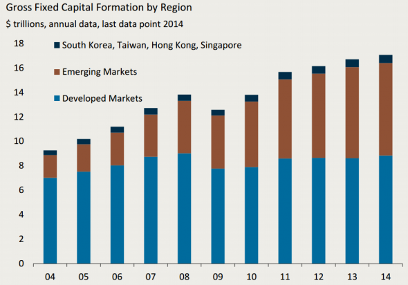
One consequence is that more than all of the increase in investment since 2008 has come from emerging markets. From the Jerome Levy Forecasting Center:
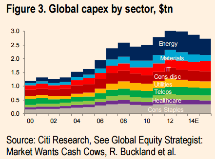
Another, related, effect is the distribution of global capex spending by sector. Essentially all of the growth since the pre-crisis peak has come from energy and materials. From Citi:
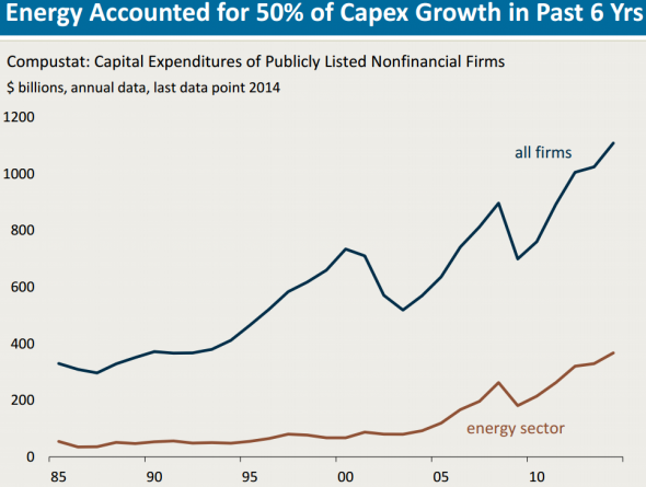
America looks similar. According to the Levy Center’s analysis of Compustat data, half of the total increase in capex spending by US-listed nonfinancial companies since the trough has come from energy firms:
Each of these forces that had been supporting growth have slowly come undone.
First, EM ex-China started running into trouble, as domestic credit booms turned into busts and capital fled — think of Brazil, Turkey, and Russia, for example. This was then exacerbated by the combination of the “taper tantrum” and China’s efforts to “rebalance”. Then came the carnage in oil, the wider increase in credit spreads, and the soaring dollar. China’s slowdown has gotten relatively worse and its trade surplus has widened to all-time highs, thanks in large part to falling imports.
Falling oil and metal prices, falling exports, and tightening credit conditions will, in this argument, hit US business investment and employment. Manufacturing growth has already slowed to a crawl, while surveys suggest output will fall. Meanwhile, losses on financial assets will cause American consumers to retrench and exacerbate the downturn. (You could also imagine severe declines in Bay Area house prices and employment if the tech boom deflates, if you really want to add in some misery.)
The net effect might not be as bad as the last recession but it could lead to a prolonged period of slow growth following sharp cuts in business investment — like the early 2000s, except without the fillip of the housing bubble.
We would be willing to believe the world economy as a whole could be on the verge of, if not already in, a recession, at least if you use Robin Harding’s reasonable definition of “two consecutive quarters of growth 2 percentage points below a country’s trend”. But that’s distinct from the darker scenario of a sustained decline in real US output.
Start by looking at the parts of America already hurting from weakness in energy and foreign demand.
From the peak in the third quarter of 2014 through the third quarter of 2015, the most recent period for which we have revised data,* real investment spending on “mining exploration, shafts, and wells” has collapsed by about 44 per cent. On the other hand, this spending was only worth about 0.8 per cent of total nominal output at its peak. For any additional cuts to have as much of an impact on aggregate output as what’s already occurred, the US oil industry would have to essentially disappear. That seems…unlikely.
(See tables 1.5.5. and 5.3.6 of the National Income and Product Accounts.)
This isn’t the best way to measure total spending by oil and gas businesses, however, since they spend a lot on equipment and are also a big source of demand for other businesses’ products in a range of sectors. John Kemp has noted the importance of the oil and gas firms for manufacturers, truckers, railroads, and diesel fuel.
North Dakota is not representative of the broader economy, but it has nevertheless swung from boom to bust. While the unemployment rate is still falling, this number is misleading because economic migrants who had come for the quick riches in the oil patch have been evacuating in droves. Over the past year the number of people working in North Dakota dropped by more than 4 per cent, which is by far the biggest drop since the data begin.
Houston is a better example. It’s America’s seventh-biggest metro area by total employment and also has the distinction of having added more jobs since 1990 than every other US city except for Dallas. However, Houston is still exposed to the vicissitudes of the oil market. Its jobless rate has already jumped by a percentage point just since the trough in July, 2015.
That’s not as bad as what’s happened in Alberta, so far, but employment is a lagging indicator and cutbacks are expected to continue into this year. We wouldn’t be surprised if Houston’s unemployment rate continued to rise, especially since the rate of job creation is dangerously close to recession territory (for Houston).
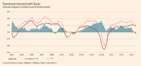
Texas as a whole is a diversified economy with little obvious exposure to the oil price, but its rate of job growth has collapsed from around 3.2 per cent annually at the start of 2015 to just 1.4 per cent now. By contrast, jobs are being created in the rest of America at the fastest clip since the summer of 2000, at just over 2 per cent. The gap (blue columns below) is the widest in more than a quarter-century:
On the other hand, Texas endured a much worse recession in the mid-1980s from collapsing oil prices and did little to dent the broader US economy. Texas is somewhat bigger now than it was then relative to the rest of the country, but it’s also handled the recent oil price drop with far more aplomb now than then.
Then there’s net exports. The dollar has been soaring against the currencies of America’s trade partners, which ought to have some impact on Americans’ desire to substitute domestic for foreign wares at the same as it discourages foreigners from buying increasingly expensive made-in-the-USA goods and services. In a remarkably neat symmetry, the roughly 25 per cent appreciation of the broad dollar index since the start of 2014 has gone together with a 26 per cent increase in the real trade deficit. (See table 1.5.6 in the NIPAs.)
The cumulative impact of the widening trade balance, so far, has been about 0.7 percentage points shaved off growth since the start of 2014. Total output growth over that period was about 4.5 per cent, which means the drag from the widening trade deficit reduced the expansion by about 13 per cent from what it would have been.
That’s annoying, but not enough to seriously dent the outlook for a large closed economy like the US. Even if world demand for American exports dropped by, say, 20 per cent — which, to be clear, would be a catastrophe roughly double what happened in 2008-9 — the hit to American output would only be about 2.5 per cent. And unless foreign demand continued to collapse at twice the rate it did during the worst crisis in 80 years, the hit to American output would be a one-time event.
Besides, the growth in the real trade deficit has come entirely from a boom in imports, despite weakness from abroad and the stronger dollar. In real terms, US exports are still at all-time highs, and have grown by 4 per cent since the start of 2014. The “problem” is that imports are up even more (8 per cent in real terms).
The deterioration in the trade account also looks a lot different when you stop attempting to adjust for changes in prices. In simple dollar terms, the trade deficit has been essentially flat since the middle of 2012 at around $530 billion, and shrinking as a share of a growing US economy. Far from reducing the dollar earnings of American producers and consumers, the changes in the trade balance have, so far, had no effect.
Oil cuts and foreign weakness are therefore insufficient, by themselves, to push the US economy into a recession.
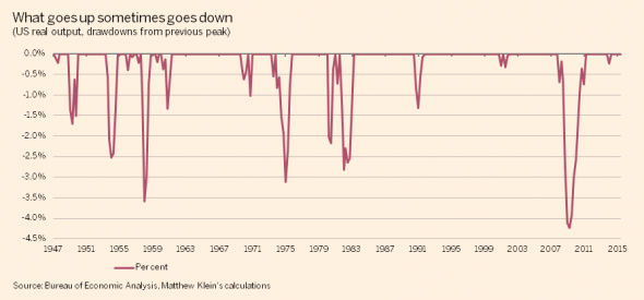
To see why, it helps to look at what’s happened in past recessions. While we endorse Robin Harding’s definition at a conceptual level, we unfortunately have little insight into how to define the sustainable “trend” of US growth during each cycle. We therefore used a simple definition where real output declines from its previous peak for more than one quarter, which more or less lines up with the National Bureau of Economic Research’s subjective recession dates. That looks like this:
(The main drawback of this approach is that it understates the severity of the 1989-92 and 2000-02 downturns, in addition to the recent crisis, because the initial drops in output weren’t nearly as painful as the subsequent sluggishness of the recoveries.)
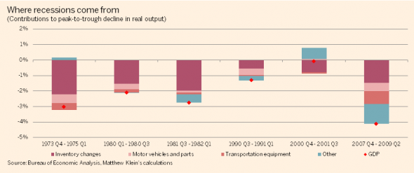
While the US economy is dominated by personal consumption, which in turn is mostly services such as healthcare, restaurants, and finance, the volatility in output mostly comes from a few small sectors. Oversimplifying somewhat, recessions are essentially sharp declines in the appetite to spend on cars, trucks, and inventories:
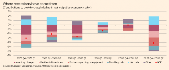
A broader perspective (note the different colour scheme) shows how changes in homebuilding have also been significant in most of the modern American recessions, while inventory drawdowns are often partly if not fully cancelled out by improvements in the real trade balance:
The “other” category includes consumption of services, nondurable goods (food, gasoline, clothes, etc), business spending on software, R&D, and structures, and government spending. Changes in these categories of spending have historically been far smaller during recessions than the ones we’ve highlighted.
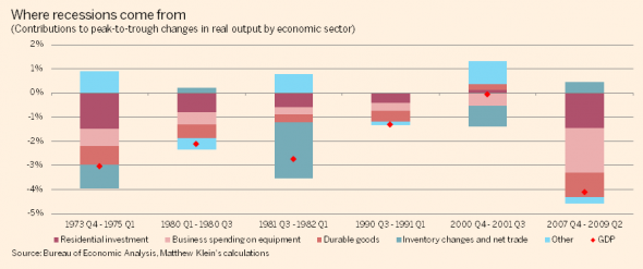
Here’s an even clearer view, with a slightly different color scheme:
(All of this is based on our toiling inside the guts of table 1.5.2 of the NIPAs.)
At the end of 2007, residential investment, durable goods consumption, and business investment in equipment together only accounted for 18 per cent of the US economy in nominal terms, yet these sectors were collectively responsible for all of the decline in real output.
Even in our supposedly post-industrial, all-digital, services-only economy, recessions still come from sharp contractions in spending on physical stuff, just like they did 40-plus years ago.
Aside from their power to wreck the US economy when people stop buying or making them, houses, cars, trucks, and furniture all have something important in common: they’re big-ticket items often purchased with credit. When people get worried that money will be hard to come by, it’s both easier and more logical to postpone buying a new car than to wait on getting a haircut or groceries. Little wonder the recession following the biggest financial crisis since the Great Depression was so painful.
You should also notice how there is often little obvious connection between the supposed excesses preceding a recession and the components of the economy which fall the hardest. Everyone knows America went on a credit binge before 2007, building too many houses and supporting too much consumption relative to income. Yet the composition of the actual downturn was almost identical to what happened in 1973-5, despite radically different origins. The excessive borrowing didn’t show up in the aggregate data during the recession itself but in the geographical distribution of the downturn and the weakness and composition of the subsequent recovery.
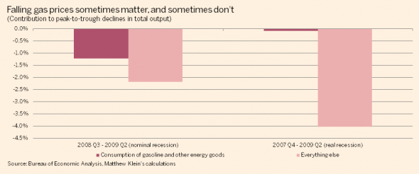
Another weird fact about the most recent recession is that an enormous chunk of the decline in nominal output came from the drop in oil prices, even though this had essentially no impact on real GDP:
Past performance is no guarantee of future results, but all this suggests the outlook for housing and durables is what to focus on. Put slightly differently, if you’re worried that weakness abroad and in the oil patch will push America into recession, you should probably have a sense of how these forces could translate into sharp contractions in spending on motor vehicles and housing.
The likeliest channel would be a disruption of credit.
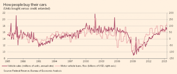
There is an almost perfect relationship between changes in the flow of credit to purchase motor vehicles and the number of light trucks and cars sold in the US:
Part of this could be a response by lenders to changes in consumer demand for cars, although changes in credit standards have played a big role in the most recent expansion. We don’t want to speculate here on the outlook for US auto lending, although interested readers may want to read this, this, this, this, this, and this.
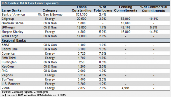
The problems in oil could cause trouble if losses on energy junk bonds reduce investor demand for auto ABS and if losses on bank loans to energy companies cause them to retrench in both vehicle and mortgage lending. We have no idea if this will happen, but a little context may be helpful.
According to CreditSights, the face value of high-yield bonds to energy companies is slightly under $200 billion, and investors who mark their holdings to market have already experienced losses of about 33 per cent. For comparison, the US corporate debt and asset-backed securities market is worth more than $11 trillion. Meanwhile, US banks have lent about $105 billion to energy companies, with another $132 billion of undrawn credit available:
In CreditSights’s view, the small size of this exposure, the structure of the loans, and the particular types of companies doing the bulk of the borrowing all make the risk to bank balance sheets relative low. In their opinion, the worst outcome for the big lenders is a temporary hit to profits rather than something imperiling the ability of banks to make new, profitable loans.
We have a harder time imagining how foreign weakness could flow through to domestic US credit conditions. It’s possible losses on dollar-denominated debt to companies in weaker countries outside the US will make investors less eager to fund auto loans, but as with oil and gas lending, we have no ability to judge the likelihood of this scenario.
You could also look at the nominal trade figures if you want to find something to worry about. We noted earlier how the trade balance has been flat in nominal terms and how exports have been rising steadily in real terms. But the dollar earnings of American exporters have dropped by 4.3 per cent since mid-2014.
The net impact on the trade balance has been zero so far because nominal imports have dropped by 3.0 per cent thanks to the soaring exchange rate and the collapse in oil prices. The big question is if American exporters will respond by cutting their spending in the US more than American importers increase their domestic consumption and investment.
(There’s not much point in talking about the risk to housing finance because nowadays it’s essentially a closed system within the GSEs and the Federal Reserve, and should be shielded from whatever could hurt the outlook for autos.)
It’s more likely, however, that the collapse in the oil price is a windfall for the vehicle market.
The outlook for global oil demand may have deteriorated since mid-2014, but growth in American consumption of gasoline, in inflation-adjusted terms, is growing at the fastest rate in decades as people take advantage of lower fuel costs to drive more. More driving means cars wear out faster and get replaced more than they otherwise would.
Perhaps more importantly, the drop in prices improves creditworthiness. The people most in danger of default on their auto loans are also the ones most likely to appreciate the extra cash in their pocket from lower oil prices. (People who make less money spend a higher share of their income on gasoline, and the subset of people with subprime car loans probably spend an even higher share.) Some economists think the US economy would already have gone into recession by now had borrowersnot gotten bailed out by their savings at the pump.
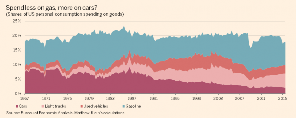
In general, Americans spend roughly the same fixed share of their goods consumption on the sum of motor vehicles, parts, and gasoline:
(Based on NIPA tables 1.1.5 and 7.2.5B.)
There is no good reason why people should budget this way, although it fits with aneven stranger finding that Americans consistently switch to premium gasoline when the price of regular fuel falls, and switch back to regular when the price rises. During the teeth of the crisis, when millions of people were losing their jobs and their houses, you nevertheless saw a significant increase in the relative amount of higher-octane motor fuel being sold.
Not coincidentally, real investment on transportation equipment, which also ought to move somewhat inversely to fuel prices, has been booming. Since the previous cyclical peak at the start of 2007, real spending on trucks, buses, planes, and ships has grown by 40 per cent, more than any other subcategory of business investment. Just since the start of 2014, investment in transportation equipment is up more than 15 per cent — again, far more than any other category.
One final note. We think it’s likely countries burdened by a legacy of excessive private borrowing have generally become more vulnerable to falling into recession, in part because central banks lose much of their potency when people don’t want to take on lots of new debt and interest rates are already near (or at) the lower bound.
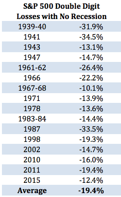
Consider the recent decline in stock prices. It could easily be a fake signal of trouble ahead, and Ben Carlson has noted how double-digit declines in US stocks happen quite frequently without predicting, causing, or coinciding with a recession.
However, if you look closely at his table, you’ll notice every single decline in the past 35 years has been followed by Fed rate cuts or, more recently, QE2 and “Operation Twist”. Many of the episodes he identifies before the Volcker disinflation were also followed by monetary easing:
Even if some of those decisions were unwise, it’s reasonable to think at least some of them helped avert a recession. Monetary stimulus is harder to engineer now, though, so the stock market could end up being a better recession predictor with fewer false positives than in the past.
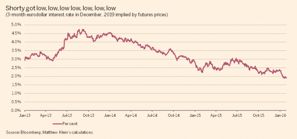
Just look at eurodollar futures prices, which currently imply 3-month Libor will be under 2 per cent in December, 2019 — down nearly 3 percentage points from the peak after the “taper tantrum”:
Unlike the more recent gyrations in equities and spreads, the downward trajectory in future interest rates has been relentless ever since it started years ago. It fits with a vision of a world plagued by slow growth interrupted by recessions that central banks have limited ability to ameliorate, and in which fiscal authorities are unwilling to do what they can to boost nominal spending. That’s a much bigger concern than whether or not America enters a recession this year, or two years from now, or five years from now.
Source: What Might the Next US Recession Look Like – FT Alphaville

