
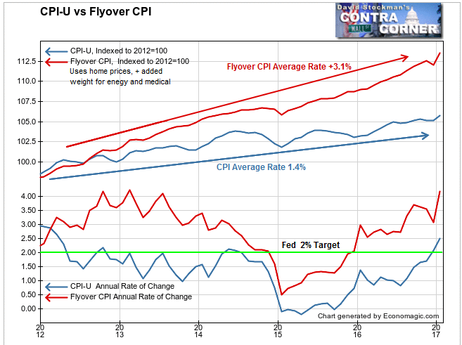
Yesterday we looked at the difference between the BLS method of measuring consumer prices vs. our Flyover CPI. The Flyover CPI attempts to show how “flyover America,” which is everybody excluding the coastal elites of New York, DC, and California, experience inflation. It has persistently been well above the Fed’s 2% “inflation target” ever since that target was first enunciated in 2012.
In fact, the CPI doesn’t even purport to measure inflation. The Fed’s target is really a consumer prices target.That’s a lot narrower than the traditional definition of inflation: a rise in the general level of prices. The “general level of prices” is a lot broader than a rise in the level of prices experienced by urban consumers for a particular basket of consumption goods and services as manipulated by the BLS for maximum suppressive effects. That’s what CPI represents. As we saw in the previous post, CPI methodology suppresses even that number.
The CPI wasn’t the only measure to grossly understate consumer inflation. There were others. But first there’s the comparison we looked at previously between the CPI and Flyover CPI. Thanks mostly to how the BLS fudges housing inflation, the CPI has vastly understated consumer inflation.
But the Flyover CPI isn’t the only measure showing the Fed behind the curve, way behind. Here’s a chart comparing Core CPI, PCE and Core PCE, with the PPI for finished consumer goods, ex food and energy. That would be akin to the Core CPI and PCE. The core measures remove the effect of the energy price crash in 2014-15 and subsequent rebound. The resulting indexes depict the underlying trends.
The BEA’s Personal Consumption Expenditures Index (PCE) is the one the Fed reportedly bases its inflation readings on. The measure the Fed really has its eye on is the CPI. That’s the one that has suddenly made the Fed collectively wet its pants. Had the Fed been paying attention to real measures of inflation all along, there would have been no sudden surprise to the policymakers.
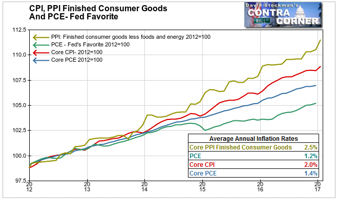
Core CPI has, lo and behold, averaged 2% since 2012. But the Fed was excusing that by pretending to focus on PCE and Core PCE, which only registered average inflation of 1.2% and 1.4% per year since 2012.
Core PPI for finished consumer goods looks very different. This measure represents the wholesale prices to retailers of the goods that they sell in their stores. The BLS doesn’t bother to manipulate this series, perhaps figuring that no one is paying attention. But we have been. And we have seen it average +2.5% per year for the past 5 years. That’s a pretty good indication that consumer price inflation has been above the Fed’s target for the entire time since it introduced that benchmark in 2012.
Here’s how these measures looked on the basis of year to year change.
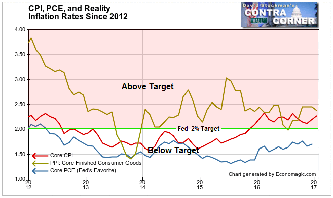
The Fed’s favorite measure, the Core PCE has been below target since the Fed announced it in 2012. How convenient. Core CPI had been below it until late 2015. That upmove in Core CPI got the Fed’s attention. It made its first move to increase the make-believe Fed Funds rate. The money market actually forced the Fed’s hand. It had already started moving up before the Fed announced its first increase.
The core PPI for finished consumer goods was only really below target for about 5 months in 2013. Since then it has been above 2%for all but one of those months. In January it posted a 2.4% year to year increase.
This is another illustration of the Fed being behind the curve because it has focused on the wrong indicators. We have to ask if the Fed’s misdirected attention was intentional, or an accidental effect of their economic religiosity and refusal to face facts.
The government’s chief tool in suppressing CPI inflation is Owner’s Equivalent Rent. I have expounded on OER in past reports, but briefly, here’s how it works. It purports to represent the typical consumer’s housing cost by annually asking a tiny sample of homeowners what they think their house would rent for, as if owners are local rental market experts. Then the BLS inflates that figure monthly by a tiny sample survey of renters, asking them how much rent they are currently paying. That’s what we former appraisers called contract rent. It’s not market rent. It doesn’t in any way represent the current rent inflation rate in the market. Contract rent typically includes a tiny fixed annual escalator, like $10 0r $20 a month, or a CPI based escalator, which becomes a self fulfilling prophecy when OER is imputed in CPI.
Look at this chart comparing OER with Market Rent, which the Census Bureau estimates quarterly from surveys of landlords. The chart also includes the FHFA house price index through November. I have updated it through January using real time national MLS data from the NAR and Redfin. All 3 series are not seasonally adjusted (NSA), which means, actual prices. FHFA does smooth its data with a 3 month moving average, but there’s no seasonal manipulation. Note that real NSA data fluctuates. When you see NSA data that moves in a perfectly smooth curve, you know it’s not real. The BLS’s OER data is FAKE DATA. No economic series moves like that in the real world.
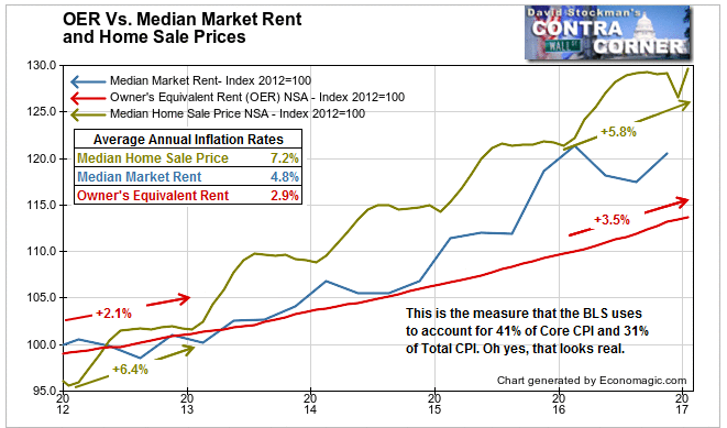
Ultimately the fake data must play catch up with real data, otherwise in the long run people would catch on to the massive fudge factor in the CPI. We’re now in one of those periods. House prices have averaged inflation of 7.2% per year since 2012. At the start in 2012, FHFA’s index rose by 6.4%. In the past 12 months, as adjusted by actual MLS data for the last 2 months, home prices rose 5.8%. There was a bulge in the middle of that period with house prices rising faster than the average.
In 2012 the OER inflation rate was 2.1%, lagging home prices by two thirds that year. Over the past year OER began to creep up. It rose 3.5% over the past 12 months. That only lagged home prices by about 25% this time. At the same time, rents barely rose in the year ended Q4 2016. They were up by just 1.6%. OER rose by more than double that in the past 12 months. In the real world, rent increases have hit the wall of lagging household income. The rental market is softening.So now the OER is overstating recent rent inflation. Home prices are likely to start to peak as well as mortgage rates rise, and household incomes grow only very slowly.
So it’s man bites dog time. The OER component of CPI, after lagging badly since the inception of the Fed inflation target in 2012, is now accelerating. It’s going to start pushing harder and harder on the headline CPI numbers, even though market rent inflation is slowing down. It won’t ever catch up to the reality of housing inflation, but it will play enough catch-up to scare the bejeebers out of economic pundits and policymakers, particularly as bond yields move up in tandem.
So keep this in mind as the stock market bubble blows off. The pressure of rising recognition of inflation will start to sink in, and the market will soon wake up one day to shocking news on both the inflation front and the bond yield front. I would not be buying the dip on the next selloff. Instead, I’m looking to sell this rip.
Follow Lee’s weekly market timing reports, including ETF trading recommendations, in the Wall Street Examiner Pro Trader Market Updates. Currently open picks have an average gain of 9.2% and an average holding period of 39 days. Try the service risk free for 90 days.

