
The ho hum drumbeat in the ever increasing number of low paying jobs that won’t support a family without having four of them, goes on. That’s that for my jobs post this month.
Actually, I will get back to this subject, even if I can’t hold a candle to David Stockman’s unparalleled mastery of that subject, or any other issue for that matter.
But first, let’s go back to those revealing charts I promised on new home sales. There is so much rich detail in that Commerce Department report that nobody reports, it’s really a crime. It’s the crime of willful ignorance. There are so many angles to explore in that data that I could probably spend all month just reporting on that sector alone.
The nice thing about housing is that everybody cares about it. The stock market is only for crazy people like me who are driven to understand and report why things work the way they do. Conversely all of us need a place to live, and most of us care about what it will be worth tomorrow. My job is to try and figure that out for you.
All real estate is local, of course. You can follow the trends in your city and region with the research pages of websites like Zillow and Redfin.com, which have great local data. I focus on the national picture. Your region is likely to differ from the national averages and medians. But I need to focus on the big picture to understand and communicate to you what it means to the outlook for the health of our financial system, and therefore to the health of your stock and bond portfolio.
The religion of home ownership, after all, really is the fountainhead of financial creationism, and the Big Bang that explodes after housing inflation. Economists and Wall Street don’t count it as inflation, even though it is. And it affects everyone. If you own a home, your faith leads you to believe that you are accumulating wealth. And if you don’t own a home, it just reminds you daily what a poor schnook you really are.
In truth, if you are a renter, you are probably the smart one. We’ve looked at this issue before. In most cases, your house will barely allow you to break even on the money you put into it in taxes, maintenance, insurance, and most important, interest. Nowadays, being able to successfully extract your equity is largely a matter of market timing.
Now might be a good time to get your equity out. If you were thinking about it anyway, I’d encourage it. If it’s your home for life, that’s another matter. Some day you’ll pay it off. Of course, by then you’ll need to spend 200k in inflated dollars to renovate it back to the current market standard. Then you’re behind the 8 ball again.
The current housing inflation has been under way since prices bottomed in 2010-11. There’s nothing remarkable about that, given that mortgage rates and house prices are inversely proportional. The Fed pushed rates down and house prices went up… pretty much constantly since 1982, with the exception of the 1990-91 break, and the 2006-2010 crash.
Now rates look like they have gone down as far as they’re going to in this 34 year bull market in bonds.
It was a bull market mostly brought to you by the Fed and its partners in crime, the Bank of Japan, and the European Central Bank. But they have probably run out of rabbits to pull from their bags of cheap money tricks. The European banking system is in full meltdown mode and the banks are selling their holdings of US Treasuries to raise cash. As bond yields consequently rise, all the money printing in the world, particularly from the ECB, won’t be able to put Humpty Dumpty back on the wall. There’s a new sheriff in town and his name isn’t Mario Draghi, it’s Monetario Collapsi.
The rise in mortgage rates is lagging US Treasury yields a bit, but they are starting to heat up. That creates a potential double whammy for housing prices, and hence for the financial system as a whole. It’s because house prices have probably gone as high as they are likely to versus the incomes of American families and odd assortment of other US households.
This chart illustrates the issue in the short run. It is the ratio of average annual wage and salary income per worker to the median new home sale price. In 2006, that ratio hit 6.8. In other words, the median price of a new house was 6.8 times the average annual wage. Considering most households have 2 wage earners, that equates with a sales price to household income ratio of 3.4.
It’s like a PE ratio for stocks. When stocks are 25X earnings, they’re overvalued and risky. When house prices are 6.8X average earnings, they’re overpriced and risky. The difference is that once people can no longer afford to buy houses, it’s game over. Stock prices can keep bubbling as long as the world’s central banks force money into the accounts of stock dealers and trading firms.
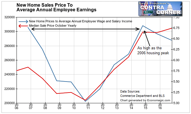
In 2014 the sale price ratios hit the exact same levels as they hit in 2006– 6.8 per worker, and 3.4 for 2 earner households. The market could afford no more. So the ratio fell, and kept falling.
That was even with the help of collapsing mortgage rates from 2006 to 2010. Rates fell from 6.4% in October 2006 to 4.1% in October 2011. Prices didn’t start to recover until the median sale price to average salary fell all the way to 5.0. Once sale prices fell to the old gold standard of 2.5 times household income, that looked like a bargain to enough buyers that it reversed the tide.
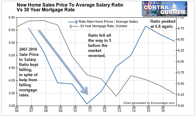
The pendulum than swung back to the upside, and 4 years later the ratio was back at 6.8 (3.4 for household), where the market was again stretched. House prices flattened at that point, even though mortgage rates again declined. They fell from 4.1% to 3.4% between 2013 and October 2016.
That party is now over. Mortgage rates are back to 4%. And if I’m right about the European banking crisis, those rates will head higher as the banks of Europe sell any readily saleable piece of paper they can to raise cash.
The easiest paper to sell to raise cash always has been and always will be US Treasuries. The banks in Europe hold a ton of them, and they will continue to cash out. That will drive Treasury yields upward. Mortgage rates will move up in concert.
I wondered about the lack of history on the salary to home price ratio. The BLS only started tracking average wages in 2006.
But there’s a long history of data on personal income per capita. It differs from wage income because it includes gains from dividends, interest, and sales of stock. That has skewed personal income up faster than salaries. The benefit of that accrues only to the very few at the top of the wealth spectrum. Still, it is possible to analyze that data over the long run. It looks like this.
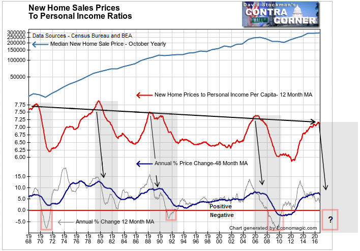
There are a couple of things to note on this chart. First is that as with the price to salary ratio above, the price to personal income ratio also peaked in 2006. It peaked below the level of the prior peak in 1988, and that was below the previous peak in 1979. But they were all along the same trendline.
1979 was back when I was selling real estate in my roaring twenties. I remember it well. My local market in Center City Philly was in a raging bubble. 1987 was also a bubble peak, as was 2006. The 1969 peak coincided with the end of the institutional stock market bubble of the 1960s. I remember that well too, because it’s when I started trading and charting in earnest.
The peaks are descending since 1979 because income other than salaries, which accrues to almost entirely to the wealthy, has been rising much faster than salaries. Very few people use their interest and dividend income to buy houses. In the vast majority of markets in the modern era, it’s the salary income that carries the load.
Under these circumstances each successive lower peak in the sale price to personal income ratio has run along a trendline for the past 37 years. I’d say that is a fair amount of history on which to draw conclusions. Lo and behold, in the past couple of months, the sale price to personal income ratio has reached this line again. That to me is a valid signal that the party is over.
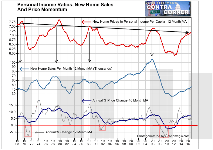
Each time in the past that this line has been reached, the housing market topped out. You can see the downturn in the momentum of housing inflation on the bottom scale. In 3 instances, not only did prices stop rising, they fell for a year or more. That was in 1970-72, 1991-92, and of course, 2007-2010.
In each case prices bottomed when the ratio fell sharply for at least 2-3 years. And in all cases those markets had help from falling mortgage rates. That’s not likely to happen this time. Instead today’s market will probably be buffeted by a mortgage rate headwind. That is likely to put prices into a tailspin again, similar to the last cycle.
But it won’t be just prices that sink. History shows that volume follows the same pattern. And this time, the downturn in volume will be starting from the lowest peak in history by far. Apparently, the housing depression never ended.
This has been a weak market with lots of inflation. Because of that inflation the housing market has, or will soon, hit a wall in terms of prices. Prices have been rising faster than salaries for too many years. Buyers hit the limit of what they could afford in purchasing a new home when mortgage rates were at rock bottom. If they don’t stay there, then the housing market will plunge again.
Trillions of dollars of debt are backed by housing collateral. A downturn in housing now would be a different kind of disaster, because it probably won’t be cushioned by a fall in mortgage rates like the last time.
I first reported in 2002 that Fed actions were driving US stock prices. I have tracked and reported on that relationship for my subscribers ever since. Try these groundbreaking reports on the Fed and the Monetary forces that drive market trends for 3 months risk free, with a full money back guarantee. Be in the know. Subscribe now, risk free!

