
The flaws in the Case Shiller Index national data are bad enough. But Case Shiller’s worst features become most glaring in the metro market data. The problems start with using stale old public record data. The lag gets worse with the use of the 3 month average of sale prices from that stale data, making the index about 5 1/2 months behind reality as soon as it’s released.
That’s not a big deal in slow moving markets, but it can matter lot when demand dries up at market tops. Reported price levels are meaningless when there are no buyers for your house. At that point, the housing market becomes a high stakes game of chicken, with the only question being which seller blinks first.
Then there’s the problem of the CSI using only seasoned paired sales data, which excludes new houses and houses that have been renovated and resold in less than 6 months. It’s as if new houses in good condition somehow don’t represent the market. The Case-Shiller Index as really the This Old House Index.
But the biggest sin is the inclusion of bank sales out of foreclosure. Professor Shiller made the excuse that bank sales were arm’s length sales. That’s stupid. Banks holding foreclosed property don’t care about getting market value, which can take a long time in a soft market. They care about getting enough to recover as much of the mortgage balance as possible, in the shortest period of time. These are liquidation sales, not market oriented arm’s length transactions.
These sales do cap the market on the way down as non distressed sellers must compete with lenders dumping their foreclosure inventory. In the initial stages of a down market, they are good predictors. But the foreclosure properties and the sellers’ financial conditions deteriorated as the market crash unfolded. At the bottom of the crash they kept a lid on prices even when the local market prices were starting to recover a bit.
Prices don’t rebound until the distressed market oversupply clears. That shows up in the non-distressed sales data. It’s not necessary to overweight the distressed sales to get an accurate view of the market. The inclusion of distressed sales in metro market price indexes merely retarded and suppressed the turn in the price index at the bottom of the market. Naturally, that gave the private equity vultures a leg up in acquiring big inventories of properties at the bottom of the crash. Individual buyers shied away from buying at the bottom because it appeared that prices were still tanking when, in fact, the seeds of a turn were in place.
In local metro raging bubble markets, Case Shiller makes it appear that there’s no bubble, or that it’s not as extreme as it actually is. That’s the problem today. Buyers are being lulled into a false sense of security in what is an even more dangerous market than in 2006. The functioning of today’s market is reliant on the financing subsidy from the Fed and the price inflation caused by any central bank QE. It doesn’t matter if it’s the Fed or a major foreign central bank. All capital roads eventually lead back to the US market as foreigners flee their home markets for what appears to be a better deal in the US. Ultimately, that better deal will turn out to have been a mirage. But as long as the QE flows, that capital will help drive US housing inflation.
The inclusion of bank sales and only old house sales makes Case Shiller faster at the top and slower at the bottom and on the way up. To give it its due, it gave concurrent warnings at the top of the late great housing bubble of the 2000s, but it lagged the price turns at the bottom in most localities. And the indexes are really understating how dangerously inflated some markets are today. This is a problem.
Obviously, there are different ways of constructing indexes. To his credit, Shiller recognized the housing bubble of the early 2000s. He constructed the indexes in a way that overweighted poorer quality sales, both by the inclusion of non market sales, and by excluding the newest properties in the best condition. In some cases, it gave timely warnings that the market had topped, well ahead of unmassaged measures of price, particularly MLS data.
The fact that sales may have shifted to higher price tiers in the process of the market rebound is a better reflection of the condition of the market than Case Shiller’s torturing the case. The paired sale method using old data on old properties which have suffered both physical depreciation and style depreciation in the period between the 2 sales is not a true reflection of market condition in bubbly markets in particular. Most people don’t renovate their houses over long holding periods. Those who do are few and far between. Therefore, repeat sales don’t represent the values of the best properties in the market. Sale prices of inferior quality houses naturally inflate at a slower rate than newer houses. There’s a bubble, but it’s not visible in the price index so constructed.
I have used two data sources to compile price indexes on several metro markets going back to 2000 on the same scale as the Case Shiller Indexes. In so doing, the difference between Case Shiller and an unmanipulated index of market oriented sales becomes clear.
The data since 2009 is from Redfin. It is the MLS data on contract prices for the current month, released about 4 weeks after the month closes. It’s as timely, broad, and market oriented as data gets. Prior to 2009, the data pulled from public records by Zillow is a little more lagged, but that’s not a problem with historical data. I have compiled the median sale price indexes by adding the month to month change to a base of 100 in January of 2000. This equates the index with the Case Chiller Indexes.
Chicago is a case in point of a market that has exceeded the peak of the late Great Bubble of blessed memory. Some pundits will tell you that the Chicago market is healthy because of the Case Shiller Index. But I’d argue that it’s a dangerously unhealthy bubble based on the median sale price.
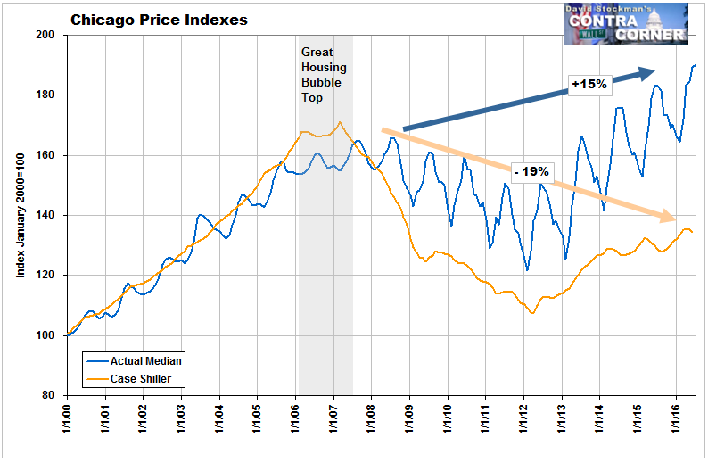
Ask yourself this. Have Chicago median household incomes risen by 90% since 2000? I should say not. Personal income per capita for the Chicago metro has risen by roughly 42% between 2000 and 2014 and by an estimated 9% between 2007 and today. Given steadily worsening housing affordability, the Chicago market is heading for a major adjustment. It’s like to be swift in its onset, persistent, and ugly.
We’ll take a look at a few other big markets around the nation in a followup post.
Liquidity drives markets. Follow the money in the Wall Street Examiner Pro Trader Liquidity Reports.

