
The major headlines will continue to focus on the month-to-month changes in the Establishment Survey though the real analysis is the labor force. Given that the April to June period is often the most heavily influenced by birth-death imputation I would caution over-interpretation of that headline. That is further directed by a conflicting -73k in the Household Survey.
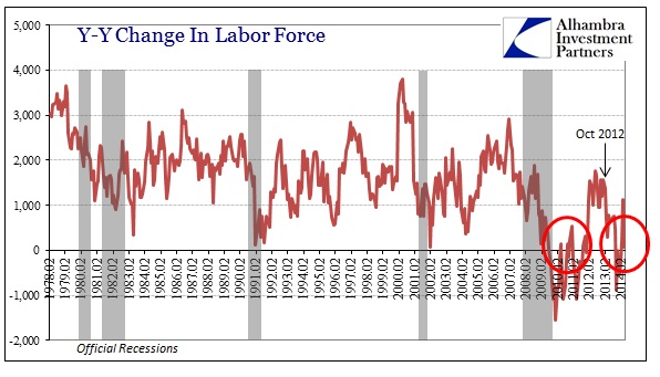
This disparity, however, goes way, way beyond just one month of headline clashing. The Establishment Survey shows just over 1.8 million new jobs since July – the Household Survey about 500k fewer (a 30% discrepancy). The labor force itself has been see-sawing up and down, but is 272k below that of July. In fact, the labor force is basically unchanged since October 2012, an eighteen month stretch that is nearly unprecedented outside of recession.
In its January 2012 Monthly Review, the Bureau of Labor Statistics (BLS) attempted to explain the unusually slow growth of the labor force to that point.
The slower growth of the labor force is primarily the result of a slower rate of growth in the U.S. population and a noticeable decrease in the labor force participation rate. The civilian noninstitutional population 16 years and older had an annual growth rate of 1.1 percent from 2000 to 2010, but is projected to grow by a lesser 1.0 percent during 2010-2020.
The population theory actually makes some sense and there is empirical evidence to back that assertion. The civilian non-institutional population grew quite slowly during the Great Recession.
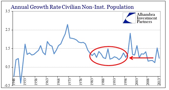
In 2012 and 2013, population growth picked up again. In fact, the last two years are not at all different from the population expansion from 1983-1998, yet that was a period of a rapidly growing labor force. Hence, I have a very difficult time buying the population theory to explain even a small part of this. The labor force grew by an average Y/Y rate of 1.4% from 1983 to 1998, but only 0.5% in 2012 & 2013.
Shorn of satisfactory population causation, the BLS does provide a secondary account.
In addition, the labor force participation rate started a downward trend in 2000, and the decrease accelerated during the 2007-2009 recession and its aftermath. As a result, the labor force participation rate declined by 2.4 percentage points over the 2000-2010 period and is projected to drop by another 2.2 percentage points between 2010 and 2020. These two declining factors lead to a projected annual growth rate of only 0.7 percent for the labor force from 2010 to 2020, a 0.1-percent drop from the annual growth rate exhibited in the 2000-2010 timeframe.
The appeal this time is to broader demographics, not just population but changes within the existing population. There is no shock that the aging of Americans, in general, would offer an explanation to this end, and is indeed a factor in lower participation rates. That much is uncontroversial. However, even given that, the participation rate as of April 2014 is already below that which the BLS expected for 2020! Whatever they were anticipating of simple demographics has been surpassed, by quite a large amount, via some other mechanism.
The unemployment rate drops all the way to 6.3% and April is acquainted and asserted as being robust. But plentiful jobs usually lead to an increase in labor participation especially if it is sustained over time; it’s basic common sense. It’s not just April, the commentary has been in that direction for some time now, so if Americans believed that jobs were better now than say 2011 or 2012, it stands to reason that they would be acting on their cumulative individual anecdotal experiences.
The opposite has occurred, and has done so in an extremely peculiar manner. What we see of the various labor statistics is unique in the series going back to the 1940’s. Nowhere else exist periods where the labor force is flat to decreasing and jobs are “robust”; in almost every other case where the labor force is in such disarray as now, jobs are decreasing not gaining.


Furthermore, the discrepancy between the Establishment Survey and the Household Survey reaches now a year and a half. These survey pieces, particularly when you add the labor force series, are almost always complementary. Where they are not, the gap closes in relatively short order, nothing like what has existed since October 2012. That is what drives this sense of unease about the validity of any of these data series. They should be far more harmonious; that they are not leads to larger questions about accuracy and validity.
Searching back through the historical data, I show below periods where there are changes in the relative stations of these series. In other words, when the labor force stops growing alongside both payroll surveys, the results are uniformly a change in cycle.
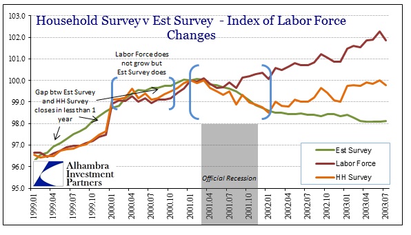
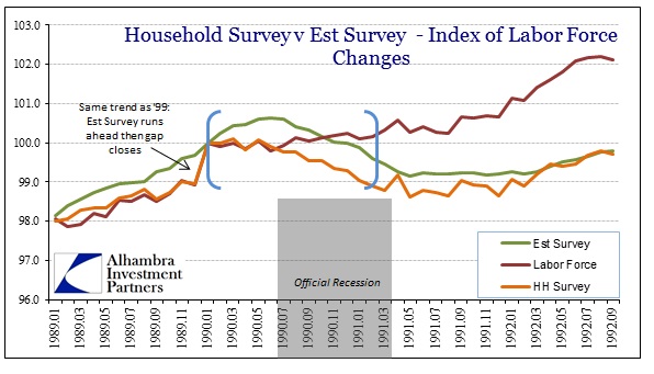
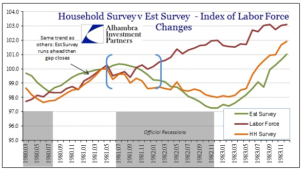
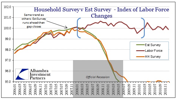
In each of the charts above, the blue brackets highlight the period where labor force growth is arrested or reversed. And in every case, but one, the resulting job growth is negative. In that one exception, the first blue bracket in the dot-com era of 2000, it precedes recession and negative job growth by only a few months.
Nowhere does anything even remotely like this exist:

The labor force was at least growing modestly prior to October 2012, population related or something, but then abruptly shifted. There is no explanation for it other than macro factors that would seemingly conspire to convince Americans to stop looking for work. We can’t even pin this on government transfers as the major categories have been either the same or reduced (UI).

The contradictions here would give me pause beyond the behavior of the Establishment Survey itself. It was always designed to be less volatile, but even that is relative.

Less volatile is perhaps expected, but no volatility is not. Given the divergences here across every series, the contradictory nature of the data is not explainable by the standard reasons. I am open to other interpretations, particularly as I believe in no uncertain terms that we are experiencing a unique set of circumstances, but there should be an account that includes all of these features. There is nothing like that coming from the BLS or the mainstream/orthodox interpretation.
If there is a reason beyond worsening macro conditions it would have to be something broad and powerful, but robust job growth has to be eliminated. Since October 2012, the Establishment Survey estimates 3.6 million new jobs; the population (civ non-inst) has grown by an equivalent 3.45 million. Those not in the labor force, we can only surmise as previously unemployed, has gained a similar 3.54 million. Therefore, the labor force is thought to be perfectly flat (-86k). While all these numbers are equivalent, they should not be; something does not add up.
Click here to sign up for our free weekly e-newsletter.
“Wealth preservation and accumulation through thoughtful investing.”
For information on Alhambra Investment Partners’ money management services and global portfolio approach to capital preservation, contact us at: jhudak@alhambrapartners.com

