New car prices are a good introduction to the world of inflation seen and not seen. The National Auto Dealers Association (NADA) has been reporting a consistent figure for the average price of new vehicles for several decades. It represents actual transaction prices in dealer showrooms net of rebates and discounts. In round numbers, the NADA reported average price per new vehicle at the time of Greenspan’s irrational exuberance moment was $22,000. Seventeen years later it is about $32,000 or 50% more.
Not so much says the BLS—you’re forgetting those pesky “hedonic” adjustments. In fact, owing to ten standard airbags, XM radio, run flat tires etc., the “adjusted” price of new cars today is—drum roll, please— exactly where it was in 1997! Thus, notwithstanding the interim dip shown in the BLS index below, the trend difference in the two measures could not be more dramatic: 0% inflation over the past 17 years as the BLS confects it; 50% as the car dealers report it.
Needless to say, hedonics is at best a subjective thing. There certainly is some significant part of the car-buying population, for example, that would weigh the utility gained from their nest of air-bags as not even remotely off-setting the loss of utility from reduced horsepower, acceleration speeds and towing capacity. In short, the bean counters at the BLS should stick to tabulating the sticker prices and leave hedonics to the marketplace. That’s what its for.

But the place were inflation not seen truly manifests itself is in health care. During 1997 the US spent about $1.2 trillion on health care and today that figure is about $3.0 trillion, meaning that the 17-year growth rate was 6.0%. Since nominal GDP growth averaged only 4.3% during the same period, the health care share continued to claw its way upwards—-rising from just under 14% of GDP to 18%.
By the reckoning of the BLS, however, much of that 6.0% health care spending CAGR represented volume or real gains in services delivered. That’s the case because the sub-index for medical services shown below, which has a 7.5% weight in the CPI basket, increased by only 3.7% annually.

The huge gap between the rate of aggregate medical care spending growth and medical price change is hard to explain by the usual measures of volume. Nor can it be explained by population growth—since health spending per capita is up by more than 5%/year during the same period.
Looking at the volume/capita data, it is evident that the spending/price gap is not due to hospital admissions growth. The rate per 1,000 population has actually declined from 121 to 112 since 1997, and length of stay has also continued falling to boot. Nor have surgical procedure rates or nursing home admissions or any other major volume metrics surged enough to even remotely close the medical expenditure/price change gap.
The explanation is that even though the reported CPI medical inflation rate of 3.7% per annum is nothing to sneeze at—-the likely true rate of medical inflation is much higher. After all, the US health care system did actually earn its well-deserved reputation for being long on cost inflation and short on productivity.
The disconnect undoubtedly lies in the massive and perverse third-party payment system which dominates the US health care system—both via public programs like Medicare and Medicaid, but most especially through employer provided plans which cover some 170 million workers and their dependents.
What happens is that as health care costs inflate, more of the employee’s total compensation packet comes in the form of employer contributions to benefit programs and less in the form of cash in the pay envelope. Thus, during the past 17 years cash wage disbursements, as measured by the official NIPA accounts, have grown at only a 3.8% annual rate compared to a 5.0% rate for the “unseen” employer contributions for employee health care and retirement programs. And there can be little doubt that within the latter grouping, the rate of growth for health benefit plans alone has been even greater than 5%.
So this is medical care inflation sneaking in through the back door. Moreover, it has gotten worse in recent years. Since 2007 the rate of growth in cash wage disbursements has declined to 1.9% per annum—and even that is not the end of back door medical cost inflation.
As is well-known, employers are now pushing back aggressively against rising health plan costs by off-loading a rapidly growing share of the cost burden to employees in the form of sharply increased insurance premiums, co-payments for services and other cost sharing mechanisms. Needless to say, when costs are shifted to employees in this manner, the added burden comes out of their pay envelope—that is, its a subtraction from the already meager 1.9% growth rate of wage disbursements cited above.
Thus, when Bernanke first began jawing about the “deflation” threat in 2002-2003, the average worker contributed about $2,400 annually to the cost of their health plans according to Kaiser Foundation data. As of the present time that figure has doubled to $4,800. When something doubles in a decade, the embedded math is a 7.2% annual growth rate—not exactly the stuff of deflation.
So the truth of the matter is that the 7.5% weight of the medical cost component in the CPI is mismatched with health care sector’s 18% take from GDP owing to the third-party payment system. During the years since the Fed has been gumming about “deflation” the very opposite has been happening in the single most inflationary sector of the American economy.
Out there in the real world, as opposed to the BLS statistical puzzle palace, medical inflation is being back-flushed through the employer health plan sluice gates; and it happens in a manner which reduces real wages no less surely than does higher price tags on gasoline and tomatoes.
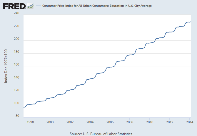
Much the same can be said of education, which has a 3.2% weight in the CPI. According to the CPI sub-index shown below, education prices (primarily higher education tuition and fees) have more than doubled over the past 17 years, thereby rising at a hefty 5.2% annual rate.
But by nearly all accounts out-of-pocket costs including the proceeds of student loans, which at least in theory (and under bankruptcy law) have to be paid back some day, have risen by considerably more. That’s especially true when taking account of the recent explosive growth at those student loan and grant harvesting machines otherwise known as for-profit higher education companies.
Moreover, the quality of higher education has most surely deteriorated measurably since 1997. Stated differently, the hedonic adjustment in this case ought to raise, not lower, the BLS index number.

Yes, there are a few things going down besides cars, shoes and refrigerators. Television sets would be one well-advertised example. But since you need a cable subscription to watch them, the savings from cheap Chinese labor embodied in those flat-screens get more than off-set by the cable bill which is up at a 4% compound rate over the last 17 years.
And that’s based on the BLS sampling and measurements which result in a figure well below what households see on their monthly bill, or what cable company executives brag about in terms of revenue per sub. In the alternative, of course, consumers could unplug the cable box and try movies and the theatre. But the sub-index there wasn’t all so deflationary either—having rising at 3.0% rate since 1997.


Indeed, try as you might, its hard to find much that’s seriously deflating among the CPI sub-indices. There is always information technology including computers, software, internet services and communications equipment—-which have declined by 80 percent over the last 17 years as hedonically calculated by the BLS. But their weighting in the CPI is only 1.2% or only slightly more than the weight of personal care services which have increased at a 2.5 % rate during the same period.
In short, there very little deflation to be found in the CPI basket at the sub-index level, whereas the evidence of inflation, seen and unseen, is nearly everywhere.


The one place there seems to be very little inflation since 1997 is the PCE deflator less food and energy. There the annual increase has averaged just 1.6%. To be sure, the cumulative 31% gain in the Fed’s favorite price change measure does not exactly bespeak a deflationary death spiral. But the rate of increase since the Fed opened the monetary spigots in the spring of 1997 is well below the ordinary CPI at 2.3% per year and far below the seen and not seen components of the CPI basket which have been rising at 2-6% annual rates during the entire time that the monetary politburo has been gumming about deflation.
The full measure of this disconnect will be treated in Part 3. Suffice it to say that when it comes to evidence for deflation, the monetary politburo puts the naked emperor to shame.


