
Last month the government reported a much ballyhooed gain in median household income (MHI) of 5.2% in 2015. We thoroughly debunked that idea. Last week the BEA released data on personal income. It is more evidence that the household income data was just wrong. At the risk of carrying coals to Newcastle, I will briefly cover the new information, and what it portends for economic growth.
The BEA reported August personal income as follows:
Personal income increased $39.3 billion (0.2 percent) in August according to estimates released today by the Bureau of Economic Analysis. Disposable personal income (DPI) increased $31.9 billion (0.2 percent) and personal consumption expenditures (PCE) increased $6.2 billion (less than 0.1 percent).Sep 30, 2016
The gross dollar change is reported on a seasonally adjusted annualized basis.The headline number percent change is reported on a seasonally adjusted monthly basis. None of the data is reported on a not seasonally adjusted (NSA) actual basis, so it is impossible to determine if the seasonally adjusted data is a reasonable representation of the trend or not. Assuming that it is, the year to year change would be +3.1% comparing August 2016 to August 2015. That’s not adjusted for inflation, which the BEA pegged at 1% for the PCE. We’ll leave that silliness for a little later.
The BEA does not include data on Personal Income (PI) per capita in the press release or readily searchable tables on its website, but if you dig deep enough you can find it. That number was $43,378 in August. That compares with $42,290 in August 2015, and $41,107 in August 2014. The year to year gain for this year was +2.6%, and +2.9% for 2014-15. The two year gain was 5.5%.
I was a bit suspicious about that, so I calculated Personal Income Per Capita by dividing the BEA monthly figure for total personal income by the Census Bureau’s monthly total population estimate. That number came out to $49,478 for August 2016, $48,350, and $46,764 for August 2015 and 2014. The percentage gain was 2.3% this year and 3.4% for 2014-15. The 2 year gain was 5.7%. Why the difference between the two sets of numbers? Who knows, but apparently it’s close enough for government work.
All of this calculating leads us to my point, which is that this is another data set which contradicts the Census Bureau report of a 5.2% gain in median household income in 2015 that everybody got so excited about a few weeks back.
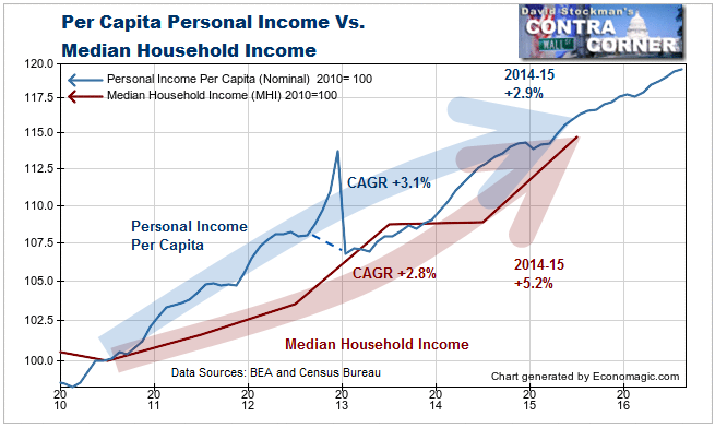
Both Median Household Income and Per Capita Personal Income began to recover from the Great Recession in 2010. From then until 2015, per capita PI grew at a compound annual rate of +3.1%. MHI grew at a rate of +2.8%. The difference is reasonable because MHI is a median and per capita PI is an average. The average is skewed by very high income earners whereas the median is not. Profits from capital gains in stocks and bonds typically push PI per capita up at a faster rate than MHI.
But then in 2015, MHI supposedly posted a 5.2% gain. This would be impossible since per capita PI only grew at 2.9% in 2015. One of these numbers is obviously wrong. Considering the MHI compound annual growth rate of +2.8% and the 2.9% in per capita PI in 2015, the MHI figure looks bogus.
The annual rate of change gives us an idea what’s going on. It reflects the fact that the various government agencies that report economic data either do not have a good handle on the period to period changes, or if they do, they may intentionally manipulate the numbers to support a desired policy result. If they make a “mistake” in one period, they may or may not make a complete adjustment of the earlier period in the process of revising old data. When those “mistakes” occur, especially in seasonally adjusting the numbers, it often takes years for the data to reflect reality. Therefore, more important than the short term headlines is the picture of the long term trend. That and comparing several data series is the only way to judge whether the current data makes any sense.
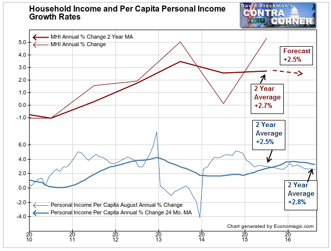
From this perspective it seems clear that the +5.2% call was a correction to 2014, when the growth rate was reported at zero. That was too low, so they offset that with an equal but opposite reaction. On average 2014-2015 saw growth of 2.6%-2.7%. Meanwhile, per capita personal income growth over a 2 year span ran from +1.9% to +2.8%. The 2 year average growth of 2.7% in MHI is reasonably consistent with that.
This year the 2 year average of PI per capita is +2.8%. That suggests that the 2 year average MHI should be around 2.5% for 2016. To get there, the year to year growth rate would again need to be zero. Don’t be surprised if that happens.
All of these numbers are nominal. They don’t take inflation into account. To derive a real, inflation adjusted number, the government deflates these numbers by the PCE deflator, which the BEA says is 1%. We know that figure is absurd. In contrast, Core CPI was +2.3% in August. That’s with the housing component suppressed with the use of the fictitious concept, Owner’s Equivalent Rent, to represent the housing component. With housing being 40% of Core CPI, and understated by roughly 2.5%, a more accurate measure of inflation would add about 1 point to the core measure, bringing it to around 3.3%.
The bottom line is that in real terms both PI per capita and MHI growth are no better than zero and may be as weak as -0.6%. This is a bad omen for the consumption driven US economy.
Lee Adler first reported in 2002 that Fed actions were driving US stock prices. He has tracked and reported on that relationship for his subscribers ever since. Try Lee’s groundbreaking reports on the Fed and the forces that drive Macro Liquidity for 3 months risk free, with a full money back guarantee.

