When analyzing the full and true nature of the dissonance between the idea of continued recovery and the financial markets’ scenario for something much worse you realize that this is not a new occurrence. In curve after curve, negativity has been building for years. Financial curves are important because they tell us the health of the monetary economy, namely assumptions and interpretations of time value. A wholly flat and shapeless curve is the definition of monetary death, a binary regime which suggests that either there is no reward in lending at longer maturities or that risk is too extreme to make any such lending unwise.
John Maynard Keynes proposed something called the liquidity preferences as one possible explanation for changes in interest rates along a positive and upward money curve. He suggested that people will respond to essentially changes in the time premiums of interest rates as a trade-off to current spending or really potential spending. If they have a high proclivity to spend now, they will forgo any interest they might receive for lending into the future. If interest rates rise sufficiently, that should induce more lending to overcome what is really a preference for holding cash in case of short-term needs.
The modern financial economy and money markets are much more complicated than that, owing in no small part to the over-bearing presence of wholesale banks and central banks. I believe there is something similar to a liquidity preference (without suggesting that Keynes was right in his view on simple money conditions) that occurs within credit and funding markets especially in the years since the eurodollar system met its apex (Aug. 2007). Banks have shown a tendency to hold more liquid (thus less maturity) instruments with each instance of crisis or really perceptions of crisis potential.
These perceptions can be purely financial, mixed in with economic concerns or somewhere along some spectrum that includes both. Any potential idea of a financial liquidity preference would trace to the highly uncertain nature of liquidity and the curious but distinct lack of convertibility as revealed in the 2008 crisis. As noted Friday, the eurodollar system is one in which everyone claims to have them but nobody truly does (the problem of the dollar short is the short). Without some more visible basis for convertibility potential, the financial system has become quite shy and for very good reason. Without a tangible and recognizable convertibility mechanism, observed or otherwise, what is really an impossible knot of intertwined liability claims only seems to work when nobody questions it. The more that “liquidity” falls under inquisition, the “shier” banks get in their liquidity preference.
From this view, and admittedly it is not a comprehensive one as other factors have to be considered, the behavior of all manner of financial curves in the past few years is highly contradictory to the dominant narrative that economists continue to suggest. We can observe this very behavior starting with the US treasury curve in the middle of July 2011. Just a few weeks beyond that point, global stocks would again crash with the S&P 500 suffering about a 17% drop just between July 22 and August 8 that year. The debt ceiling debate still somehow receives a great deal of blame for that, but it truly can only be characterized as a “dollar” run especially given what would happen globally over the next few months.
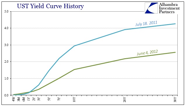
Despite the actions of the ECB (LTROs, etc.) and the Fed (unlimited dollar swaps), it wasn’t until the middle of 2012 that curve stopped its hugely flattening trend. I think it again related to not just financial uncertainty but also increasingly visible economic reversal that went along with it; Europe fell into outright recession while the US increasingly looked to find a similar fate (and I maintain was perhaps not just close, but even a potentially mild one at that time revealed more so in historical revisions). Regardless, there were increasing whispers at that time for even more “unscheduled” central bank intervention for later in the summer – visited first by Draghi’s “promise” in late July and then expectations being fulfilled with QE3 in September 2011 and then QE4 that December.
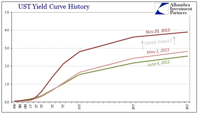
Throughout the bulk of the unquestioned portion of QE3 and QE4, the yield curve was relatively unchanged with only minor steepening. It would take the first threats of tapering QE in early May 2013 to unleash what “should” be accompanying a full economic recovery; steeper curve with higher nominal rates. Notice on the chart immediately above how the short-term rates are relatively unchanged throughout the period, and that it is the intermediate and outer years undergoing this shift in perceptions.
In other words, the financial system was literally “buying” the recovery scenario. The steeper curve here and elsewhere suggested that QE was working and that it would be effective beyond its own now-threatened boundaries. But there was a problem with that scenario, one that curiously fits within this paradigm I am trying to uncover in the history of these liquidity preferences. This perception of ultimate return to “normalcy” in the middle of 2013 was itself highly destabilizing; a contradiction, if not almost paradox, that is entirely revealing of this kind of not just behavior but monetary nature.
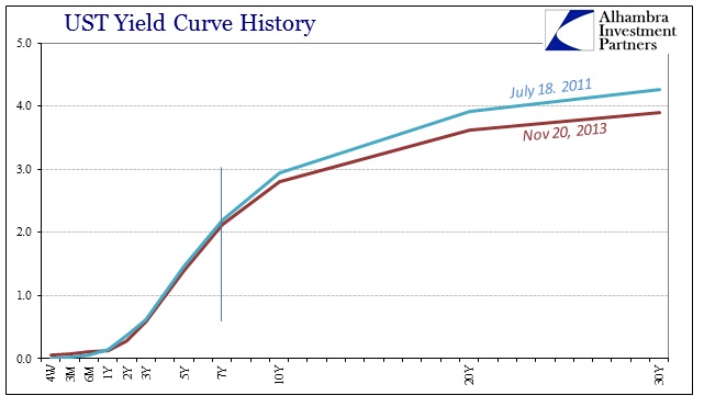
That point became apparent on November 20, 2013, with whatever happened internally in the monetary sphere of the eurodollar system (involving IR swaps and certainly dealer positions). In direct comparison of the “peak” in July 2011 to the “peak” in November 2013 shows this sort of conflict; the yield curve matched almost exactly its shape from July 2011 at the front but was significantly shallower in the belly of the curve and out. It hasn’t been the same since, no matter what the FOMC declares or actually does.
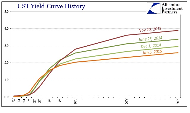
From that point forward, the UST curve has mostly shriveled despite increasingly higher rates (which should be “normalizing” behavior) at the front end. That is clearly the monetary policy window but it is far from suggesting that it was policy dictating the direction of the rest of the curve. In fact, if monetary policy was heading closer and closer to “normalizing” the rest of the curve should have followed the path set out in the middle of 2013.
I think that point is further reinforced by the action in UST’s throughout 2015 and now into 2016. No matter what the perceptions of monetary policy changes, the yield curve has sort of stuck to a relatively narrow range and, more importantly, flat shape.
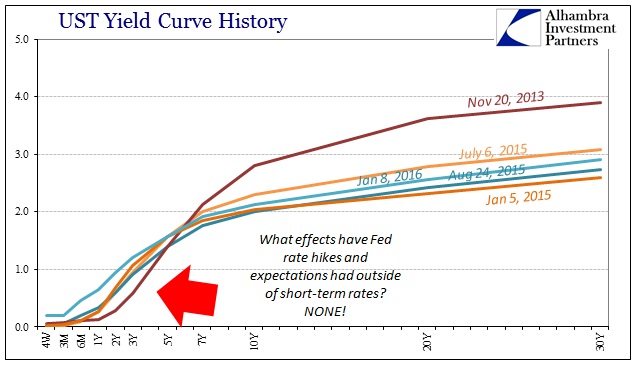
It’s almost as if the back end has become divorced from the front; leaving the suggestion of liquidity preferences dictating the potential skews in everything but the shortest maturities (2-year and in). If this was performance unique to UST’s it might be something more easily dismissed as perhaps technical factors or fundamental considerations unrelated to potential financial turmoil and perceptions of the same. Instead, the same pattern emerges from so many curves including interest rate swaps.
IR swaps are supposed to be pretty well correlated and related to the UST curve and nominal UST rates. And a review of IR swap rates in this same chronology reveals exactly that.
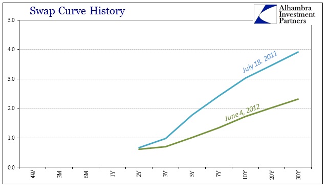
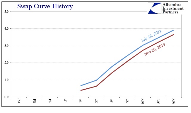
You have the turmoil and flattening of 2011 into 2012, the QE response and even the shallowing of the curve peak 2013 as compared to peak 2011. From November 20, 2013, forward, the swap curve has not just flattened in a singular downward “motion”, it started to do so with a rather obvious twisting – at least until the outset of 2015.
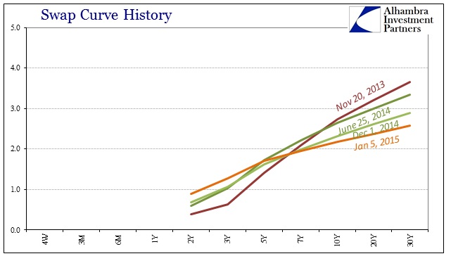
Throughout last year, however, the swap curve far more so than the UST curve has been very tightly constrained in this shriveled state, especially recently.
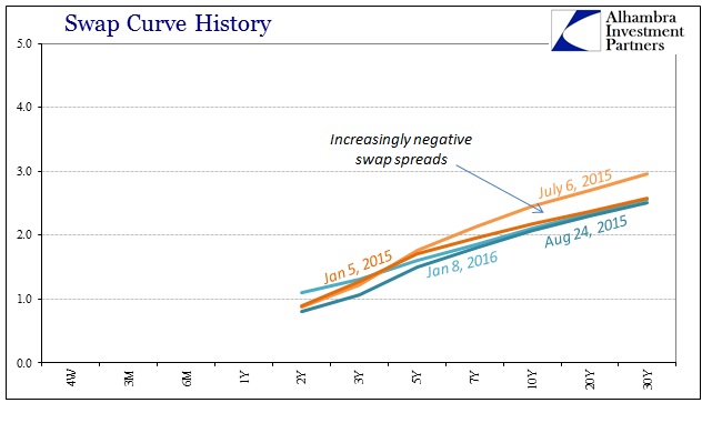
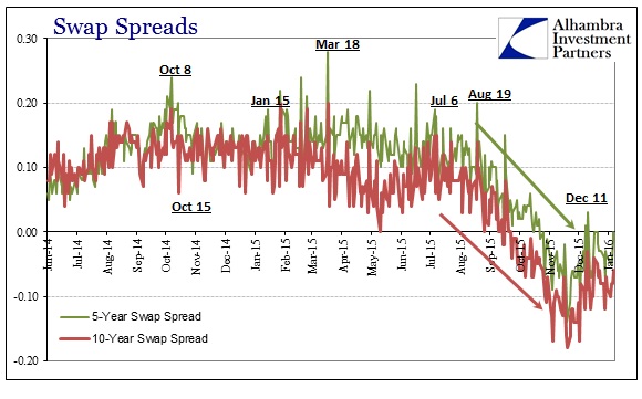
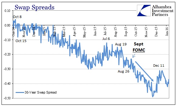
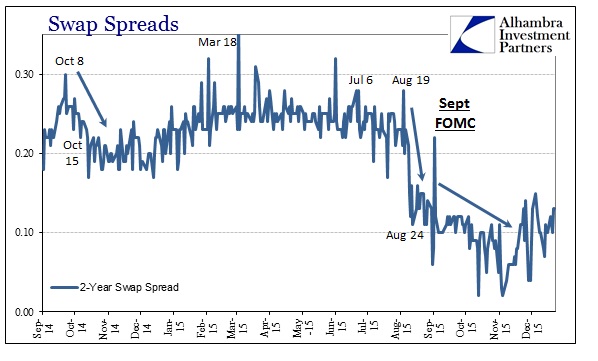
This flattened curve has become known as the increasingly compressed and negative swap spreads that caused so much consternation in late summer (and now, somehow, seemingly forgotten). In the context of potential liquidity preferences, it would suggest that banks providing a basis for swap rates (dealers) no longer wishing to place resources out in time for the nominal swap market and its curve to function in good order and standing (almost a binary liquidity preference as noted at the outset). A negative swap spread, as a reminder, is complete nonsense in terms of that price providing an idiosyncratic piece of useful information; as a systemic outbreak, however, negative spreads are telling us a lot about dealer resources and just these kinds of proclivities surrounding the potential “death of money.”
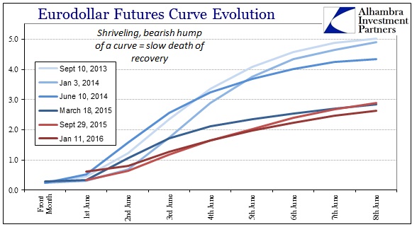
To add even more to that point, I could (and will) add the eurodollar futures curve, further related to IR swaps as it is. I won’t go into a similar historical reconstruction at each of these points, but even in a singular aggregation of curve history the same trends and potential analysis is revealed.
I would also add the WTI futures curve into this same reference, as what that shows is not just changing economic circumstances of supply versus demand in actual, physical crude oil flowing to Cushing, OK, but also the intersection of the same “dollar” finance and thus financial variables embedded in the futures prices. Starting on June 25, 2014, the entire WTI curve was upended, not just in prices collapsing all over but in terms of overall shape – from normal backwardation (past the front months) to sustained contango going on now for more than a year and a half (again, totally disproving “transitory” since not only are prices still falling, the curve has yet to find anything close to backwardation in the 19 months, and counting, since it all started so very wrong).
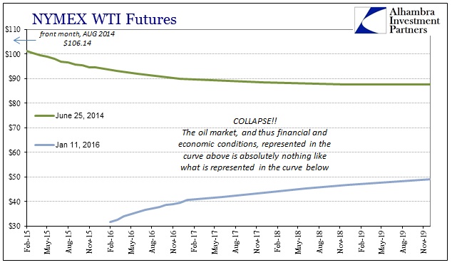
Unlike backwardation, a large contango spread contains the potential for significant financing difficulties of the entire futures curve. The greater the cost of carry (buying spot, selling future, taking delivery and storing until final delivery) the steeper the futures curve should be, especially since there is enormous leverage in every step of that process (you don’t put it up the full purchase amount of the oil you just acquired to sell into the future, you borrow as much as you can and use the oil as collateral in the interim). Thus, the oil curve becomes itself a derivative commentary on both collateralized “dollar” conditions now and especially perceptions about those conditions in the future. In the case of the oil curve over this period, though, the front end has essentially pulled the rest of the curve downward now to the point that the whole of it has fallen below $50.
In other words, funding markets that are financing more and more stored oil hitting storage (rather than the normal usage in backwardation) are increasingly looking to disgorge that oil at whatever point in the future since it looks less likely that funding commitments can be maintained (easily and cost-effective) and rolled over in perpetuity. If you bought at spot or took short futures delivery in the past year hoping to get a Janet Yellen “transitory” payday, the shaky status of funding commitments (including the perceived value of stored oil as collateral) means that more and more speculators and physical owners (including producers) are increasingly looking to offload what they already have into the futures market (rather than stored oil coming back on market in an orderly and regular fashion over time as the curve pushes back up to backwardation) at whatever price they can get (including margin calls). The result in this rush has been futures prices sinking to the point of compressing current levels of contango – a self-reinforcing rush of financial desperation.
All of this suggests that the current darkening financial background with regard to liquidity preferences, such that they may exist, dates back more than two years. The accompanying presence of the WTI futures curve in that reductionism dating back to June 2014 suggests that same trend only amplifying beyond that point. Financially-speaking, then, the recovery was dead years ago, and then really dead almost a year after that, only economists and policymakers tried their best to totally ignore and dismiss it. The same banks that were supposed to be the engine of this recovery have instead fostered and bred its increasingly opposite condition.
If the recovery has been dead that long it is because “money”, or whatever passes for it in the eurodollar system, has been that way. As I have written many times before, the death of the eurodollar would be cause for celebration had the global system and economy been prepared for it. As it is, even at this late date, hardly anyone knows it even exists. It provides an almost surreal possibility; that the greatest financial force of the past forty or even fifty years that might have built and created everything economic and financial (some good, mostly bad and artificial such as bubbles) might yet pass into history without anyone knowing it was ever there. Perhaps at some point in the distant future more open and seasoned economists will discover these money and credit curves and then recognize them for their significance, as if some ancient artifact of a long-extinct culture and system. Unfortunately for us now, getting to the point where mainstream economics can recognize these parts is going to require a whole paradigm alteration, something usually messy and violent.


