
Last week, I discussed the boost the market received as the BOJ made an unexpected move into negative interest rate territory combined with end of the month buying by portfolio managers. To wit:
“However, the announcement by the Bank of Japan (BOJ) to implement negative interest rates in a desperate last attempt to boost economic growth in Japan was only the catalyst that ignited the bulls. The “fuel” for the buying came from the end of the month portfolio buying by fund managers.”
But more importantly, was the push higher by stocks that I have been discussing with you over the last couple of weeks. To wit:
“Over the last few weeks, I have suggested the markets would likely provide a reflexive rally to allow investors to reduce equity risk in portfolios. This was due to the oversold condition that previously existed which would provide the “fuel” for a reflexive rally to sell into.
I traced out the potential for such a reflexive rally two weeks ago as shown in the chart below.”
Previous Chart
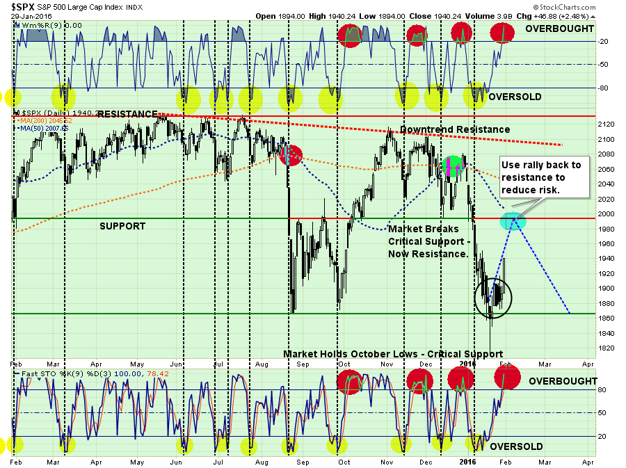
As I stated then, the most important parts of the chart above are the overbought / oversold indicators at the top and bottom. The oversold condition that once existed has been completely exhausted due to the gyrations in the markets over the last couple of weeks. This leaves little ability for a significant rally from this point which makes a push above overhead resistance unlikely.
“Just as an oversold condition provides the necessary “fuel” for an advance, the opposite is also true.”
Here is the problem. I have updated the chart above through Friday’s close.
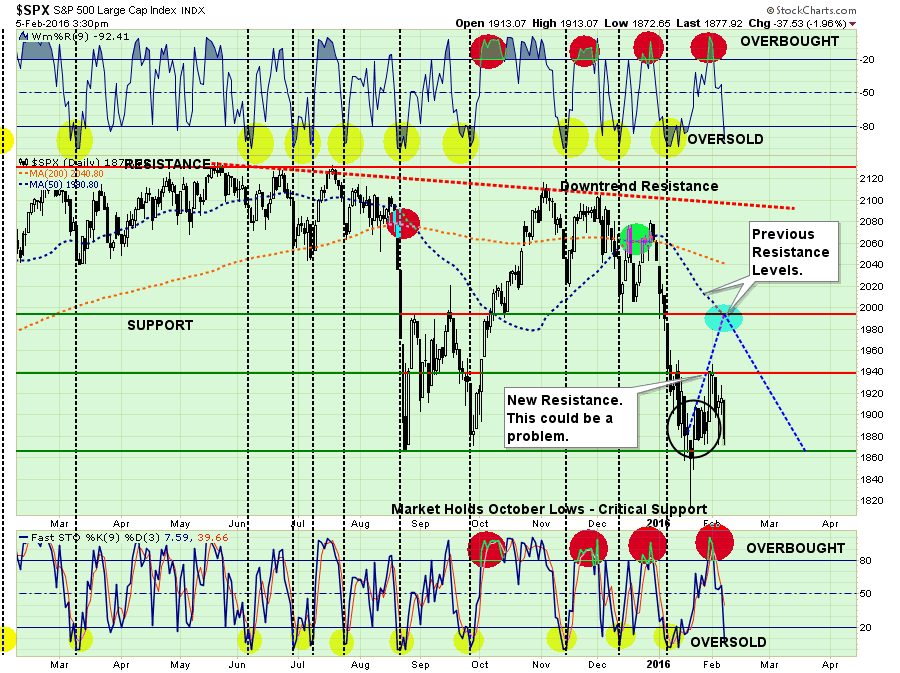
The rally failed at the previous reflex rally attempt during the late December/January plunge. This failure now cements that high point as resistance. Furthermore, the market continues to fail almost immediately when overbought conditions are met (red circles), which suggests that internals remain extraordinarily weak.
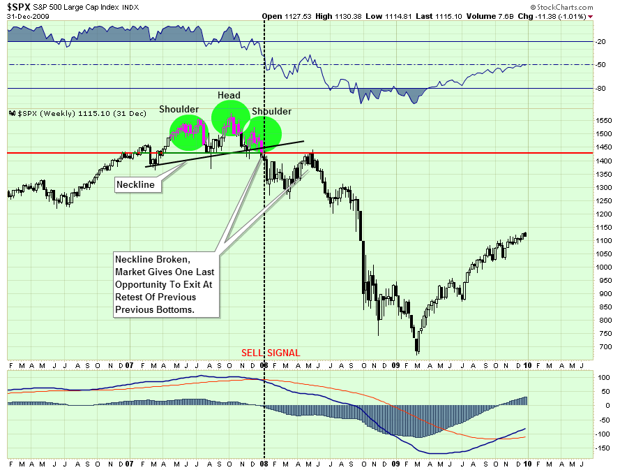
HEAD & SHOULDERS – NOT JUST DANDRUFF
The good news, if you want to call it that, is that the market is currently holding above the recent lows as short-term oversold conditions once again approach. It is critically important that the market holds above that support, which is also the neckline of the current “head and shoulders” formation, as a break would lead to a more substantive decline.
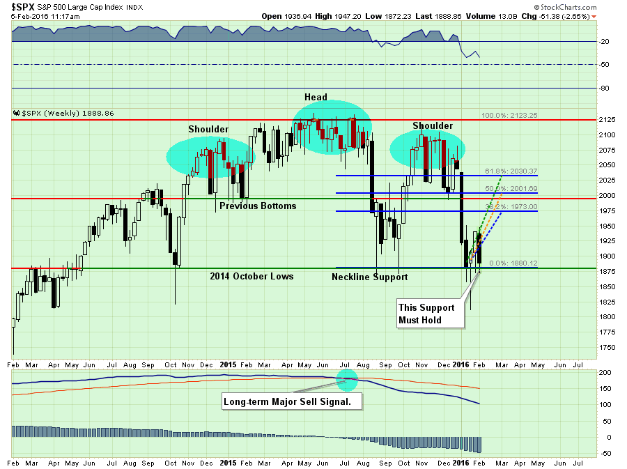
However, this isn’t the first time that we have seen a “head and shoulders” topping pattern form COMBINED with a long-term major sell signal as shown above. I emphasize this point because many short-term technicians point out “head and shoulders” formations that consistently do not lead to more important declines. However, when this topping process combines with enough deterioration in the markets to issue long-term “sell signals,” it is something worth paying attention to.
The first chart shows the same development in 2000.
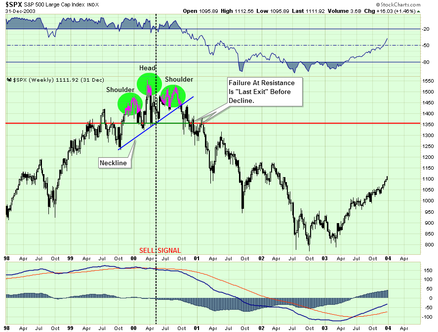
And again in 2007.
These are the only two points since the turn of the century where a topping process was combined with a long-term sell signal.
It is important to note that in both previous cases the markets did provide one last chance to exit before a more substantiative decline ensued. This is because by the time the market has declined enough to break the neckline, sellers have been temporarily exhausted. This allows the market to rise enough to test previous resistance where “sellers” once again emerge.
It is very likely that if, or when, the market breaks current neckline support, individuals will be given one last chance to exit the markets for safer ground. A failure to do so has previously been the start of the “trail of tears.”
PREDICTING OR PAYING ATTENTION?
Last night I gave a presentation to a group of doctors discussing the economy, the markets and what is most likely to come over the next few months.
One of the questions I was asked during the Q&A section was:
“How can you be so sure that you are right? No one can time the market?”
It is an interesting question, and one that I have been asked before. If you scroll down to the bottom of this report you will see a chart of the S&P 500 with the history of portfolio adjustments over time. You could call this timing, however, I prefer to call this risk management.
For me, “timing the market” is trying to be “all in” or “all out.” If you try and do that playing poker you are eventually going to go broke.
However, a good poker player understands the “risk of losing” given the particular hand that he is dealt. He will bet much heavier given a “full house” versus a “pair of deuces.” However, even given a great hand, a good poker player reads the other players at the table and adjusts his bets accordingly.
The same is true when it comes to managing your portfolio. While you may have a “great hand of stocks,” you must read the rest of the players in the market. If they are all buying or selling, what do they know that you possibly don’t.
So, that brings me to the question above. I am NOT sure that I am right.
However, since last May I have held exposure in portfolios to 50% of normal equity allocations because the price trends of the market have been deteriorating. Furthermore, they continue to do so which is leading me to reduce allocations even more (see next section.)
Am I predicting a major market decline? NO. However, I am suggesting that given the current weight of evidence that one may very likely already be in process. The chart below is a MONTHLY chart of market indicators that measure a variety of market internals. Currently, every single measure is registering a “SELL” signal which has only occurred during the previous two bull market cycles.
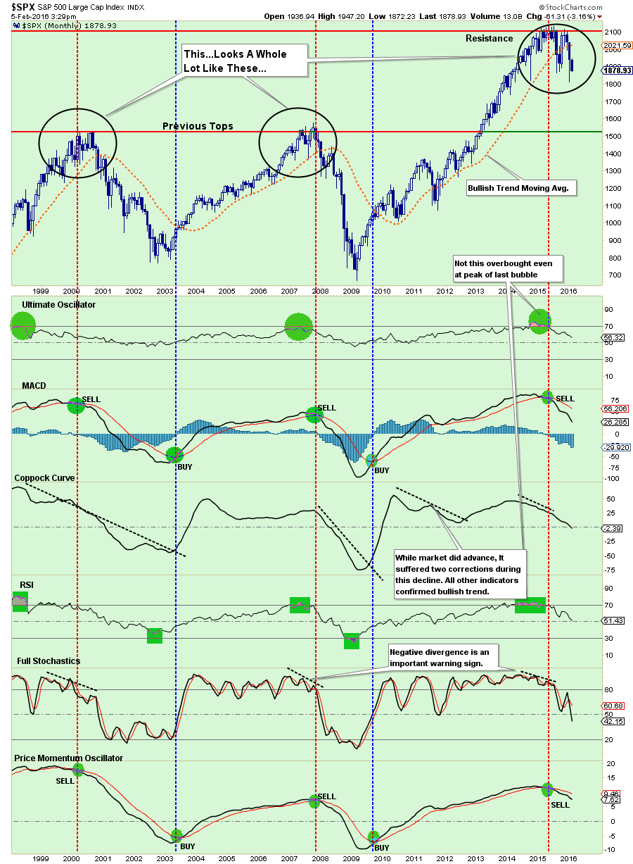
Now, you can certainly make the case for why “this time is different.” However, if you are a good poker player, should you really be betting heavily given the current hand?
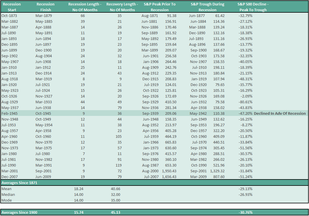
Even if correction only reverts back to the previous peaks of the past two bull markets, such would entail an additional decline of 18% from current levels, or 27% from the previous peak. Such a correction would just about meet the average draw down of a bear market cycle throughout history as shown in the table below.
Are you ready for that?
IS NOW A TIME TO WORRY?
Based on all the data above, not to mention deteriorating economic, fundamental and earnings as well, should you be worried about your investments?
I found this note from United Capital rather interesting (emphasis is mine):
“For anxious investors who want a quick answer to the question, the simple answer is, “No.” Now we’ll explain why. First, corrections are natural, normal, and we’d even say, necessary. I’ve gone through many of them, having started my career in investment management just two months before the 1987 crash.
While different circumstances led to each one, the fundamental aspect of a correction (or even a bear market) is that the market simply reprices securities to better match the underpinnings of an investment as they currently are.
Sometimes, this may happen because of a recession, which we do not think is the most likely scenario, but in many other cases, it’s simply because stocks got a little ahead of themselves. Right now, stocks in the S&P 500 are more expensive relative to their earnings than they historically have tended to be, according to Ned Davis Research. That means that investors bid up share prices more than (or perhaps one might even venture to say “earlier than”) they should have. In that sense, a correction is just that: “correcting” a stock’s value to what the earnings and net worth of the company in question should dictate.”
This really goes to the root of why I am so fed up with the financial advisory industry as a whole. Let me translate the above for you.
“We don’t really manage your money. What we do is encourage you to buy some stuff and then sit on it so we can charge you a fee.
When prices decline, because we don’t really pay attention to the markets, we have to send out an excuse letter to keep you from transferring your money to another advisor who actually pays attention to what is going on.
Even though we knew stocks were overvalued, and such overvaluation leads to corrective cycles in the market, we really didn’t think about selling stocks to reduce the risk of loss. We are too busy trying to get other people to invest money with us. The more the better.
We hope you understand, but our revenue line is more important than yours. Oh, and please deposit more money in your account because dollar cost averaging works better for us than you.”
I realize that is a bit harsh, but I want to make a point. I know some really great advisors that work extremely hard for the clients, manage risk and try to ensure their clients reach their goals. If you ever read a site like Seeking Alpha, you will see a lot of them. Then there are these guys which give the rest of the industry a bad name.
Let me be clear with you. YES, it is time to worry, and it may be time to worry a lot.
If I am wrong, and the markets turn around, we can ALWAYS buy stuff and sit on it again. But now is not that time.
Apparently, if you don’t take some action with respect to the risk in your portfolio, no one else is going to either.

THE MONDAY MORNING CALL
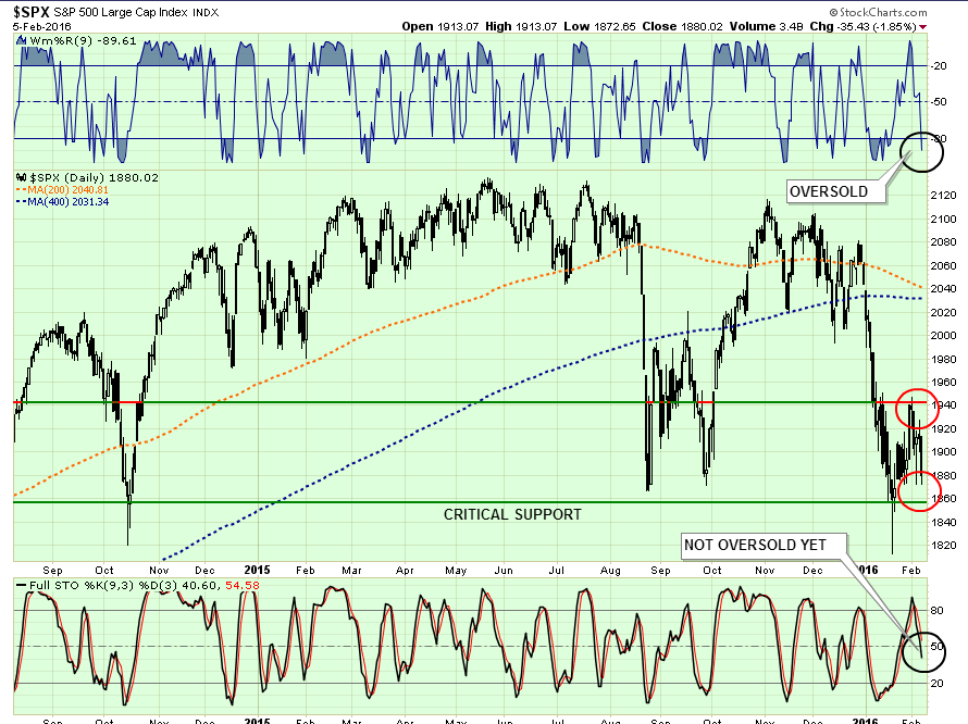
As stated above, the market bounce failed much sooner than anticipated. This changes the tone of the market to substantially more bearish.
As shown in the chart below, on a very short-term basis the market is oversold and once again suggests the markets could get some buying early next week. However, they are also on the verge of breaking critical support.
I continue to suggest taking actions to reduce risk in portfolios by taking the following actions on ANY RALLIES:
- Trim back winning positions to original portfolio weights: Investment Rule: Let Winners Run
- Sell positions that simply are not working (if the position was not working in a rising market, it likely won’t in a declining market.) Investment Rule: Cut Losers Short
- Hold the cash raised from these activities until the next buying opportunity occurs. Investment Rule: Buy Low
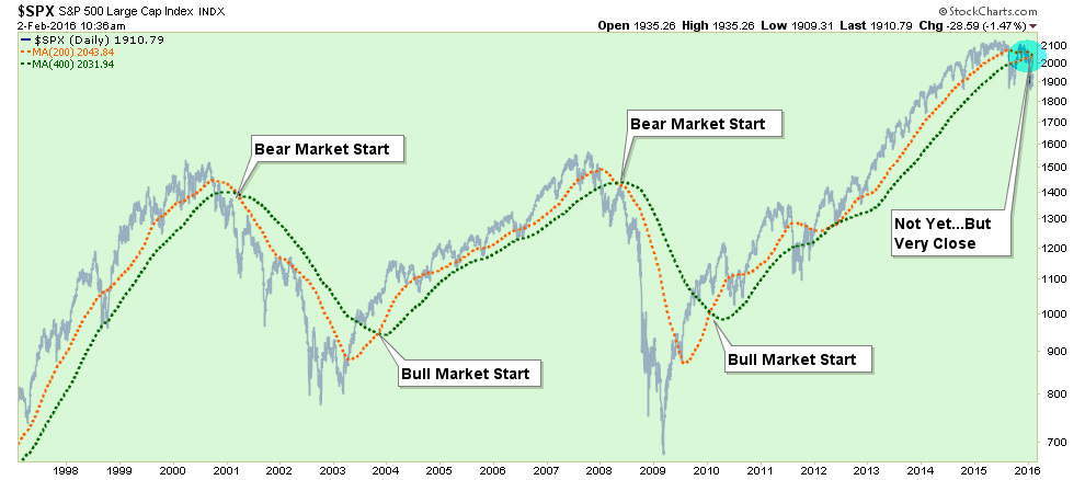
One other point. The two moving averages in the chart above are the 200-day and 400-day. As you will notice they are about to cross. Because these two moving averages are so long in nature, THEY WILL CROSS. It is now inevitable UNLESS the market immediately reverses to a runaway stampede higher.
This “real death cross” was brought to my attention earlier this week by a loyal reader:
“Most identify the death cross as when the 50-day moving average breaks below the 200-day moving average on the S&P 500. However, the real death cross takes place when the 200-day moving average crosses below the 400. In 13 of the last 18 major correction episodes going back 1920- 72% this crossover marked the onset of a major Bear market.
In the five exceptions, which were 1953, 1990, 1984, 1987, and 1996, the same crossover actually ended the correction at that time. Importantly, these five episodes were during strongly trending SECULAR bull market cycles. Given we are not currently in one of those periods, it is likely a cross-over now would be more related to each of the market failures since the turn of the century.”
As I stated above, I am not “predicting” anything. What I am doing is suggesting that current trends, based on historical precedents, suggests that “something wicked this way comes.”

