Earlier this week Bloomberg published a devastating chart showing real hourly wage growth for the first 60 months of every cycle going back to 1949. The 11 cycle average gain was 9% and the largest was 19% a half century back.
Fast forward to the 60 months of ZIRP and QE since the Great Recession officially ended in June 2009, however, and you get a drastically different picture: Real hourly wages have risen by just 0.5%, and in the great scheme of things that’s a rounding error.
Surely the above chart is also flat-out proof that massive money printing doesn’t work. After all, reflating wages, jobs and incomes is what the monetary politburo claims it’s all about. Indeed, the Fed has insouciantly cast a blind eye to the massive bubbles building everywhere in the financial system, and has kept money market rates relentlessly at zero for six years running on the grounds that it is not yet done “stimulating” the labor market.
So why does this abysmally failed and dangerous experiment continue unabated—as Yellen will undoubtedly confirm at Jackson Hole? Self-evidently, it is irresistibly convenient to both Wall Street and Washington. The former gorges on a massive diet of carry trade gambling windfalls thanks to ZIRP and the Greenspan/Bernanke/Yellen “put”; and the latter gets a fiscal get-out-of-jail-free card owing to the Fed’s massive repression of interest rates. Indeed, with the public debt now topping $17.7 trillion, the implicit (and fraudulent) debt service relief from current ultra-low interest rates amounts to upwards of $500 billion per year.
Stated differently, where there should be extreme caution on Wall Street, there is actually irrational exuberance beyond Alan Greenspan’s wildest imagination back in December 1996. And where there should be fiscal panic in Washington owing to prospective red ink of another $15 trillion over the next decade (under “un-rosy scenario”), there is unmitigated and universal complacency.
The evil of monetary central planning, of course, is exactly what is unfolding: it drastically distorts pricing signals and thereby sows the seeds of eventual financial correction shocks and the consequent economic disorder. But there is something else, and its worse. Namely, the addiction to money printing and artificial debt fueled stimulus has become so deeply entrenched in the Wall Street-Washington corridor that the mainstream narrative has lost any semblance of historical perspective and realistic appreciation of the dead-end path on which the system is now embarked.
The monumental extent of monetary expansion and debt accretion since the turn of the 21st Century, for example, goes unrecognized, and is assumed to be merely a permanent and sustainable feature of the financial landscape. And that blindness might even be understandable had it been accompanied by an unusual surge of prosperity of the “party now, pay later” variety. In fact, however, the core metrics of prosperity——real GDP growth, breadwinner employment, investment in productive assets and real household incomes—-have all gone in the opposite direction, having fallen drastically below all historical norms.
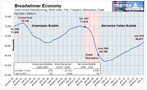
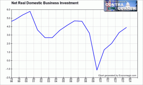
The contrasts below are dispositive. Real GDP growth during the last 14 years has averaged only 1.8%—-barely half the average rate during the prior 50 years. Likewise, breadwinner jobs are still 5% below their turn of the century level; real net investment in plant and equipment is 20% below its late 1990s levels; and real median household income is down by 5%.


The juxtaposition of these baleful trends with the metrics of debt and money need no elaboration. If we could borrow and print our way to prosperity the graphs below would be the road maps. Since the turn of the century, the Fed’s balance sheet has expanded by 10X; total credit market debt outstanding has risen by $30 trillion; and the Federal debt has soared by 3X.


Yet these screaming juxtapositions are lost in the recency bias of the mainstream narrative. Invariably, the “in-coming” data is tortured and rationalized to prove that just a few more doses of money and debt will do the trick. Consequently, the pattern and signal is obscured amidst the immediate noise.
It is therefore perhaps useful to consider a more advanced case of this Keynesian debauch from elsewhere in the world. Consider Italy. Despite all the arm-waving about the fact that the ECB has not gone to outright QE, there can be no doubt that money and debt in Europe have been flowing freely since the late 1990s and the official launch of the Euro. And as might well be expected, dramatically cheaper carry costs on the public debt have not helped Italy overcome its post-war propensity for outsized national debt.

As shown below, Italy’s public debt now stands at a debilitating 135% of GDP, representing what amounts to an incremental debt burden of more than $500 billion just since the year 2000 when public debt first crossed the 100% of GDP threshold.
Needless to say, massive fiscal stimulus and the ECBs ultra-low interest rates for most of this past 14 years have not produced the promised growth and prosperity. In fact, Italy’s macro-economy has plunged into a shocking secular decline. Real household consumption, for example, has now retraced all the way back to 1998 levels.
The same pattern is evident in Italy’s overall GDP trends—-their flawed basis which counts government spending as “growth” not withstanding. Since 2005, Italy’s GDP has spent nearly as many quarters in negative territory as in positive. Consequently, its actual level of real GDP has now lapsed back to levels reached 14 years ago.
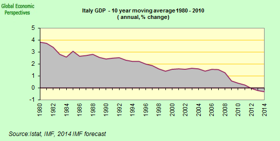
Put in broader historical perspective, and straining out the short-term noise, Italy’s 10-year moving average real GDP growth trend tells the true story. After 14 years of unprecedented debt expansion and cheap ECB finance, Italy’s rolling GDP growth trend has plunged from 4% to negative 0.5% in the most recent observation. Yet there has never been a hint in the Keynesian playbook that actual secular shrinkage of this stunning magnitude is even possible.
Add to that Italy’s negative demographics and you have an absolute and irremediable debt trap. Were George W. Bush an economist, he might even aver that “this sucker is going down”.
Delay the work force demographics for a decade or two and you have a sobering projection of where our politicians and Keynesian money printers are taking the US economy. And that destination is most definitely not the land of permanent full-employment prosperity that is embedded in today’s mainstream narrative.
Note: Italian graphs from Edward Hugh at Euro Watch


