
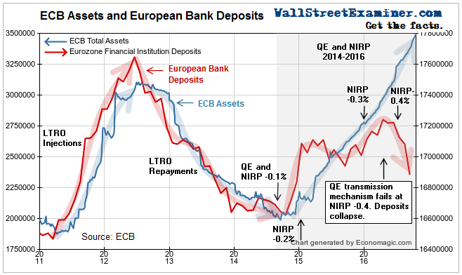
In the first 2 parts of this series I showed you the roller coaster ride of the amount of assets held by the ECB. Then I showed how European bank deposits rose and fell step for step with the assets on the ECB balance sheet. That relationship has broken since July, as the ECB’s negative deposit rate, which helped lead to negative bond yields for some countries, has begun to bite.
In this final installment in this series, I explain how the shrinkage of European banks will impact the US markets, and I show you what could be the most important chart in the world right now.
There are a couple of ways for banks to avoid the negative deposit rate. That is the interest that the ECB charges the banks for their reserve deposits at the ECB. The banks can avoid those deposit penalties by using their own cash to pay down their own debts to other banks or investors. Another is to take the cash they get from the ECB and moving it to Wall Street. To do that they convert their Euros to US dollars and buy US Treasuries, or other US securities, including even stocks. They say goodbye to those ECB deposits, and they rid themselves of the cost of holding them.
“Goodbye deposits” only worked for so long, because the European banking system is now shrinking on its own. The banks are aggressively using their excess cash to pay down debt. Assets in the Eurozone banks are shrinking. Deposits of banks in other banks are crashing as the banks aggressively pay down loans to each other and extinguish their deposits. You can see the pictures in gory detail in my monthly update on the European banking system, part of the Macro Liquidity Pro Trader service.
When you look at the key charts, it’s clear that Mario Draghi is bluffing when he talks about doing whatever it takes. He’s done everything they can think of—ZIRP, LTRO, TLTRO (targeted) QE, NIRP, more QE, more NIRP, buying corporate bonds. Nothing has worked. The European banking system is now in full fledged liquidation mode. Its deposits are shrinking at a breakneck pace. That is bearish for the entire world, including the US stock and bond markets.
Price is the inverse of yield. The chart I’m about to show you therefore shows the direction of Treasury note and bond prices. It is overlaid with the chart of European bank deposits. This is the most interesting chart in the world.
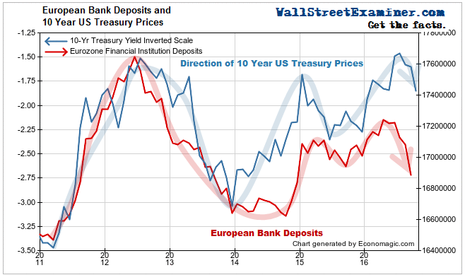
As you can see, total deposits in European banks and US Treasury prices move together. European dealers, banks, investment funds, and individual investors are big buyers of Treasuries. The ECB injected billions into the banks in 2011 and 2012 with the LTRO long term loan program. As deposits soared, US Treasury prices rose (and yields fell) as European institutions used their increasing cash to buy US Treasuries. When European banks were allowed to pay off their LTRO loans in 2012 and 2013. The banks sold their Treasury holdings and used the cash to pay off the LTRO loans. Deposits fell and Treasury prices fell with them, as there were then fewer buyers of Treasuries. The banks that had been buyers of Treasuries had shifted to the sell side.
That shrinkage created a problem for the ECB and the European banks. The ECB wanted more money in the European financial system, not less. It wanted to boost the prices of European stocks and bonds in the hopes of stabilizing the financial system, and goose the European economy into something resembling growth. So it started a new program of outright bond purchases, which we refer to as Quantitative Easing, or QE.
When the ECB started QE, it added a new wrinkle— the negative deposit rate or NIRP, which we discussed in Part 1 of this piece. In essence, the ECB attached a cost to the banks for the funds which the ECB had just injected into the banks when it bought the bonds.
When the ECB started QE with a low level of NIRP in 2014, deposits started to grow again, and again some of that cash flowed into the purchase of US Treasuries. Treasury prices rose.
But in the middle of this year, when the ECB increased the negative deposit rate to -0.4% it only made the crisis in several of Europe’s biggest banks worse. It added pressure to a rapidly deteriorating situation at Deutsche Bank, Europe’s biggest bank, as well as at the deeply troubled Italian and Spanish banks.
As a result, deposits have begun to crash in the 3 months through September. Instead of buying US Treasuries, the banks have become sellers as they come under increasing pressure to liquidate and deleverage. Over the past 2 months, following shrinking European deposits, Treasury prices have turned down and bond yields have risen.
The noose is tightening on the European banks. They are beginning to sell their massive cache of US Treasuries as a result. That there is correlation between European bank deposits and the direction of Treasuries is undeniable.
You would need to be a really deep thinker to deny that this correlation represents cause and effect. Yes, there are other drivers of US bond prices, but European demand is one of the most important. As long as there are a few more sellers on the ask side than there are buyers on the bid side, Treasury prices will be under pressure.
With everybody long Treasuries, and immense leverage against those positions, this incipient trend could devolve into a cascading vicious cycle of margin calls and liquidation. Central banks may be powerless to stop such a wave until immense damage is done. It’s a scary scenario that we are likely to see play out. Is it starting now? I think so. I will be watching the charts and data closely in the weeks ahead for any sign of change.
Lee Adler first reported in 2002 that Fed actions were driving US stock prices. He has tracked and reported on that relationship for his subscribers ever since. Try Lee’s groundbreaking reports on the Fed and the forces that drive Macro Liquidity for 3 months risk free, with a full money back guarantee.

