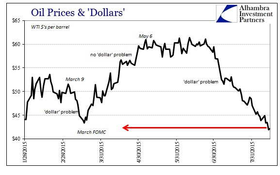
Last week, industrial production ticked higher but only somewhat while this week the Empire Fed manufacturing survey has caused extensive jitters to extend at least another week. Given those somewhat contrasting views on American industry they can be reconciled by simple timing matched against what the “dollar” has been doing across that period. Oil prices, that vital connection between “dollar” finance and real economic factors, represent these various stages rather well.
The industrial production figures are for July which is, factoring lags, still within that “pause” period where the weather explanations, port strikes and all that “transitory” slump conjecture might have still been taken as plausible. The Empire Fed, however, is much closer to the renewed “dollar” turmoil, and thus is perhaps an indication about what is coming as the prior months were not the closing act but only the intermission.
An unexpected slump in a Federal Reserve manufacturing gauge fueled concern about the strength of the U.S. economy, sending Treasuries higher and stocks lower. China’s shock devaluation of its currency continued to roil emerging markets.
Manufacturing in the New York region slumped at the fastest pace since the depths of the last recession, damping optimism in the economy as the Fed considers raising interest rates at its next meeting. China’s currency move sparked concern the world’s second-largest economy is slowing, prompting investors to reassess the outlook for emerging markets.
It was only “unexpected” if you think that the economy’s stumble was a temporary anomaly to be further ignored beyond all the prior “anomalies.” In the “dollar” context, quite the opposite as renewed trouble in the “dollar” is related renewed trouble in the real economy. There may have been some hope that the worst was behind but even that was only supported in very specific narratives, as the “dollar” itself never really retraced in the more buoyant direction but rather only stopped getting much worse.
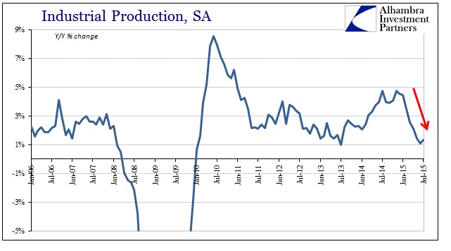
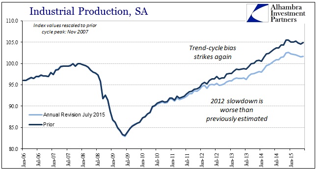
That is also true when taking manufacturing and industrial production in their more meaningful context. In other words, there wasn’t really a rebound in production any more than there was one in spending and retail sales. The numbers have only failed to decline in a straight line, again, like the “dollar”, suggesting an ebb in an otherwise uninterrupted downward dynamic.
In year-over-year terms, industrial production grew 1.3% in July which wasn’t really any better than the 1.1% in June; but it wasn’t worse which is where all the “transitory” extrapolations take hold. Month-over-month in the seasonally adjusted end, it was the second straight monthly gain after declines in the first five months of the year.
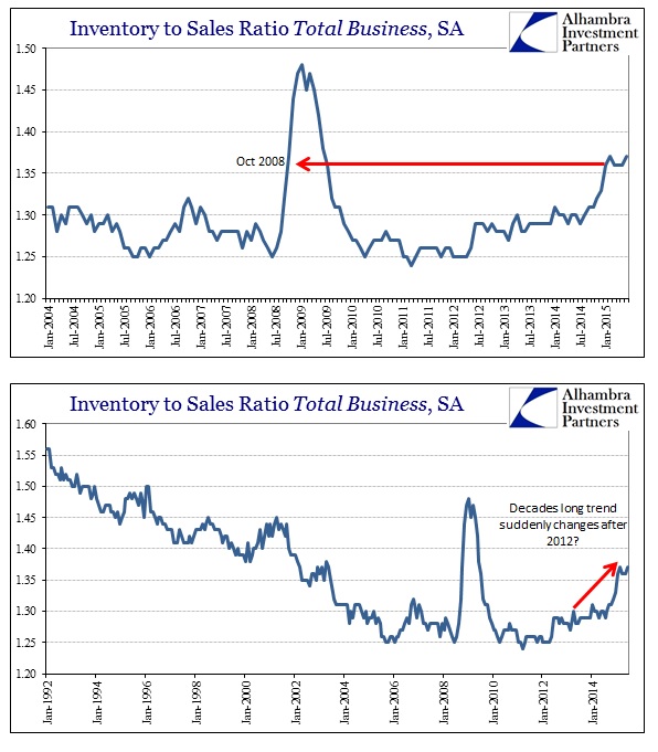
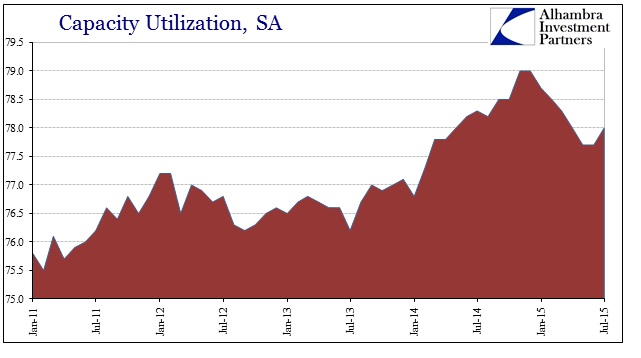
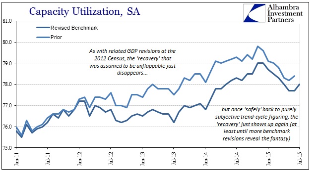
That is, overall, the basis for a much worse projection rather the long-sought recovery. As retail sales, despite the obvious slowdown that took a good deal off capacity utilization as well as production, the inventory imbalance has only gained. If this was just a temporary slump, then inventory levels would be trending back toward prior equalization; instead, that they have only gotten worse shows that top level sales are falling faster than production. That simply means at some point either sales have to actually surge (in fact, rather than only continued conjecture and promises) or production has to decline significantly.
The significance of renewed “dollar” turmoil in this production context goes toward the latter, meaning that it would far more than suggest the “demand” side isn’t anything more than a continued fantasy and not a means by which to hold production steady. That leaves only widespread and massive production retrenchment to only begin the inventory re-aligning – the Empire Fed’s drastic showing adding in just that direction.
That leaves just hope as the final counterbalance preventing that full recognition. Every economist and policymaker around the world promises that nothing bad will happen, even though it keeps repeating these weak spots that get weaker with each pass – dating back to 2012. It cannot have gone completely unnoticed in that perspective how the past promises not only were never delivered but are instead being marked down and reduced at every benchmark.
These revisions may, in accumulation, simply further erode the credibility of the recovery narrative; especially when it takes several years for those making the favorable promises to finally measure the distance between their daydream and the reality productive businesses have had to live with.
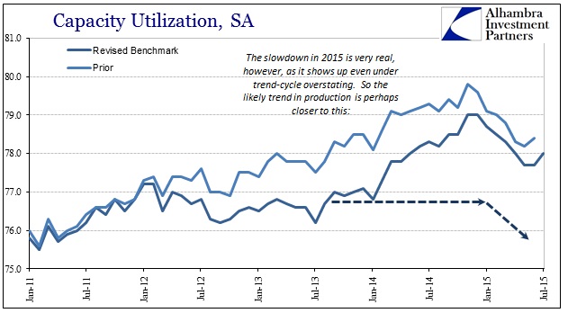
The problem with 2015 is clear in the chart immediately above – no matter how much recent statistics may still be captured by trend-cycle over-optimism the 2015 “slump” still shows up. That would suggest, even more so than in the 2012 revisions that now reveal a prior “slump” that was never supposed to be there nor even recognized at the time by economists (but was certainly felt by business), that conditions this year are actually worse than they appear in even these universally-reviled figures.
It doesn’t add up well at all, with the “dollar” renewing and prevailing “demand” concern, recession-type levels of inventory demonstrating the oversupply and even economic statistics that no longer hold the charms of ignoring all that. There are surely much darker days ahead and the world is starting to wake up to that.

