
The March CPI release last week created quite a hullabaloo. The headline number came in at -0.3% versus analyst consensus expectations of a flat month. Oops, deflation is back (not)!
This is the seasonally adjusted (SA) monthly change. It’s an even more fictitious construct than most seasonally adjusted data. In most cases, while seasonal adjustments are arbitrary and often wrong, at least they are based on significant seasonal swings in the data. Seasonality is far less significant in CPI data. Historically, some years have seen a strong rise in the first half of the year, then a small pullback at year end. But a significant number of years have had no such pattern. So we need to take the SA CPI numbers with an even bigger grain of salt than we do with things like retail sales, jobs, factory orders, industrial production, and home sales, where seasonal swings are more pronounced.
There’s only one way to see what the numbers look like. That’s to look at the actual numbers, rather than the SA fictional construct. We can do that by comparing the actual rate of change of the current month with the same month in the past. We take it a step further and graph the data. A picture is worth a thousand seasonal adjustments. Your eyes will tell you all that you need to know.
It helps to look at the data from the standpoint of technical analysis. This is a very complicated discipline which involves the painstaking process of drawing straight lines between highs and low points in the data line. It’s so difficult that even economists avoid it. They prefer their “simple” statistical models. We know how well they work.
The Wall Street Journal went all breathless over the news:
U.S. Consumer Prices Fall 0.3% in March
Index records its first monthly decline for core prices since January 2010
Consumer prices declined broadly in March, a surprising sign of fading inflationary pressure after months of firming price growth across the U.S. economy.
The consumer-price index, which measures what Americans pay for everything from chewing gum to haircuts, declined a seasonally adjusted 0.3% in March from the prior month, the Labor Department said Friday.
I read the Journal’s analysis that the March headline number was a sign of “fading inflationary pressure.” When I then looked at the chart, I had the economic equivalent of an “LOL.” To put it bluntly, even the seasonally adjusted data shows no evidence whatsoever of fading inflationary pressure. Apparently, the Journal’s reporter is incapable of looking at a chart and drawing a few straight lines. His editor gave him a story line and by golly he stuck to it.
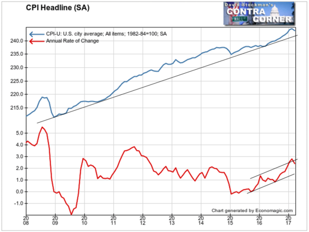
The upper line on the chart is the CPI-U SA index. Yes, it had a downtick. A downtick is hardly evidence of trend change. The CPI remains well above the long term trendline from the 2009 recession low. There’s no evidence that inflation is “fading.”
The lower line is the annual rate of change. Once again, there’s a downtick. But the accelerating trend of the rate of increase is obviously very much intact. Again, no evidence of “fading.”
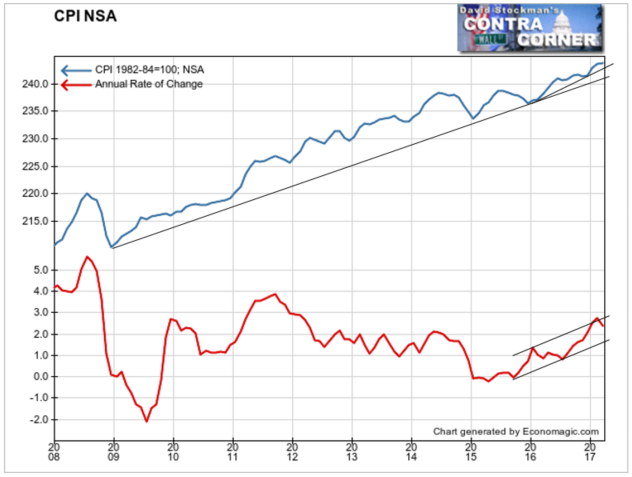
Let’s look at the actual NSA data. Not only is the trend intact, there wasn’t even a downtick in March. It was totally a figment of the seasonal adjuster’s imagination. They were able to convert a flat performance into a downtick simply because the month wasn’t up as much as March has been in recent years.
One month does not a trend change make. In fact, the relation of the data line to the shorter and longer trendlines obviously shows that the trend is still accelerating after breaking out early in 2016.
The annual growth rate is currently around 2.4%. It’s down from about 2.8% in February, but it’s still above every other month since early in 2012. There’s no sign of fading.
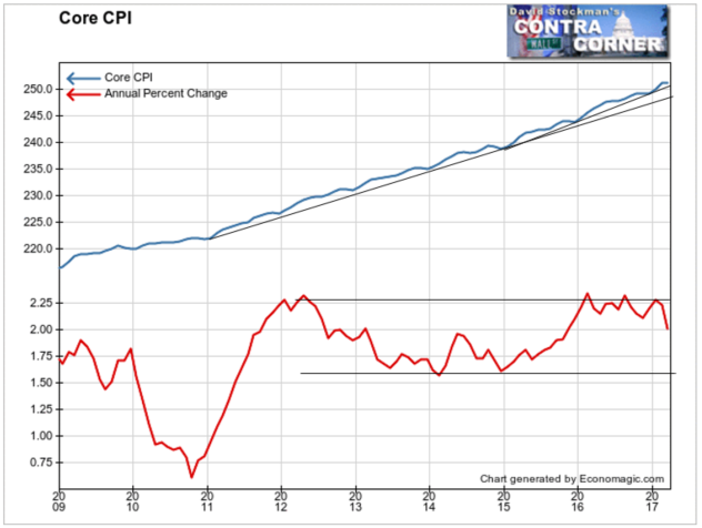
The NSA data on Core CPI shows that there was a sharp drop in this index in March. But it is also abundantly clear that there’s no sign that the trend is decelerating. The growth rate of Core CPI has been between +1.6% and +2.3% since 2012. The annual growth rate in March was 2%.
I have to laugh also that the Journal talks about CPI representing “chewing gum to haircuts.” But they say nothing about housing, which is weighted at 31% of the total CPI and 41% of core CPI.
Now here’s the clincher. The BLS doesn’t count housing inflation. The most recent data on home prices from the NAR and online real estate brokerage Redfin shows that home prices are again accelerating. They rose at an annual rate of more than 7% in both February and March. This is real time data from MLS contract data from a broad spectrum of US metros. These increases are significantly higher than the 4-6% annual growth rate through most of 2016.
While house price inflation is heating up, the BLS sticks with a phony measure of housing inflation that is based on a slanted survey of a tiny cross section of renters. That survey is based on contract rents, not actual market rents achieved in the marketplace. Instead of 7% actual housing inflation the BLS is plugging in annual rent inflation at 3.5%.
Housing cost is 41% of Core CPI. Therefore, by using the phony rent construct instead of actual home prices the BLS reduces Core CPI by 1.4%. If the BLS used actual home prices instead of a bogus rent survey the annual growth rate of Core CPI would be 3.4%, not 2%.
At that rate, no one would be worried about inflation being too low and bond yields too high. Instead, they’d be worried about the Fed being behind the curve CPI heats up. Given the facts, bond yields would most likely be significantly higher than they are now, and would be rising, not falling.
That’s something to consider as the 10 year threatens to fall below 2.2%, and the broad consensus seems to be that yields are heading for a test of the lows. If the 10 year doesn’t fall below 2.2% soon, I would gladly take the other side of that bet. Because eventually fictitious data will need to catch up with the facts.
Lee first reported in 2002 that Fed actions were driving US stock prices. The US Treasury has also played a role in directly moving markets. Lee has tracked and reported on those relationships for his subscribers for the last 15 years, helping to identify major turning points in the markets in their earliest stages. Try Lee’s groundbreaking reports on the Fed and the Monetary forces that drive market trends for 3 months risk free, with a full money back guarantee. Be in the know. Subscribe now, risk free!

